Alasdair Leask
UI/UX Designer | BSc (Hons) Computing & IT & Design | Professional Diploma in UX Design | HND: Digital Design & Development (Games)

I’m Alasdair, a UI/UX Designer with experience in both design and development. I enjoy tackling challenges methodically, using my design and development experience to create UX solutions that are both practical and intuitive.I hold a First Class BSc (Hons) in Computing & IT and Design from the Open University, as well as a Professional Diploma in UX Design from the UX Design Institute, where I gained experience working on multiple consumer-focused projects, including a car rental process and a social media platform.I have a range of real-world experience applying UI and UX design principles. This includes leading research studies to produce actionable reports that support business goals, developing accessible and responsive websites, and designing interactive digital experiences, such as a convention-focused game, with a focus on usability, intuitive interfaces, and engaging user interactions.As a designer, I enjoy creating interfaces that feel natural and intuitive, taking satisfaction in seeing ideas come to life in a way that truly works for users.
Contact
For inquiries or additional information, please feel free to get in touch.Email: [email protected]
Phone: +44 7942 973650
Case Studies
All Projects

freelance
Whack-A-Hack
case study
Breaking The Scroll
case study
Hope City Church
case study
Rent-A-Car
Fresh Assist

freelance
Achology
Induction Hob

Headbangers

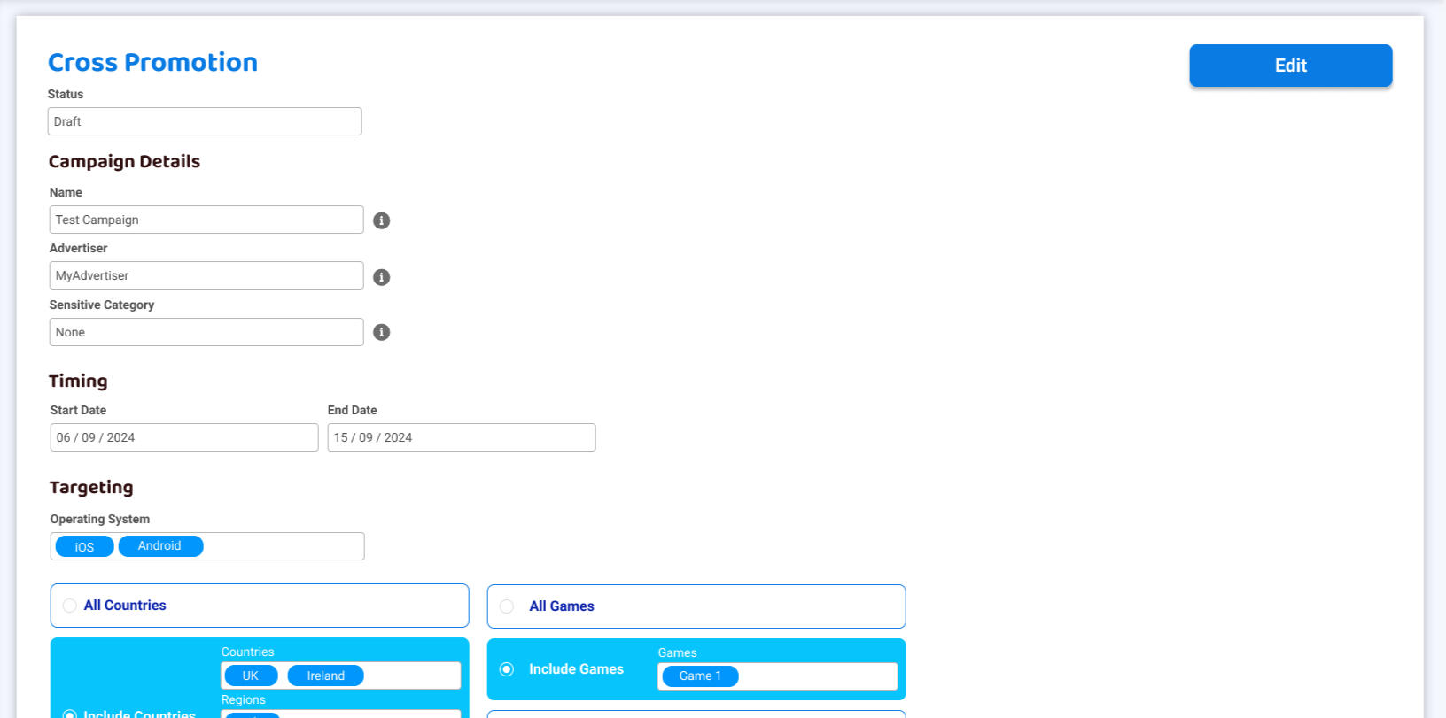
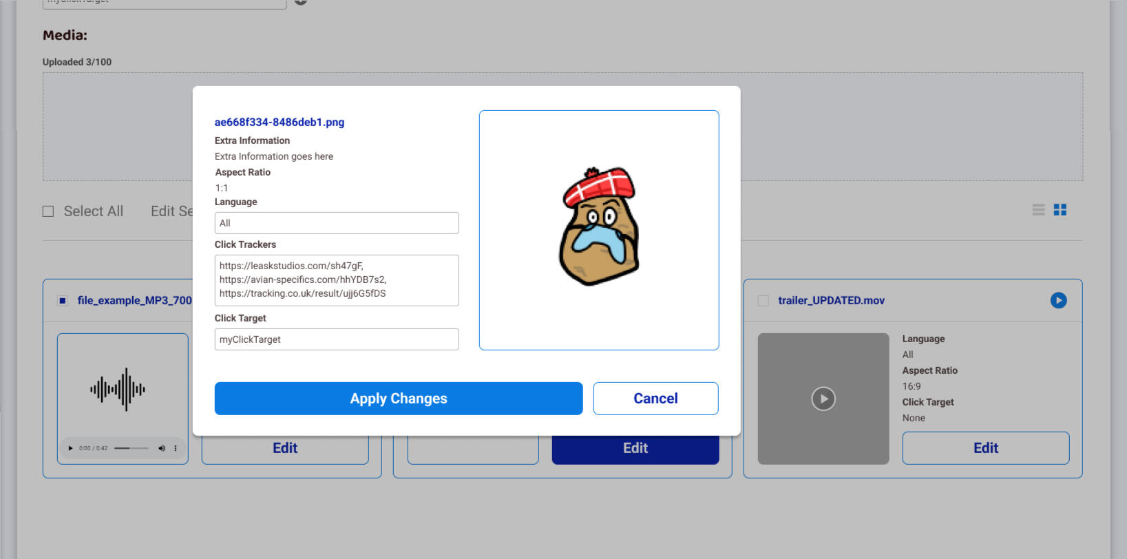
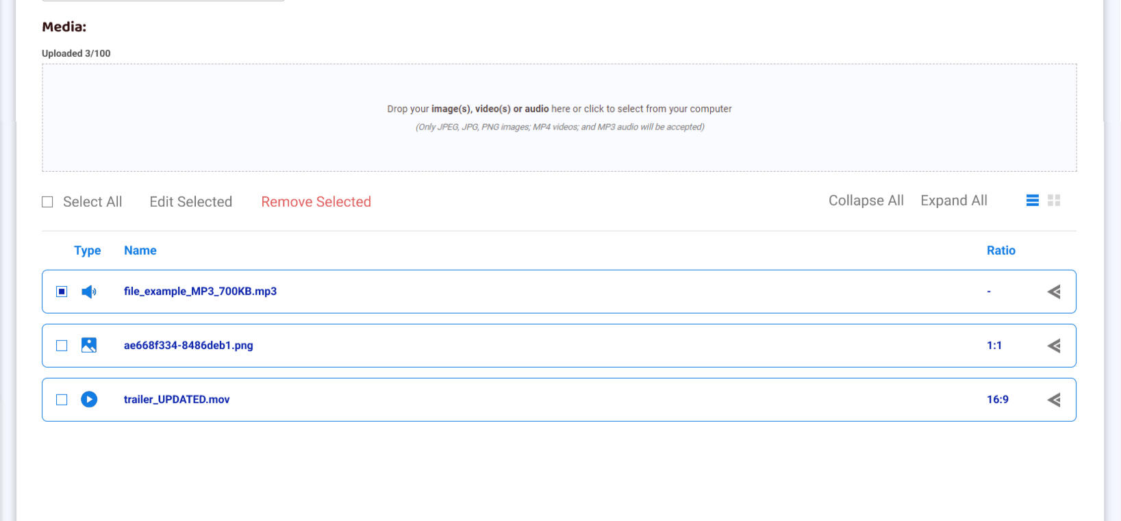
Campaign Manager

Bike King Borders

iOS | Android
Flumble
iOS | Android
Kerby
Itch.io
Multi-Space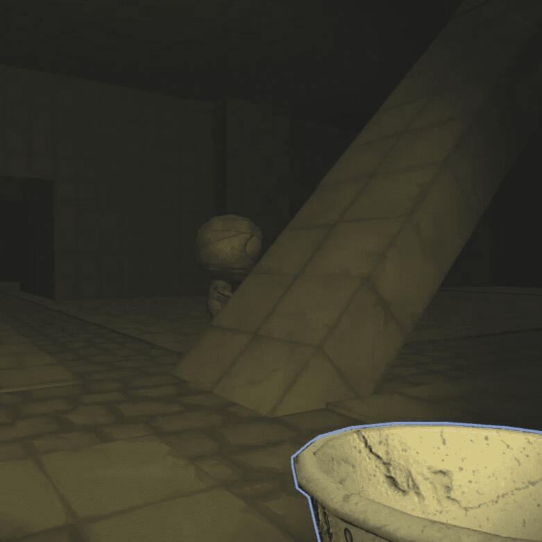
Itch.io
Chambers
Ships 'n' Sharks

Peak Flow Simulator

Tend & Grow
Ninja Nightfall

Peace o' Scotland

Itch.io
Bloomin' Boots
All Projects
2025
2024
2023
2022
2021
2020
Rent-A-Car
December 2023
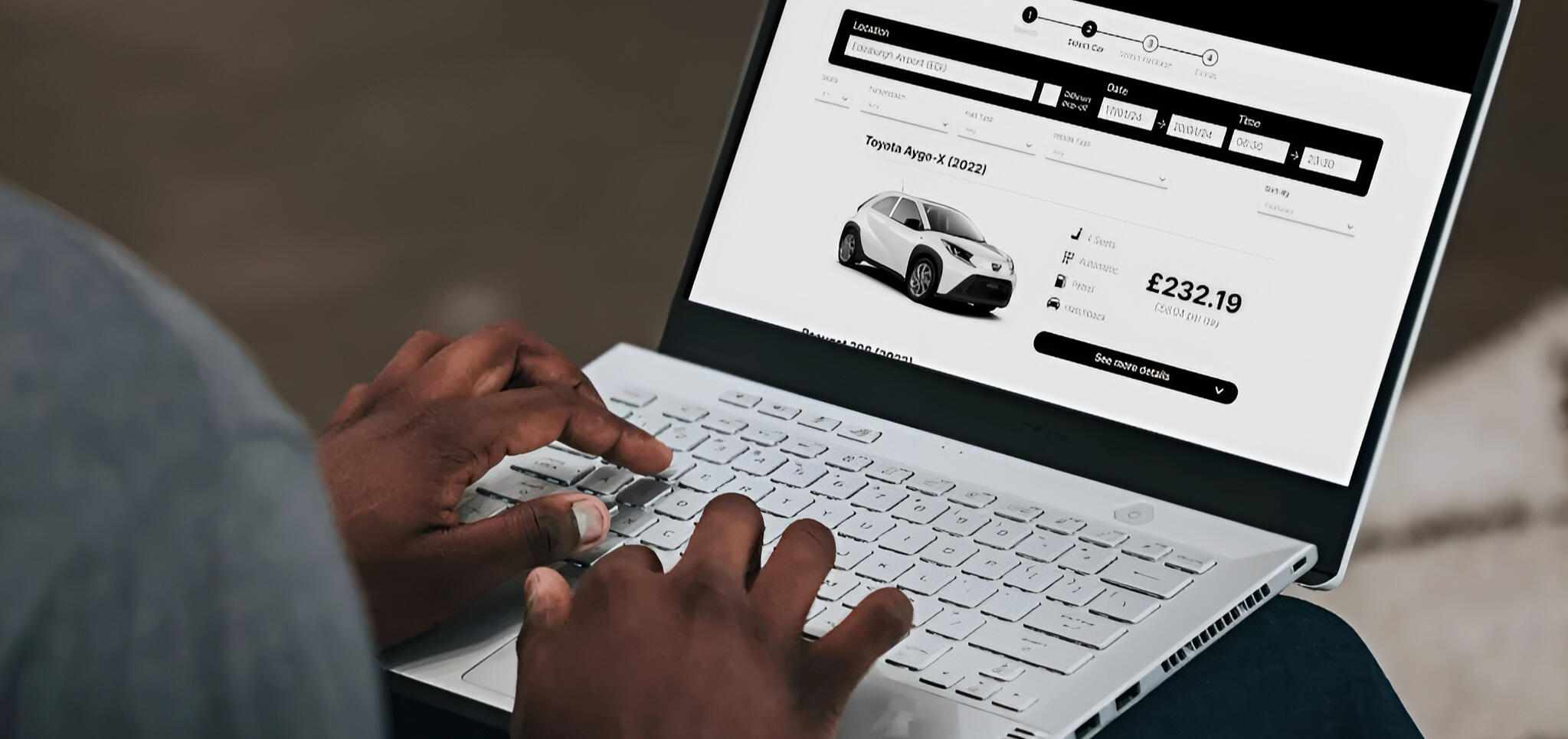
This is a project I completed as part of my
Professional Diploma in UX Design
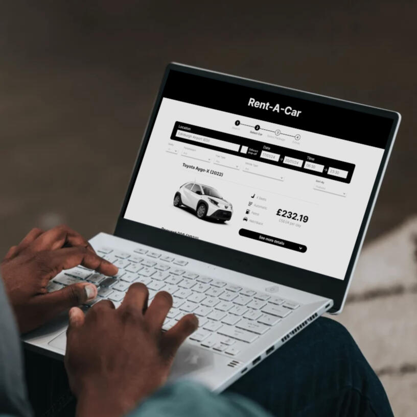
As part of my Professional Diploma in UX Design, this project encompasses the complete UX design lifecycle, commencing with the research phase and concluding with the first comprehensive design iteration. This project adheres strictly to the requirements and instructions outlined in the course, follows the specified timeframe according to the course schedule, and operates with no allocated budget.
Problem
Users often face complexities when renting a car, encountering hidden fees, navigation issues, and struggling with industry terminology.
Goal
The goal of this project was to optimise the car rental experience by simplifying the booking process, breaking it down into clear steps, while reducing ambiguity between the user and the application regarding fees and industry terminology.
My Design Process
Plan
My research plan combined benchmarking, surveys, and usability tests to assess existing products. Using a triangulation approach, I reduced bias and strengthened credibility. Benchmarking identified competitors’ strengths and weaknesses, surveys captured user preferences, and usability tests explored real user experiences. This multi-method strategy provided well-rounded insights to guide and validate design improvements.
Competitive Benchmarking
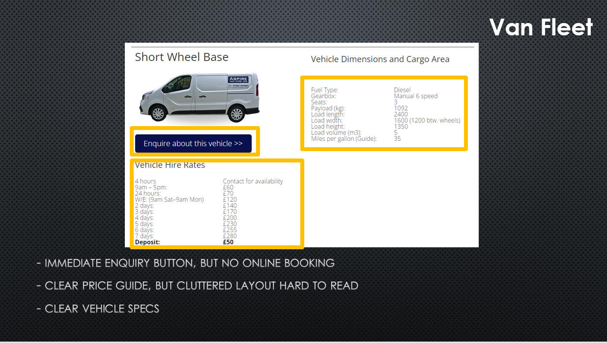
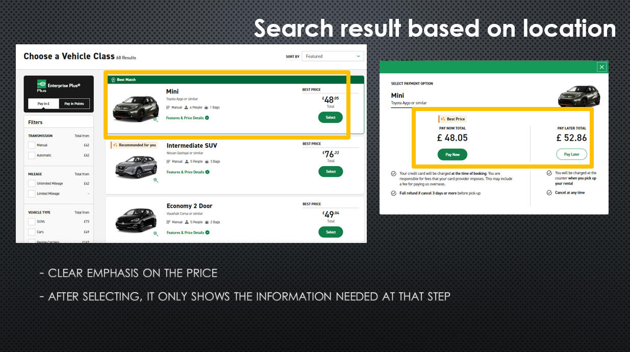
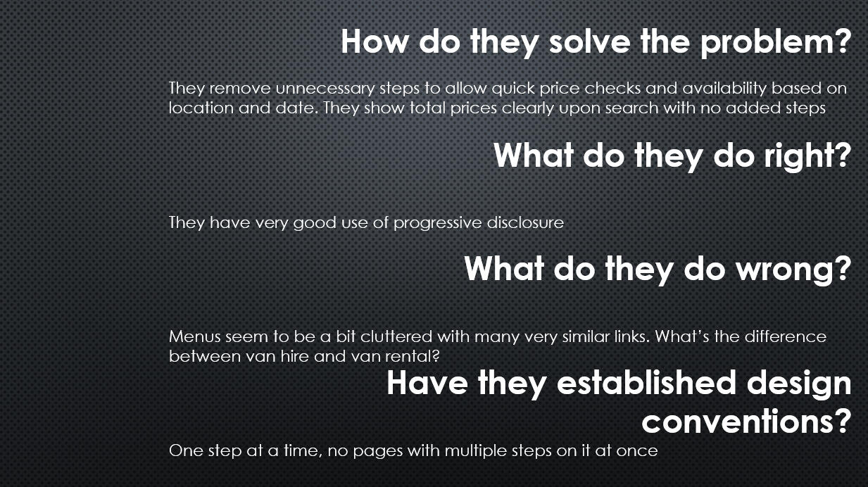
To understand industry standards and identify improvement opportunities, I conducted a competitive analysis of three websites: Aspire Van Hire, Enterprise, and Ace Car & Van Hire. I focused on how each addressed user needs, what worked well, what didn’t, and whether design conventions were established.Findings:
Enterprise offered the most seamless experience with a clear, step-by-step online booking process. In contrast, Aspire and Ace required users to contact the company directly to complete bookings, suggesting less emphasis on online usability. While all sites provided upfront pricing, the smaller companies lacked detailed vehicle information and clear navigation, reducing user trust and accessibility. Overall, Enterprise’s approach best demonstrated how to simplify the booking experience for users.
Surveys
To better understand users’ context, goals, and behaviors, I conducted a short survey with four multiple-choice questions and optional open fields for additional comments. The survey gathered 15+ responses from recent car renters, including friends, family, and community members.Findings showed that most users visited car rental sites to compare prices or complete bookings, often for moving or travel purposes. Many expressed frustration with cluttered interfaces—specifically, excessive links and buttons that made navigation confusing. These insights provided a strong foundation for the next stage of analysis and design direction.
Usability Testing
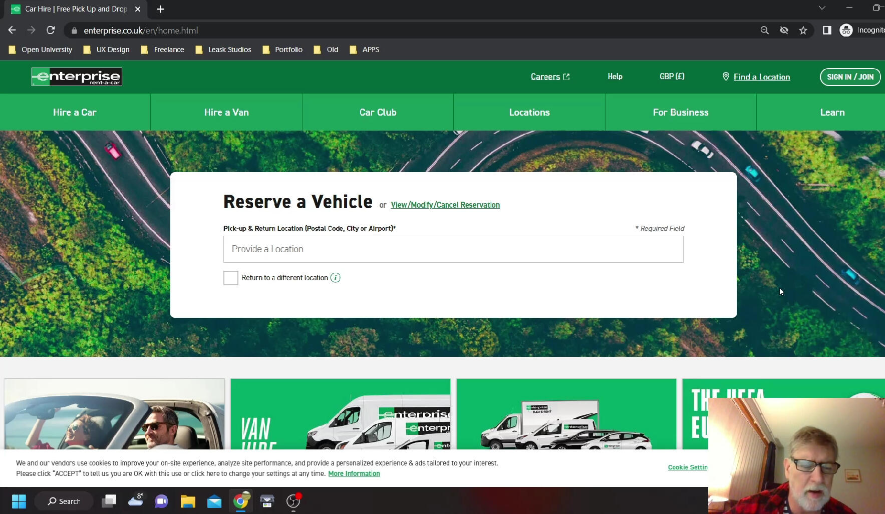
To deepen my understanding of industry standards and user expectations, I analysed two usability tests on popular car rental websites, focusing on user goals, behaviors, and context. I also conducted my own usability test, replicating key tasks to gain first-hand experience in designing test scenarios, engaging participants, and drawing actionable insights.The research revealed several key findings for improving the booking experience. Users valued intuitive navigation with clear search bars and filters for refining results, as well as transparent pricing with detailed cost breakdowns for extras like additional drivers. They preferred visually clear layouts that build trust by avoiding misleading information, and emphasized the need for clarity around industry-specific terms such as “unlimited miles.” Interest in contactless rental options also emerged, highlighting a growing expectation for convenience and safety.
Affinity Diagram
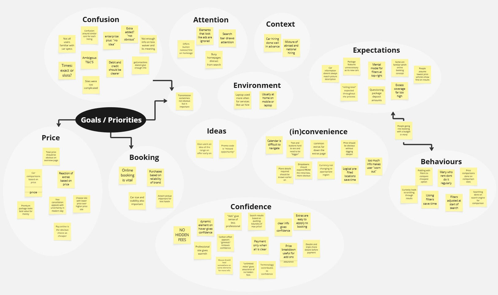
At the end of the research phase, I consolidated my findings using an affinity diagram. I began by reviewing all raw research materials and taking detailed notes, which I then organised in Miro by grouping related insights into clear categories.This process provided a comprehensive overview of the data, revealing key patterns and helping me define the core project requirements with greater clarity and focus.
Project Requirements
Based on the findings of my research regarding the users, behaviours, and actions, I set out the fundamental objectives for my design.1. Intuitive navigation and clear booking path: Ensure users can navigate the booking process easily without clutter or ambiguity, guiding them seamlessly from start to finish.2. Transparency in pricing and information: Provide clear, detailed breakdowns of pricing and features to enhance user trust and understanding.3. Prioritise pricing display for easy comparison and booking: Make pricing information readily accessible and easy to compare, facilitating quick decision-making and action.
Customer Journey Map
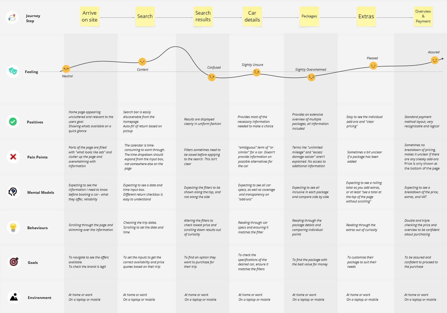
At the end of the research phase, I consolidated my findings using an affinity diagram. I reviewed all raw research materials, captured key notes, and organised them in Miro, grouping related insights into clear categories.This process offered a holistic view of the data, revealing patterns and themes that helped define the core project requirements with greater clarity and focus.
Flow Diagram
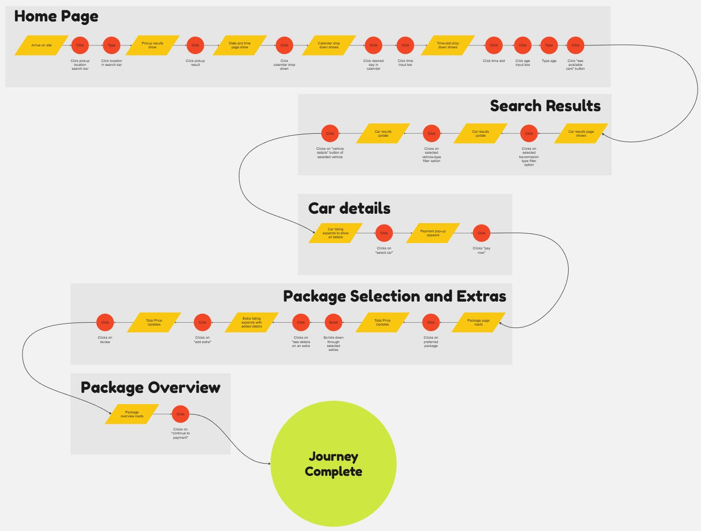
With a clearer understanding of the user journey, I took a closer look to define the detailed user flow within the application. This step was crucial in breaking down the process into clear and user-friendly sections, aligning with one of our primary objectives.Having thoroughly defined each essential screen and identified key user experience priorities, I was now ready to transition into the design phase.
Sketches
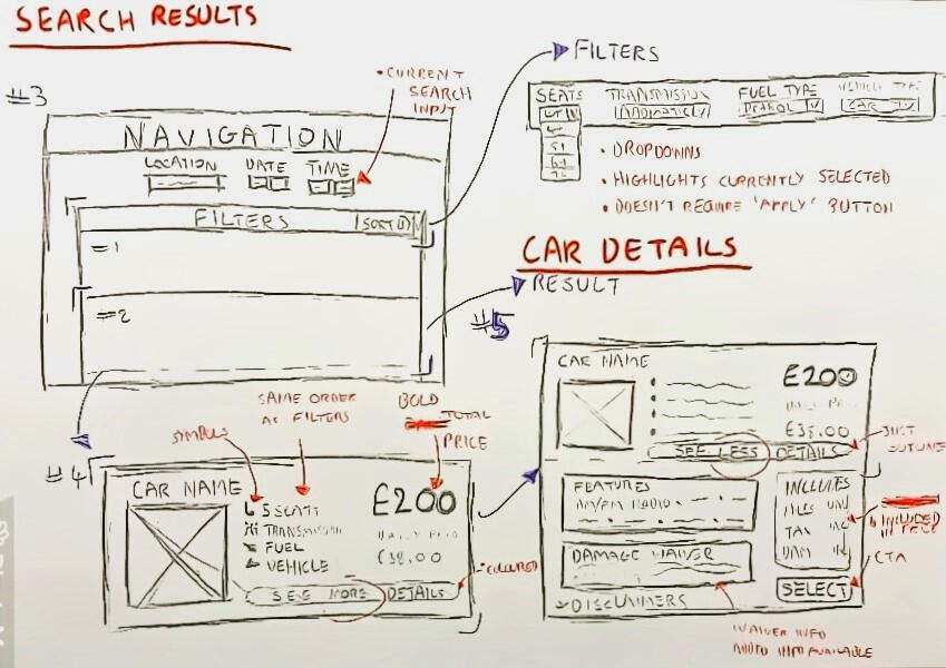
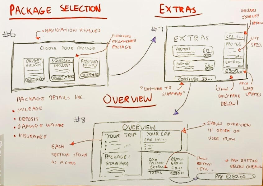
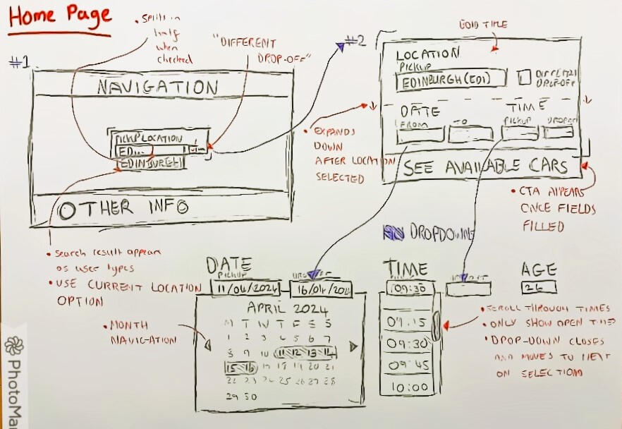
To initiate the design phase, I began by sketching out initial ideas, drawing from the insights gathered in the previous phase. Once I felt confident in the direction of the design to address the identified problem and meet the project goals, I transitioned to creating comprehensive sketches of the website.These sketches included detailed layouts of the site's elements and functionality, establishing the groundwork for the initial prototype. This process ensured a solid foundation for further development and refinement.
Key Design Choices
Booking Path
My initial design was based on the established booking path outlined in the initial project requirements. I chose to incorporate a prominent timeline at the top of each page in order to guide users through their journey, ensuring clarity and enhancing trust in the process. By limiting the amount of links and buttons, I aimed to create a clear sense of direction for the user to follow. Linking back to the research findings, this was a pain point users had experienced on similar websites.Information Presentation
I focused on presenting all necessary details in a readable format, structured by importance in order to help guide users through the information available. Progressive disclosure techniques were also implemented to reduce cognitive overload for sections requiring user inputs.Priority on Pricing and Transparency
To fulfill the second project requirement identified during research, pricing is prominently displayed throughout the design. This strategic placement aims to convey transparency and establish the brand as trustworthy and upfront with users.Summary Page for Enhanced User Experience:
At the conclusion of the booking process, I included a summary page summarising the user’s selected package. This feature allows users to quickly review all relevant information, saving time navigating back through the process to find details.
Prototype
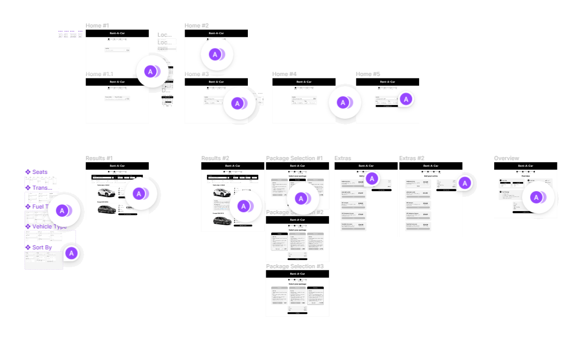
During the prototyping phase, I created the prototype in Figma, marking my first in-depth experience with the tool. Leveraging prior experience with similar software, I quickly adapted to Figma’s workflow and explored advanced features such as components to streamline the design process.I developed a mid-fidelity prototype, which provided richer insights than a low-fidelity version while requiring fewer resources than a high-fidelity one. Its moderate level of detail enabled a realistic representation of the final product, allowing for accurate user testing and feedback. By simulating key interactions and visual elements, the prototype offered a strong foundation for evaluating how effectively the design met user needs and project goals.View prototype
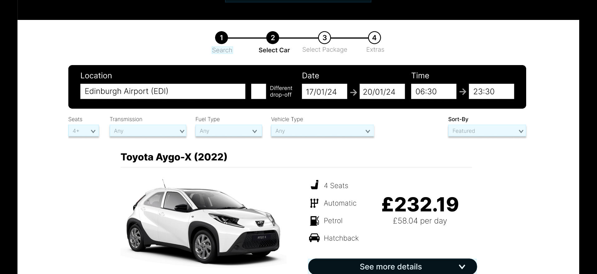
Usability Testing
With a fully developed prototype, the next step was to conduct real-world usability testing. I selected a participant with frequent experience using car rental websites and created a custom usability test script covering key user journeys across the site. This process strengthened my skills in designing precise tasks, facilitating sessions, and asking context-specific questions to capture meaningful insights.The test revealed several areas for improvement, including the need for clearer pickup location instructions and confusion between numbered navigation circles and text labels. Recommendations included adding a package details option, enlarging clickable calendar areas, and adjusting oversized text that caused dropdowns to extend off the page.Overall, the usability test validated the design’s effectiveness, showing that users experienced fewer issues with price transparency, navigation, and information clarity. While the educational context of this project limited further iterations, the insights gathered provide a strong foundation for future refinement and development.
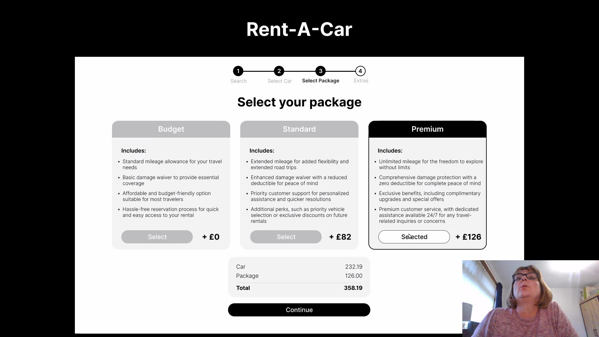
Annotations
With the design finalised, the subsequent phase involved transitioning it to the development team. Using the comments feature in Figma, I annotated the prototype file with essential information for the developers. This included detailing the expected behaviors and functionality of each element, specifying formatting and expected values for input fields, and outlining instances where the site should offer user feedback. This handover aimed to facilitate a seamless translation of the design into a functional, user-centric product during the development stage.
Reflection
Design Process
During this project, the research stage proved to be invaluable, providing a solid foundation for the entire project. In the validation stage, I acquired valuable insights that would give me a good starting point to develop the subsequent iteration of the design. Looking back, I would have expanded my creative exploration during the sketch stage, allowing for more diverse ideas and variations to be developed.
Tools & Software
Throughout this project, my proficiency in Figma has significantly advanced, making me more adept and comfortable with the software. Working with Figma has become an enjoyable and gratifying experience for me.
Personal Development
As a result of this project, I am now more confident in applying my knowledge and skills in the realm of user experience. From conducting user research to performing usability tests, the hands-on experience I gained throughout this journey has marked a significant milestone in my professional growth.
Lessons
Moving forward, I recognised the importance of testing the design with a more diverse user group. The data collected during the validation stage felt limited as the data was derived from a single user's perspective.Additionally, I've recognised the critical role of clear and detailed communication between design and development teams. Given the intricate nature of creating an exceptional user experience, conveying this level of detail to the development team is essential for successful execution.Another important lesson I've learned is the significance of regularly referencing the original project goal. This is especially important during research analysis and requirement definition. It's essential to stay aligned with the project's overarching goal when transitioning into the design phase.
Breaking The Scroll
October 2025

This is my dissertation completed as part of my
BSc (Hons) in Computing, IT, and Design
This project aimed to redesign social media for healthier user engagement by addressing the addictive design patterns that contribute to poor mental health and reduced productivity among isolated young adults. Developed as part of my BSc (Hons) in Computing, IT, and Design, the dissertation was grounded in interaction design and user experience principles from module TM356.
Problem
Isolated young adults, lacking meaningful human connection, often turn to social media for relief, but its addictive design worsens mental health, fuelling depression, low motivation, and poor productivity.
Goal
To design a social media experience that encourages healthier engagement and helps users manage their screen time more effectively.
My Design Process
Research Strategy
Before beginning my research, I set clear goals to guide what I needed to learn and keep the project grounded in its design context. My research objectives were:1. Organisational Context: Understand how social media platforms design interactions to maximise revenue, engagement, and retention.
2. User Context: Examine the cognitive and physical effects of these design choices, including addiction, mental, and overall well-being.
3. Activities & Environment Context: Identify the behaviours, habits, and motivations behind excessive use.
4. Solutions: Explore how designers can create interfaces that support healthier engagement.To investigate these objectives, I used three methods: information searching, indirect observation, and focus groups. Together, they provided both high-level context and firsthand user insight.Information Searching
I researched how platforms design for engagement, the resulting cognitive and physical impacts, and existing approaches that promote healthier use. This included a range of online sources, books, and academic articles, forming a strong theoretical foundation.Indirect Observations
I observed four young adults who felt they used social media more than they wanted to. Over one week, they logged each session’s purpose, duration, platform, and post-use mood. This revealed recurring patterns, motivations, and emotional reactions tied to daily use.Focus Groups
To deepen these findings, I held a 30-minute open discussion with the same participants. We explored their habits, health impacts, and reasons behind excessive use. This qualitative session provided richer insight into their experiences and attitudes toward social media.
Research Findings
I summarised the findings from my research methods according to the four initial research objectives:Organisational Context
Social media platforms use persuasive design strategies, such as infinite scroll, auto-play, gamification, and personalised algorithms, to maximise engagement and retention. Features like social validation loops and “slot-machine” refresh patterns exploit dopamine-driven reward mechanisms, increasing dependency. While regulations like the Online Safety Act aim to address these tactics, enforcement remains inconsistent.User Context
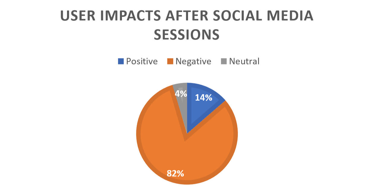
Social media’s impact on users is largely negative, with 82% of observed sessions linked to worsened mood or productivity. Reported effects included fatigue, procrastination, social comparison, anxiety, and disrupted sleep. Passive, boredom-driven scrolling proved more harmful than purposeful use.Activities & Environment Context
Social media often fills idle moments or accompanies multitasking. Boredom, procrastination, and FOMO were common triggers, with spikes in use during events or algorithmic recommendations. While short, intentional sessions were viewed positively, prolonged use tended to become passive and harmful.Solutions
Self-imposed limits, app deletions, and tools like Screen Time or TikTok’s daily caps showed mixed effectiveness, often undermined by persuasive design patterns. Participants emphasised that effective solutions must encourage intentional, self-aware engagement rather than impose restrictions.
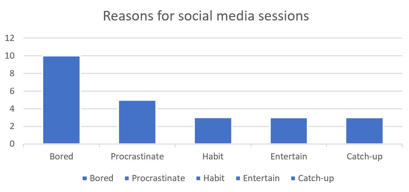
Identifying Requirements
Based on my research analysis, I justified the following design requirements:1. Give users control over their usage
Strong control mechanisms are needed because simple tracking tools don’t effectively prevent overuse. Clear limits and prompts help users regulate their own behaviour.2. Encourage productivity
Social media was often used as a form of procrastination, leading to reduced focus and increased fatigue. The design should help users return to their original tasks instead of slipping into unproductive scrolling.3. Promote intentional over mindless interaction
Many participants engaged in passive scrolling, which contributed to eye strain, poor sleep, and reduced wellbeing. The design should discourage frictionless, automatic behaviour and encourage deliberate engagement.4. Break habitual, idle-moment use
Frequent checking during boredom or downtime showed a strong habitual pattern. The design should interrupt these automatic cycles and reduce addictive use.5. Focus on connecting people
Despite the negative effects, users valued staying connected to friends and family. The design should prioritise meaningful social connection over passive content consumption.
Initial Concept
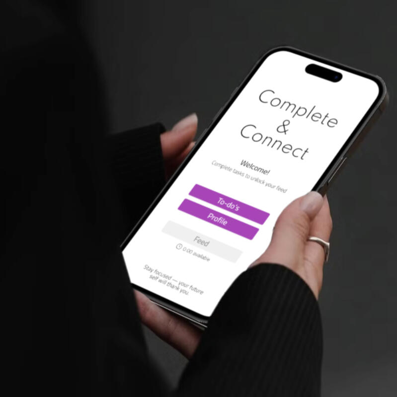
After completing my research and defining clear project requirements, I focused on finding a way to shift social media from a source of distraction to a tool for support. A key insight was that many people use social platforms to procrastinate, which reduces productivity. This inspired Complete & Connect, a productivity-first social media app that rewards task completion with access to social features and time-based rewards. The concept addresses the core problem by prioritising productivity over passive scrolling and helping young adults break addictive usage patterns.
Concept Development
I first explored different approaches for how the app’s core functionality could work. This early ideation helped shape the key behaviours, interactions, and logic behind the concept.From there, I moved on to sketching layout options and user flows to see how these ideas could translate across different screens. This rapid sketching helped map how users would move through the system, what inputs were required at each step, and how the app should respond.The process also clarified how interdependent features, such as task completion, post creation, and content unlocking, would need to connect smoothly. Focusing on structure rather than visuals allowed me to identify relationships, dependencies, and potential friction points early on.
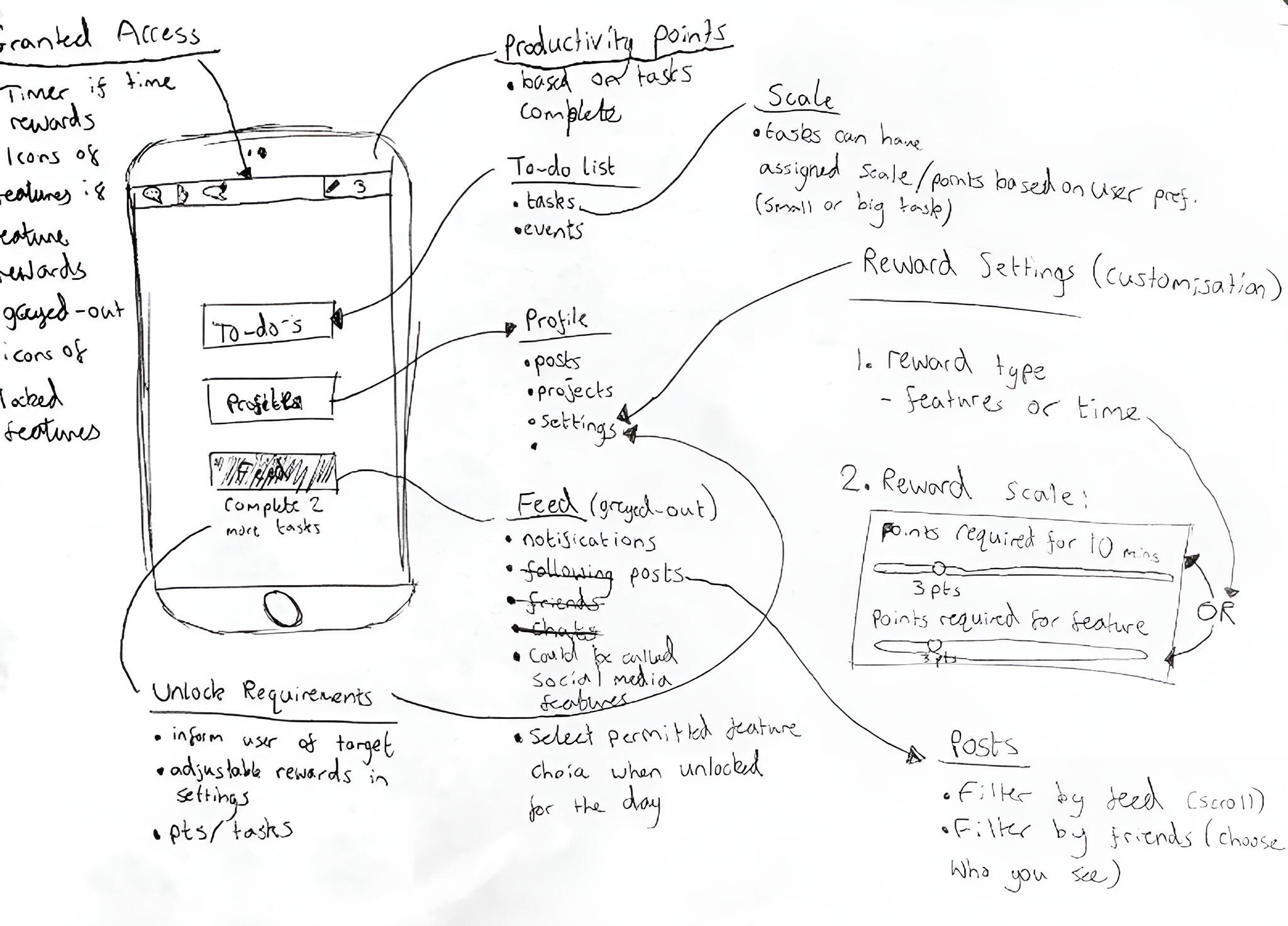
Conceptual Model
Once the idea was developed further, I created a conceptual model to summarise the social media application concept:Idea: Complete & Connect is a productivity-first social media app that rewards task completion with access to social features and time-based rewards, prioritising productivity over passive scrolling.
Error: Young adults face reduced productivity, low motivation, and poor mental health due to addictive social media designs.
Metaphor: The app functions like a gym for social media habits, At the gym, you exercise first (complete tasks) before enjoying the feel-good result (social media interactions) after. If you skip workouts (tasks), you don't get the reward of feeling good afterward (social media interactions). Over time, you build a stronger and healthier body (habits and mental state).
Scenario:
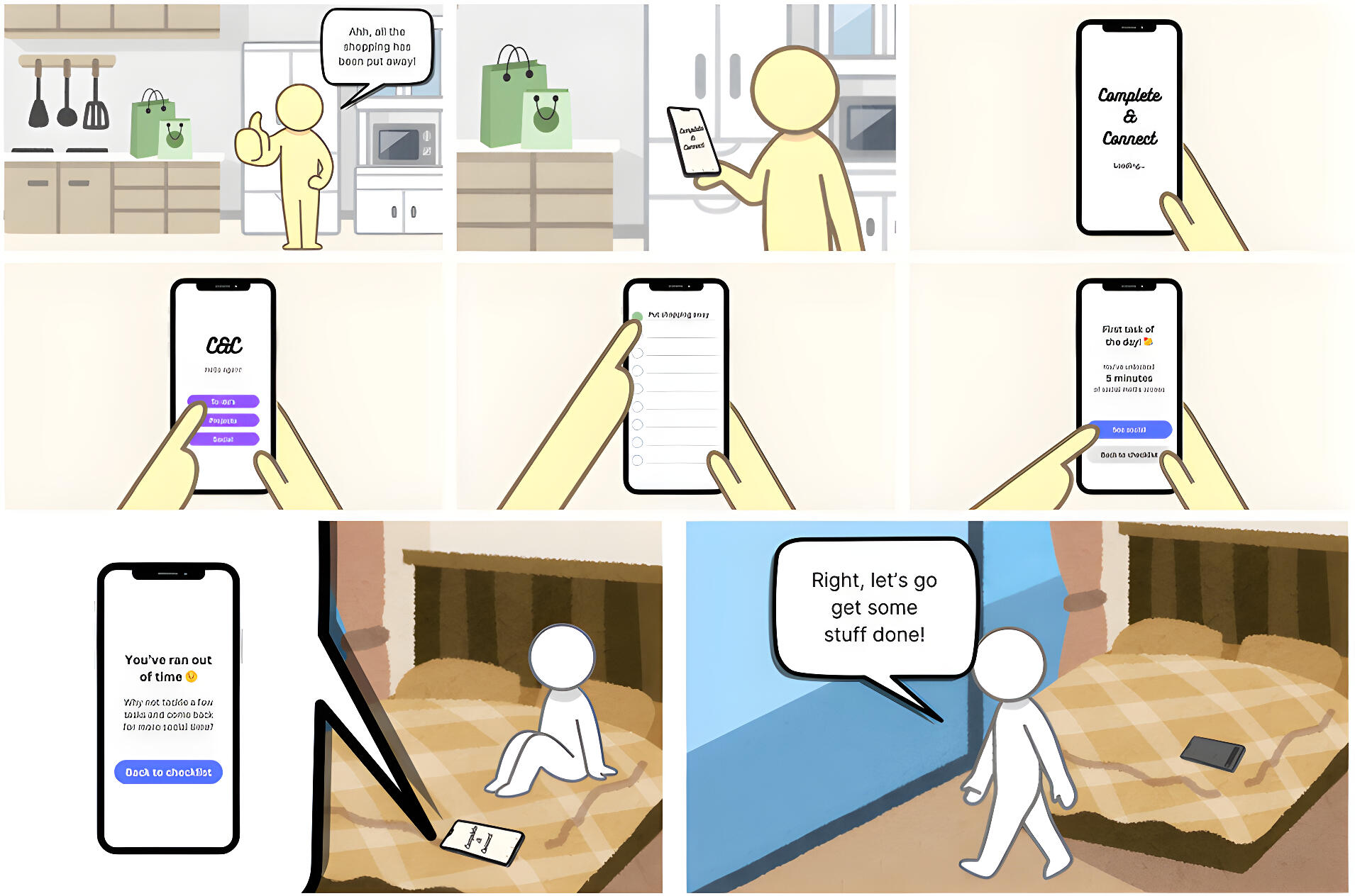
Model: Users will perceive the app as a productivity-first social media platform where they need to complete specific tasks before accessing social features.
The system operates on an earning time allowance where social media is only accessible after users accomplish predefined tasks (e.g., work-related, personal, or hobby-related goals).
Users will understand that time on social media is earned through productivity, and that interacting with content or socialising is tied directly to completing their to-do list or projects.
Wireframe
I next created a high-fidelity wireframe using Figma to establish the exact layout, positioning, and scale of each interface element. This stage was essential for preparing a fully functional prototype.The Figma wireframe file is available here.
Prototype
With the detailed wireframe complete, I moved into prototyping to demonstrate functionality and prepare for interactive usability testing in Figma. I began by building a component library of buttons, headers, inputs, and layout groups to establish consistent styling and structure across the prototype.Using Figma’s advanced prototyping tools (conditional logic, variables, and complex interaction triggers), I then implemented the core interactions to simulate realistic app behaviours. This created a highly functional prototype that closely mirrors real user flows. The final version included 37 screens and 27 interactive components, all designed to accurately reflect real-world use.
Testing
Thanks to the advanced prototyping features implemented into the prototype, I was able to conduct usability tests that yielded significantly deeper insights than would have been possible with a less interactive prototype. The high level of realism in the prototype enabled participants to engage with the interface in a way that closely mirrored real-world use, resulting in more valid and actionable feedback.Before conducting the usability tests, I defined clear research objectives and desired outcomes to ensure the sessions were focused and aligned with the overall design goals. These objectives guided the structure of the test and informed the types of insights I aimed to gather from participants. The primary research objectives for the usability testing were to evaluate the following:• Is the process of unlocking the feed clear, discoverable, and intuitive to users?
• Is the overall navigation of the app simple and logical for first-time users?
• Are the system feedback and visual cues (e.g., progress indicators, confirmations) clear and helpful?
• Does the design make users feel in control of their usage?
• Does the feed design discourage mindless scrolling and promote intentional interaction?
• Is the app’s social component clear, and do users feel it supports meaningful connections?The usability testing aimed to achieve the following outcomes:• Understand how users interpret and interact with the feed unlocking process
• Identify navigation issues and areas where users struggle to find key features
• Gather feedback on overall usability, clarity, and satisfaction across key user journeys
• Assess if control features genuinely help users manage their time and usage habits
• Uncover opportunities to improve the clarity and flow of the design
• Identify areas where the app could better facilitate meaningful social connection
• Understand whether the design supports users in staying focused and returning to productive tasks
• Learn if the design would effectively interrupt habitual driven social media useTo prepare for the participants, I developed a structured test script to guide me through the test.
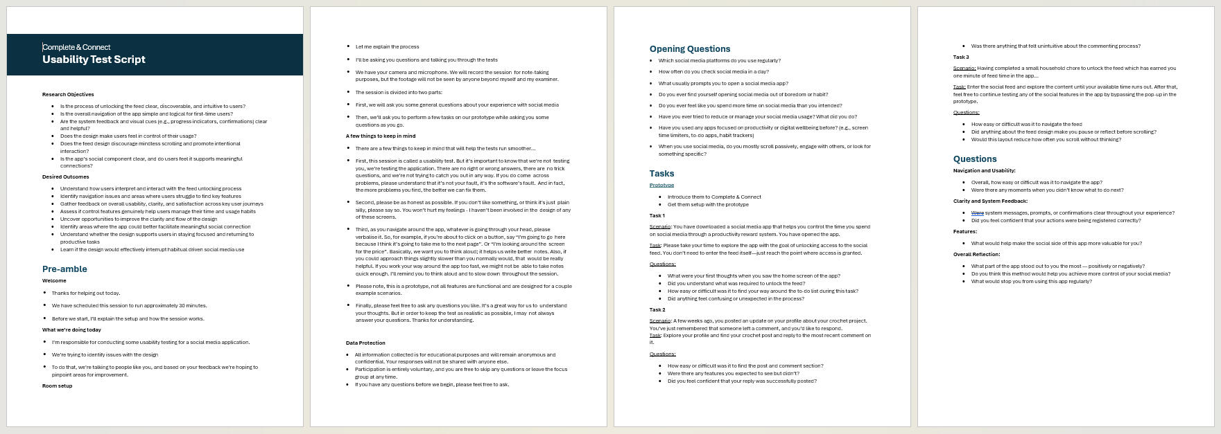
The test consisted of the following stages:1. Introductory questions:
Participants were asked about themselves and their social media usage, focusing on relevance to the target demographic. This ensured participant validity and contextualised their feedback.
2. Task completion:
Each participant was asked to complete three core tasks using the prototype. During this process, they were encouraged to think aloud, explaining their thoughts and actions while I observed their behaviour, interaction paths, and any pain points.
3. Post-test interview:
Finally, participants were asked follow-up questions about their experience. This stage allowed for deeper reflection on observed behaviours and further insights into how effectively the prototype met the design goals and user requirements identified earlier in the process.To conduct the usability testing, I selected three participants who aligned closely with the target audience defined earlier in the project. The testing took place in the week of 23rd June 2025. Two of the sessions were conducted remotely via video calling software, while one was carried out in person. All sessions were recorded with participants' informed consent, and detailed observational notes were taken throughout.
Results
Testing provided detailed results that highlighted areas where the prototype performed well, where it fell short, and how effectively it met the requirements set out earlier in the project.Positives:• Navigation and system feedback were clear and intuitive.
• Users understood and engaged with the concept of earning social time through task completion.
• The app encouraged intentional use, mindful scrolling, and productivity-focused behaviour.
• Core features like the to-do list, commenting, and social feed were easy to use and visually appealing.
• Time-limited access and minimalistic design supported focus and reduced stress.Areas for Improvement:
• Clarify task-to-reward and feed unlocking instructions.
• Simplify task and navigation flows (e.g., fewer taps, easier access to to-do list and user posts).
• Improve visibility and responsiveness of key elements (e.g., pop-ups, timers, reply buttons).
• Adjust labels and layouts to reduce confusion and enhance usability.Overall, testing confirmed the prototype’s concept while highlighting targeted refinements to improve clarity, efficiency, and user control.
Requirements Analysis
Requirement 1: Give users control:
Users understood that completing tasks earned feed access. Features like the countdown timer and end-of-time notifications supported awareness and self-regulation, effectively promoting control over usage.Requirement 2: Encourage productivity:
The task-reward structure and accessible to-do list motivated users, with feedback describing it as rewarding and “gamified.” The app’s purpose-driven design reinforced productive behaviour.Requirement 3: Encourage intentional engagement
Limited-time feed access, task prerequisites, and a clean layout reduced mindless scrolling. Smooth transitions and focused design supported deliberate, mindful interactions.Requirement 4: Discourage addictive behaviours
Time limits and structured access disrupted habitual checking, promoting mindful scrolling and preventing overstimulation, effectively reducing compulsive use.Requirement 5: Connect people
Commenting and social features were technically smooth and intuitive, but meaningful social connection was limited. The app guides users to interaction, but deeper emotional engagement may require further development.
Conclusion
Overall, the prototype demonstrated that, while it successfully addressed many of the project’s goals, there were also areas for improvement. By applying the solutions identified through analysis to these shortcomings, the project outcome better fulfils its aims to give users greater control over their usage, encourage productivity, support intentional rather than thoughtless engagement, discourage habitual use driven by boredom, and foster genuine social connection. In doing so, it more effectively meets the aims set out at the start of the project, to help young adults reduce unproductive and addictive social media use, while promoting healthier, more meaningful interaction that supports wellbeing and productivity.
Reflection
Process
Planning
I chose a development project to create a hands-on solution and structured the work into stages with clear goals and deadlines. Refining the project focus and adapting to life events helped make the project more manageable and meaningful.Research
Analysing social media platforms and user behaviours informed the project requirements and guided design decisions. Challenges included limited participant data and multitasking during focus groups, but research provided a solid foundation for the concept.Design
Sketching and wireframing enabled idea generation, concept refinement, and testing of user flows. Focusing on the productivity-first concept clarified interactions and strengthened confidence in visualising the design.Development
Building the interactive prototype in Figma with components, conditional logic, and variables allowed realistic user testing and functional validation. Development took longer than expected but improved technical skills and ensured the prototype met the project goals.Evaluation
Usability testing revealed strengths and areas for improvement, validating how well the design addressed user control, productivity, intentional engagement, habitual use, and social connection. Lessons learned included better preparation for technical challenges and device compatibility in testing.
Personal
Skills Development
My idea generation, sketching, and prototyping skills improved significantly, allowing me to explore multiple concepts before finalising the design. Figma proficiency also increased, alongside practical experience in user research and usability testing. I strengthened my ability to communicate design ideas clearly, both visually and verbally.Problem Solving & Critical Thinking
I learned to adapt quickly to unexpected challenges, revise timelines, and plan contingencies. The project enhanced my ability to make feature-based decisions, reflect on feedback, and iteratively improve designs, fostering more user-focused outcomes.Time & Project Management
Breaking the project into manageable stages and conducting regular progress reviews helped me stay on track, adapt to delays, and balance multiple deadlines effectively.Collaboration & Communication
Running usability tests improved my confidence and communication skills, enabling me to respond in real time and document design decisions clearly.Personal & Professional Growth
The project reinforced my confidence as a UX designer, strengthened resilience under pressure, and improved goal-setting and motivation. Hands-on experience with research, prototyping, and industry-standard tools has prepared me for professional UX work and future growth in complex design environments.
Hope City Church
September 2025
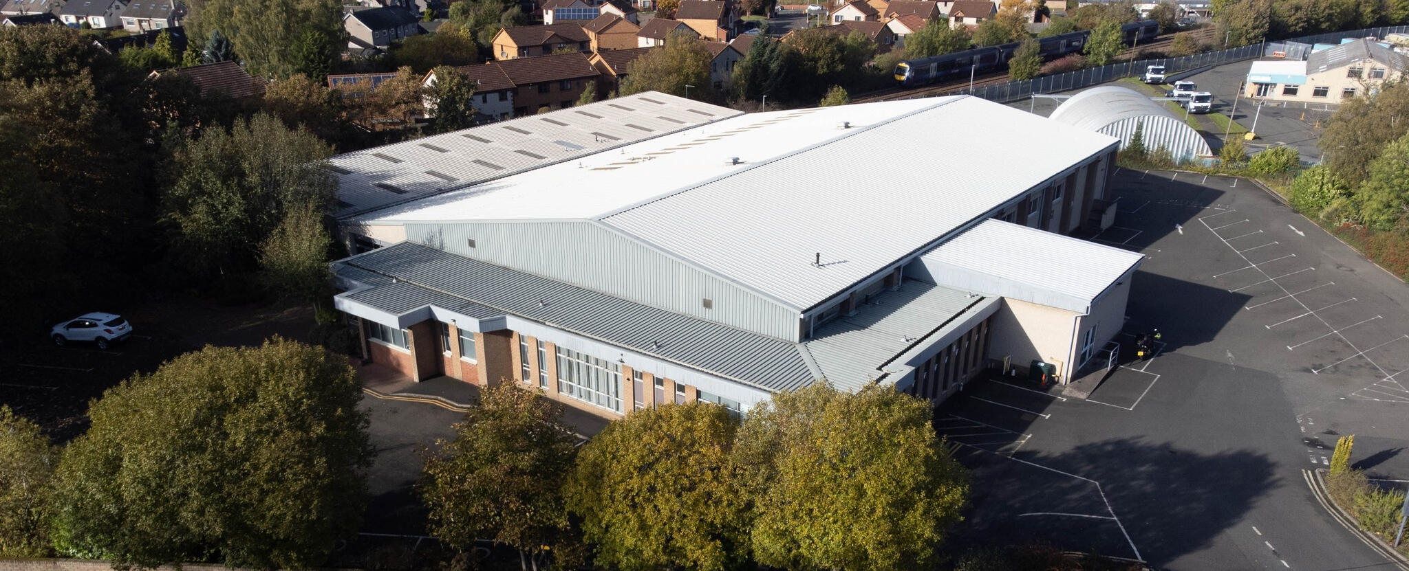
This is a voluntary UX project completed for
Hope City Church Dunfermline
This project focused on improving the venue-hire experience at Hope City Church Dunfermline by analysing user needs, identifying pain points in the booking process, and evaluating how well the current facilities support both internal church activity and external hirers. Rooted in user research and UX principles, the project examined how the church could better serve a wide range of users through clearer processes and more effective use of its spaces.
Problem
The main hall, due to its size and production capacity, has the highest income potential of all church facilities, but currently only receives 2–4 bookings per month. This underuse restricts the venue’s revenue and the financial resources available to the church, limiting its ability to grow and develop.
Goal
To identify cost-effective, short-term improvements to facilities, services, and online presence that meet the needs of both main hall hires and the church, unlocking the hall’s revenue potential and generating sustainable long-term returns that support the church’s growth and future development.
Target Market
The main hall’s core hire market includes corporate events, productions, community events, and educational events, with capacity for up to 500 seated or 800 standing attendees. Due to the secular nature of certain gigs and performances, the church intentionally excludes events that involve alcohol or conflict with the venue’s values. As a result, less consideration is given to hire needs associated with those types of events.
My Design Process
Plan
With a clear target market, this section details the user research conducted, including the methods used and the key insights gathered about the audience’s needs and context.
I chose to use four methods of research to gain a well-rounded understanding of the target market and the services on offer. These were:1. Interviews
2. Customer Journey Mapping
3. Desk research
4. BenchmarkingThis four-way approach strengthens the justification for decision-making, allowing me to draw on insights from multiple sources to support well-informed choices.
Interviews
Purpose: To gather qualitative insights into the current use, opportunities, and challenges of the church facilities.Goal: To better understand the church’s needs, priorities, and aspirations in relation to both congregation growth and facility hires.Execution: I conducted thorough discussions with key stakeholders, including the church pastor and the conference centre manager, focusing on their perspectives on facility use, target markets, event ambitions, and operational challenges. This also included a detailed examination of the facilities on-site, walking through each space together to understand layouts, equipment, and practical limitations firsthand.Key Findings: From the interview with the church Pastor, he highlighted steady congregational growth and a need for facilities that better support larger gatherings. With upgrades, the main hall could operate as a high-capacity venue for both church and community use, aligning with the church’s mission. Leadership also expressed interest in hosting well-known Christian performers to strengthen the church’s identity as a hub for worship and outreach. Financial sustainability remains a key challenge, with venue hire viewed as the primary way to generate income that can be reinvested into long-term improvements.The conference manager outlined in his interview that the main hall can host 100-500 seated attendees (up to 800 standing) and is suited to concerts, productions, conferences, cultural events, and educational functions. Events involving alcohol or conflicting with church values are excluded, narrowing but clarifying the target market, which centres on corporate, production, community, and educational hires. Recent clients often supplemented or replaced the in-house sound system, which lacks the power and distribution needed for the room. Parking was also identified as a major constraint, with only 80 spaces available and limited potential for expansion.
Customer Journey Mapping
Purpose: This method was used to analyse the hire process from the customer’s perspective, helping to identify gaps and opportunities for improvement. The analysis focused on:
• Online communication – how the website presents the service to customers
• Facilities – how customers experience the spaces and their suitability
• Services offered – the support and resources available to customersGoal: To identify unmet needs and pain points in the services provided.Execution: I mapped out the key steps of the customer hiring journey, from initial research and discovery through to the event set down. At each stage of the process, I identified the customers goals, expectations, positives, pain points.Key Findings:
| Discover | Evaluate | Contact | Book | Event | |
|---|---|---|---|---|---|
| Goals | Identify an option that fits budget for their event Determine if the venue suits their event by understanding technical and practical capabilities Have their questions answered | Confirm availability | Secure a booking | Finalise price & deposit | Prepare the hall. Everything to run smoothly. Fast turnover |
| Expectations | Clear accessible information. High-level overview of capacities, facilities, available services | Detailed specs of room. Photos, virtual tours, floor plans. | Quick responsive communication. Knowledgeable and friendly staff | Transparent pricing, simple booking process, standard registration | Staff support. Flexibility in setup. Easy access. Safe. |
| Positives | Easily navigable website for facilities. Clear outline of facilities on home page. | Plenty specs available already | Easily discoverable contact. | Fast responses in multiple forms of contact, transparent pricing & communication. | Clear booking process communicated Easy access, flexibility with tables. Good access times. |
| Pain Points | No images on list view of facilities, just dimensions to estimate room size. Unclear capacity (seated / standing). | Key specs like technical equipment missing. Lack of high-quality media showing the room at its best (audio & video). | Sometimes difficult to find correct person if visiting in-person. | Booking form is unnecessarily detailed as a first contact booking. Very specific details required. | Little flexibility in lighting / room ambience. Insufficient technical gear. |
Desk Research
Purpose: Desk research allowed me to explore a wide range of existing sources to better understand the target market. This approach was essential because direct access to this group was limited, making methods involving direct customer contact difficult.Goal: To further understand the target market and their hiring needs.Execution: I conducted desk research by reviewing a variety of resources as well as analysing the existing clientele of the church.Key Findings:
• Conferences with 101–200 delegates represent around 10–12% of the UK market; events with 201–500 delegates make up around 4–6%.
• UK venue categories range from small (<350 capacity) to arenas (up to 20,000).
• Sound quality is a top priority for production hires, including acoustics and reliable equipment.
• Lighting significantly shapes ambience and creates immersive experiences.
• Venue size influences atmosphere, from intimate small events to large-scale performances.
• Comfort, accessibility, seating, parking, and transport links strongly affect hire decisions.
• Catering and refreshments enhance events, though lack of alcohol service may limit appeal for certain gigs.
• Reliable technical equipment and clear setups are essential for smooth events.
• Flexibility in room layout, lighting, and sound is highly valued.
• Venue reputation and reviews often influence final booking decisions.
Competitive Benchmarking
Purpose: The purpose of competitive benchmarking was to compare the venue’s facilities and services with those of similar or competing venues, to uncover best practices and opportunities for improvement that better meet the target market’s needs.Goal: To identify how other venues meet the needs of the target market.Execution: I reviewed two semi-comparable venues, evaluating their strengths, weaknesses, and unique features to understand how they meet the needs of the target market.Key Findings:
| Venue | How do they meet customer needs? | What do they do right? | What do they do wrong? |
|---|---|---|---|
| Life Centre Events – Bradford | A blank canvas venue with modern staging capabilities, including an LED screen and flexible lighting. Access to any tables & chairs for various events. | Immediate overview of site, very professional and encapsulating. They show the space setup in multiple different ways. They detail practical features like 10 x 13amp sockets, 3ph mains socket. They clearly show catering options (very important for some hires). | Forced contact for price and more detailed audio specs. By forcing them to contact, they have to wait for a response and can be finding alternative venues in that time to compare. Low quality social media content |
| C7 Conference Centre - Glasgow | Providing full audio & visual equipment. | Showing multiple hire combos. They show a full venue drone overview. CTA buttons for arranging a viewing or booking | Outdated website. Their booking CTA’s lead all over the place |
| Beacon Arts Centre - Greenock | Full tech including PA setup, types of speakers. | Detailed PDF of all individual room hires. Map showing entrance & access points. | Slow website. Not many images available |
User Context
This section outlines the goals, behaviours, and context of both the church and external hires, as identified through user research.Church: The church aims to deliver high-quality worship services, accommodate a growing congregation, and host large Christian events that support spiritual growth and outreach. To achieve this, they regularly reconfigure the main hall for different service types, operate sound and visual systems in multiple formats, livestream and record key gatherings, and adjust lighting to suit everything from youth events to sermons. All of this operates within the broader context of supporting the church’s mission of fostering spiritual growth, community, and fellowship.Hires: Hirers are looking for a venue that suits their event type, audience size, and budget while delivering a smooth, professional experience and good value for money. They typically compare multiple venues before booking, configure the hall to match their event needs, and rely on staging, lighting, and AV to create the right atmosphere. During the event, they depend on staff support for setup, technical assistance, and efficient turnaround times, while making use of breakout spaces for catering, networking, or receptions. Their overall context is straightforward: they are there to run their own conferences, concerts, or community gatherings as effectively as possible.
Requirements
This section outlines the main hall’s requirements based on the goals, behaviours, and context of both the church and external hires. The requirements cover both the service and functional offerings of the space as well as the experience of using it.Based on the context of the church and external hirers, the main hall is required to provide:
1. High-quality sound and visual systems suitable for Sunday services, Christian performances, community events, and a variety of hired events.
2. Adaptable layouts, staging, lighting, and ambience to allow versatile setups for different types of services and events.
3. Appropriate space and seating for events up to 500 attendees, with additional breakout and foyer areas for gatherings, networking, and smaller group activities.
4. Full accessibility for all attendees, performers, organisers, and staff including parking and building access.
5. Dependable staff to provide assistance and technical support during services and events.
6. Catering support for external hires, including in-house options and the ability to accommodate external providers.
7. Transparent pricing and good value to support confident bookings.
Key Problems
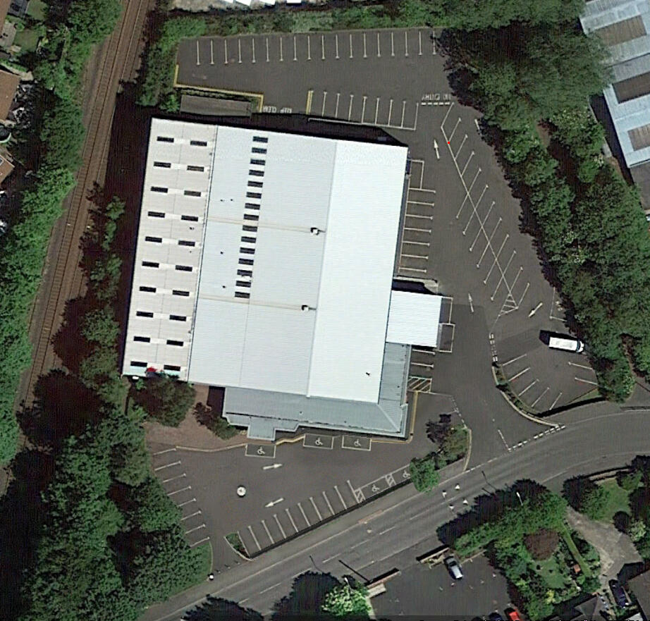
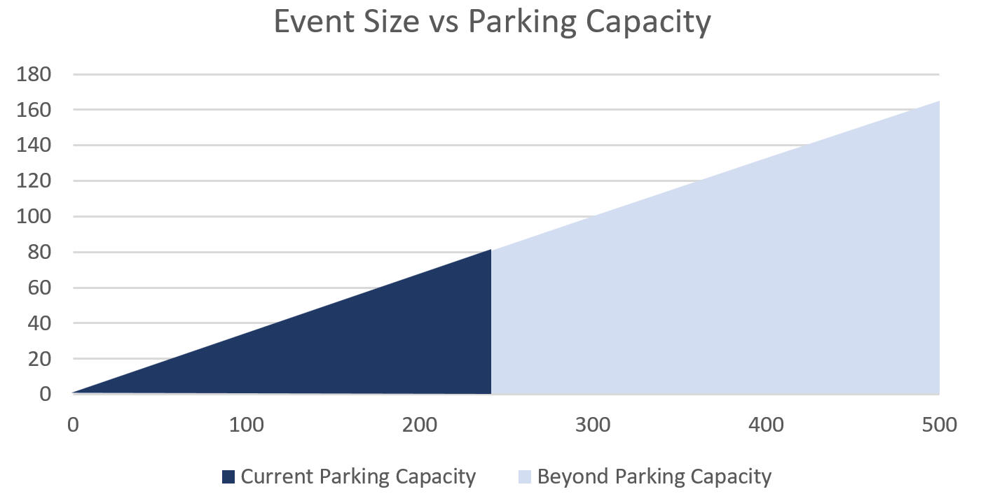
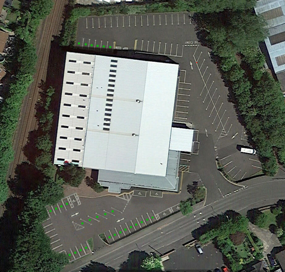
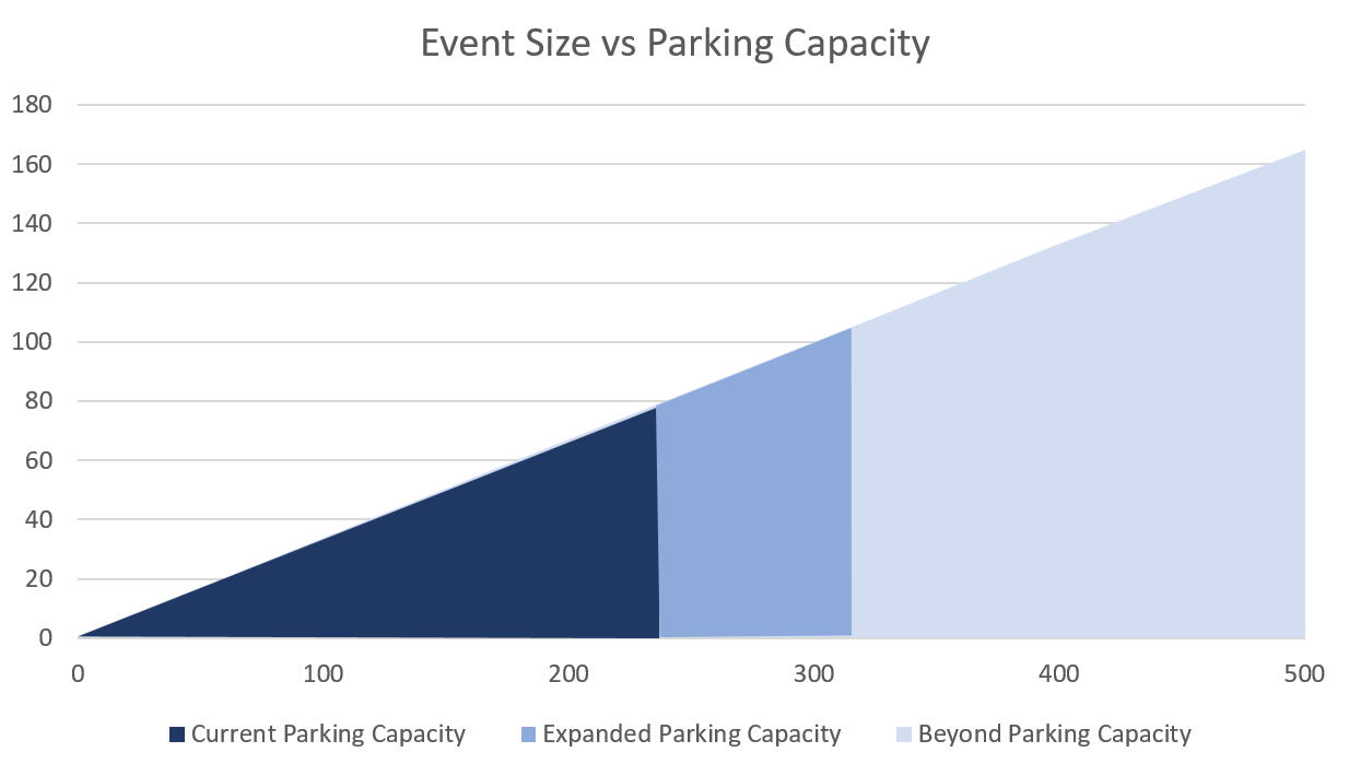
1. Practicality: The venue has only 80 parking spaces, with no nearby public car parks and limited on-street options due to recent restrictions. As illustrated in the graph below, this limits the main hall’s practical capacity to around 240 attendees (assuming 3 people per car), well below its 500-person design. Sunday services already reach capacity, often requiring attendants to close entry, highlighting the ongoing strain on parking for larger events.
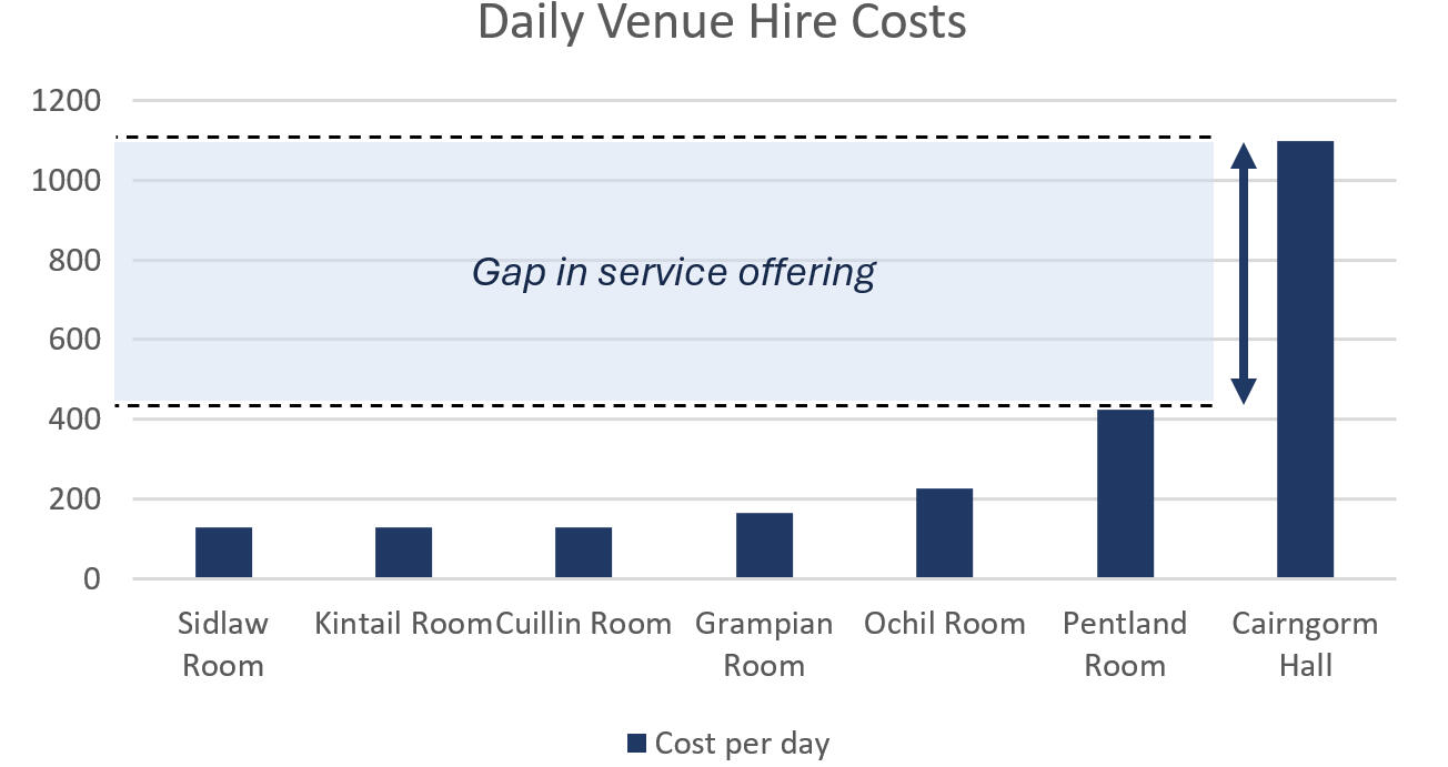
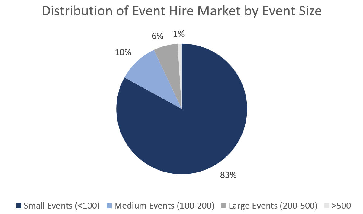
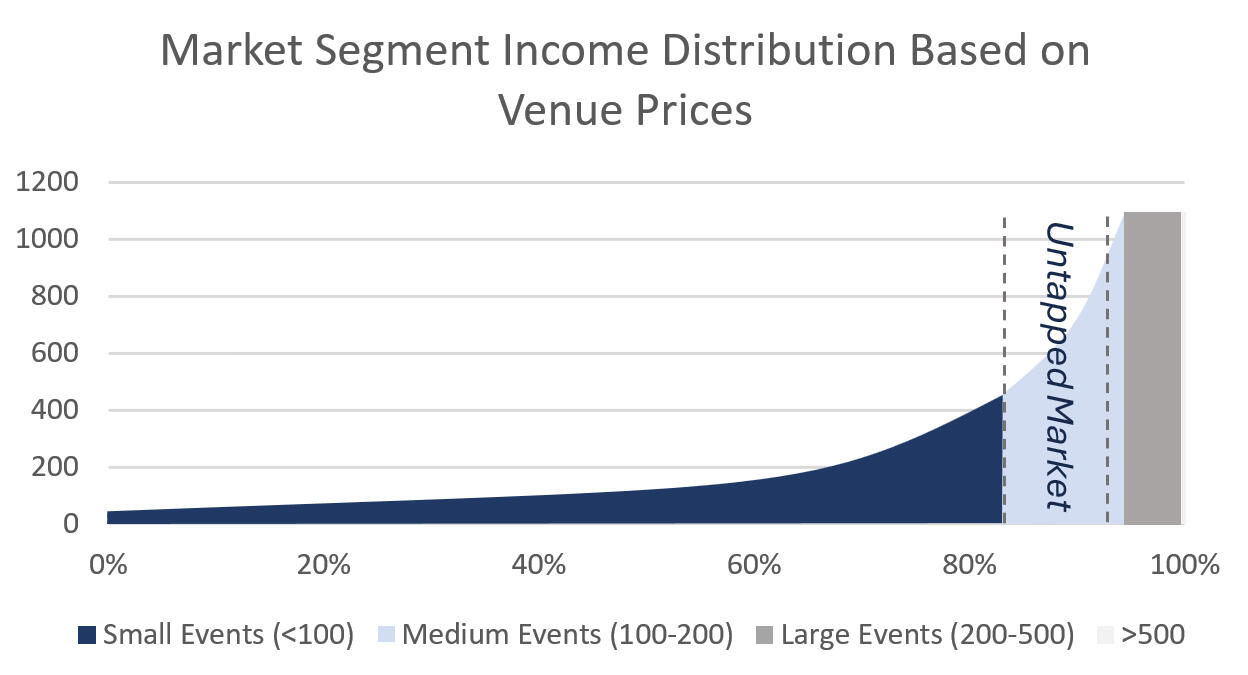
2. Size: Research shows that venue size, cost, and accessibility are critical considerations for event planners. Performance hires in particular value smaller, more intimate settings where the atmosphere feels engaging. The venue currently serves most small events (<100 attendees) and a small portion of large events (200–500 attendees), but misses the mid-sized segment (100–200 attendees).While the main hall is technically suited to large events, limited parking and accessibility make hosting audiences above 200 difficult. Conversely, events closer to 100-200 attendees find the hall too large and costly, creating a mismatch between space, price, and practical needs. Market distribution graphs illustrate this gap in hire size, and income analysis shows that up to 20% of potential revenue lies within the untapped mid-sized segment, highlighting a significant opportunity currently being missed.
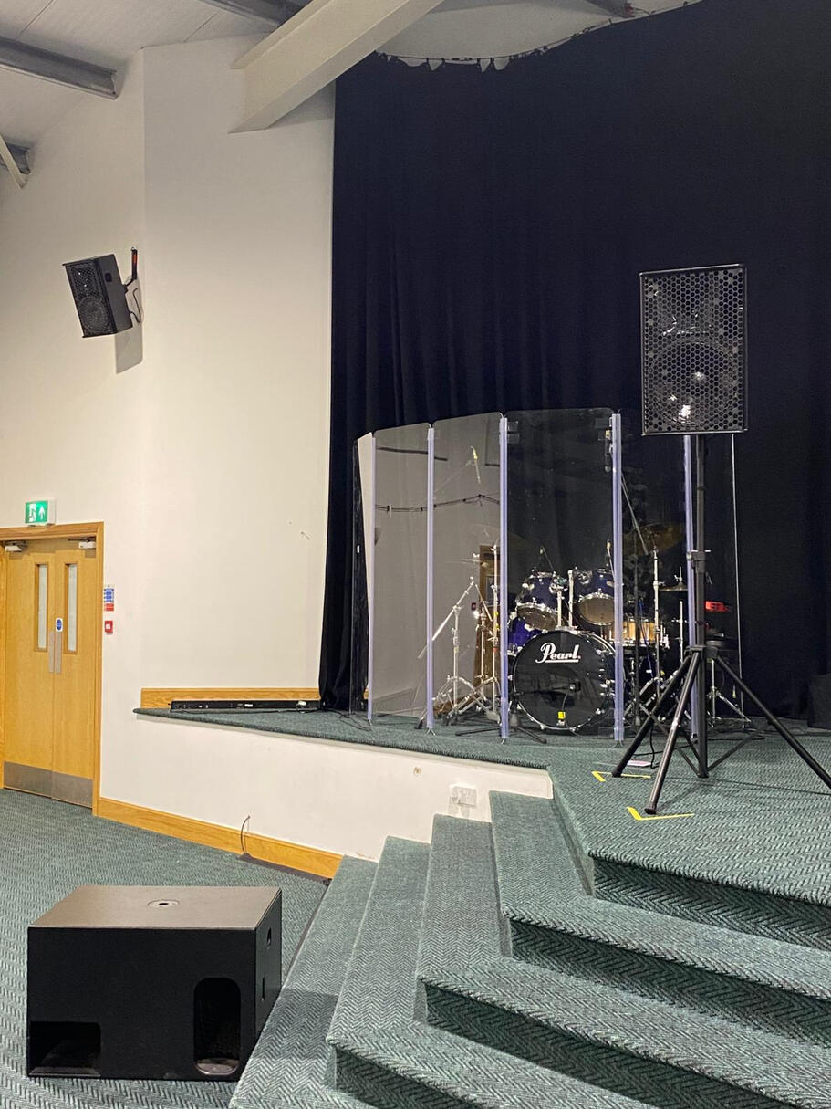
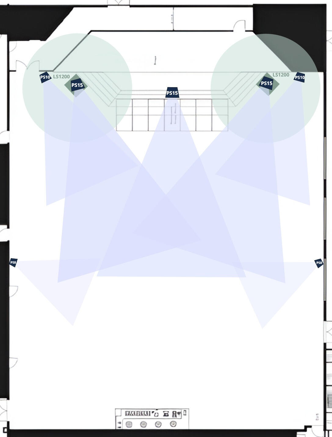
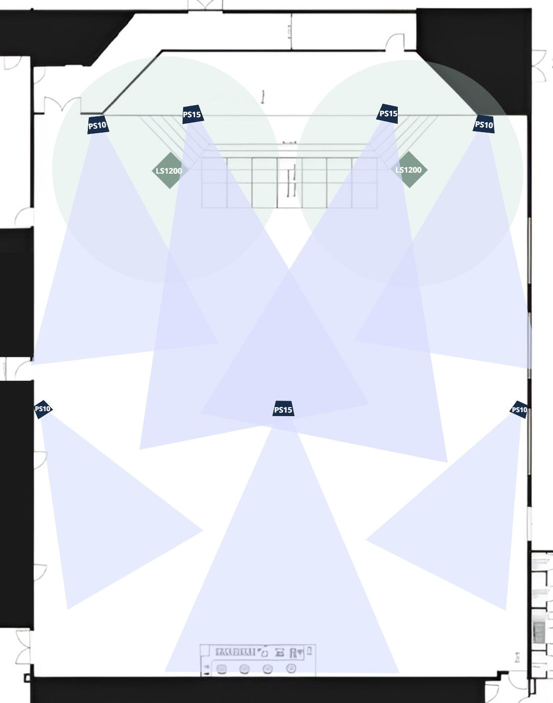
3. Sound: The main hall’s current PA (as represented in the image below), comprising aged Nexo speakers and subwoofers, presents two key limitations. First, bass headroom is insufficient, subwoofers frequently peak during services, limiting volume flexibility and risking damage due to their age. Second, volume coverage is uneven, leaving back and side areas underpowered and reducing clarity for attendees.These issues affect both church services and external hires: poor sound impacts attendee experience, diminishes the hall’s reputation, and forces some hires to bring additional equipment. A reliable, high-quality audio system would better support full-capacity events, improve sound consistency, and increase the venue’s appeal to potential clients.
4. Online Representation: The venue currently presents its services and facilities online in a limited and unprofessional way, with low-quality media and insufficient detail on the hall’s capabilities and versatile setups. Since hires often form first impressions based on online information, this weak presentation fails to convey the hall’s suitability, reducing confidence and potentially driving clients to competitors with clearer, more engaging marketing.
Design Propositions
1. Expand Parking Capacity
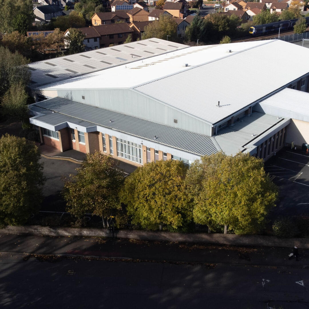
This proposition involves adding 27 new parking spaces by utilising the property’s remaining unused land and removing the old, deteriorating deck. To optimise space, I prototyped multiple road and layout configurations to maximise the number of spaces while maintaining safe access and circulation.The venue’s current 80 spaces restrict practical event size and limit the hall’s capacity, while Sunday services already push parking to full capacity. Increasing total spaces to 107 raises the practical event capacity to around 320 attendees, making medium-to-large bookings more feasible and reducing parking pressure during church activities, enhancing the venue’s overall practicality and appeal.
2. Main Hall Divider / Tiered Pricing
To address the gap for mid-sized hires (100–200 attendees), I proposed installing a black curtain to divide the main hall into a 60/40 split as seen in the mockup below. This idea came from analysing event sizes, pricing, and the hall’s underutilisation for mid-sized bookings. Cycling through different ideas showed that a movable divider could be the best solution to creating a smaller, cost-effective section while maintaining full stage, AV, and production capabilities. The expected cost for this would be around £8,000 based on market research.
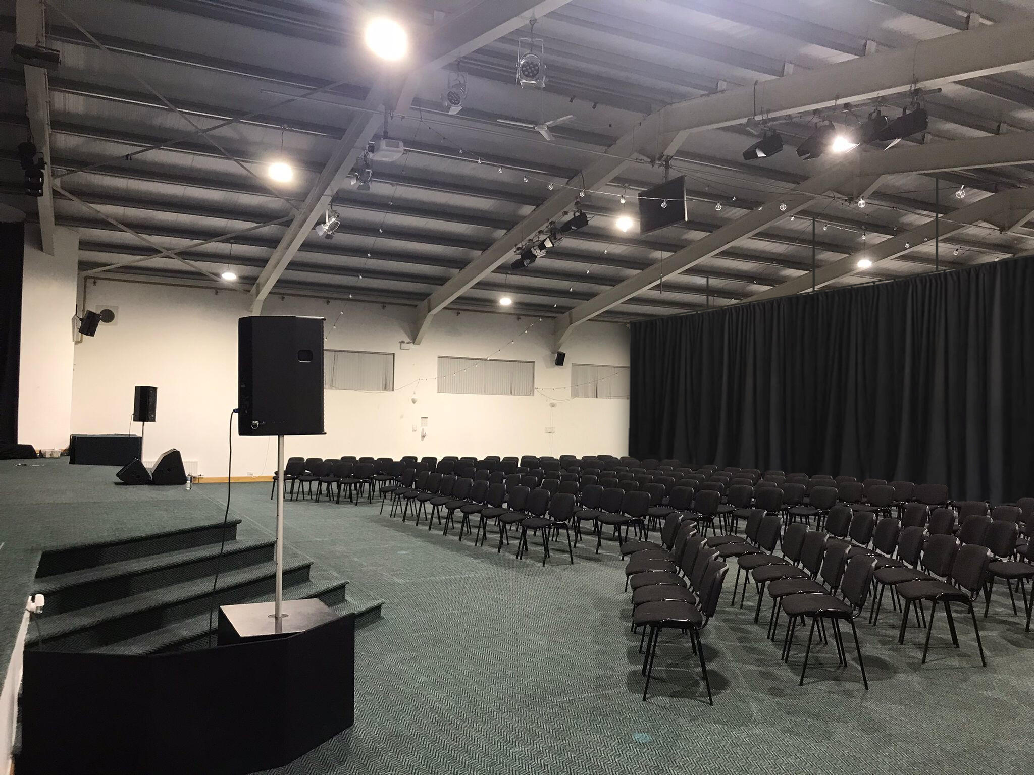
Offering a 2/3 section at a lower, relevant price provides an appropriately scaled space for mid-sized hires, filling the market gap without sacrificing functionality for full-hall eventConservative projections based on past hire income show this approach could nearly double total income, capturing untapped mid-sized hires while retaining full-hall bookings.To keep projections cautious, four conservative assumptions have been applied:1. It assumes the venue already captures the upper end of the estimated market share for large hires (6% out of the 4–6% range), making it harder to project additional growth, despite the parking limitations that restricts events above 200 attendees.
2. It assumes the missing market share for mid-sized hires is at the lower end of the 10–12% estimate, using 10% rather than the higher figure.
3. It assumes 20% of existing hire income already comes from the mid-sized market using the full facility, so the entire 10% potential is not treated as untapped.
4. It assumes a small portion of potential hires may not happen due to busier schedules. Around 5% of projected hires are expected not to take place because of possible scheduling overlaps.
5. It does not account for events that are near full capacity of the Pentland Room (70-100 attendees) who may opt to book a 2/3 portion of the main hall for additional space
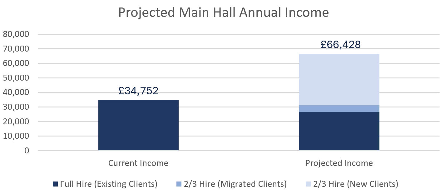
The divider offers greater flexibility for full-hall hires, allowing semi-split layouts to suit different event types. The rear 1/3 of the hall can function as an additional hireable space or a dedicated catering area, maximising revenue potential. Smaller hires benefit from improved acoustics, while the controlled division provides a more effective method of restricting access to unused areas. This solution also adapts well to smaller church events, ensuring the space can be scaled appropriately without compromising functionality.Fire safety must be ensured through fire-retardant curtain materials and clear marking of emergency exits. AV setup may require wireless HDMI and audio extenders to manage the divided layout effectively, and stage blocks may need repositioning to optimise space usage. Signage and physical barriers should guide attendees around restricted areas, maintaining both safety and a smooth flow of movement during events.3. Reconfigure PA System
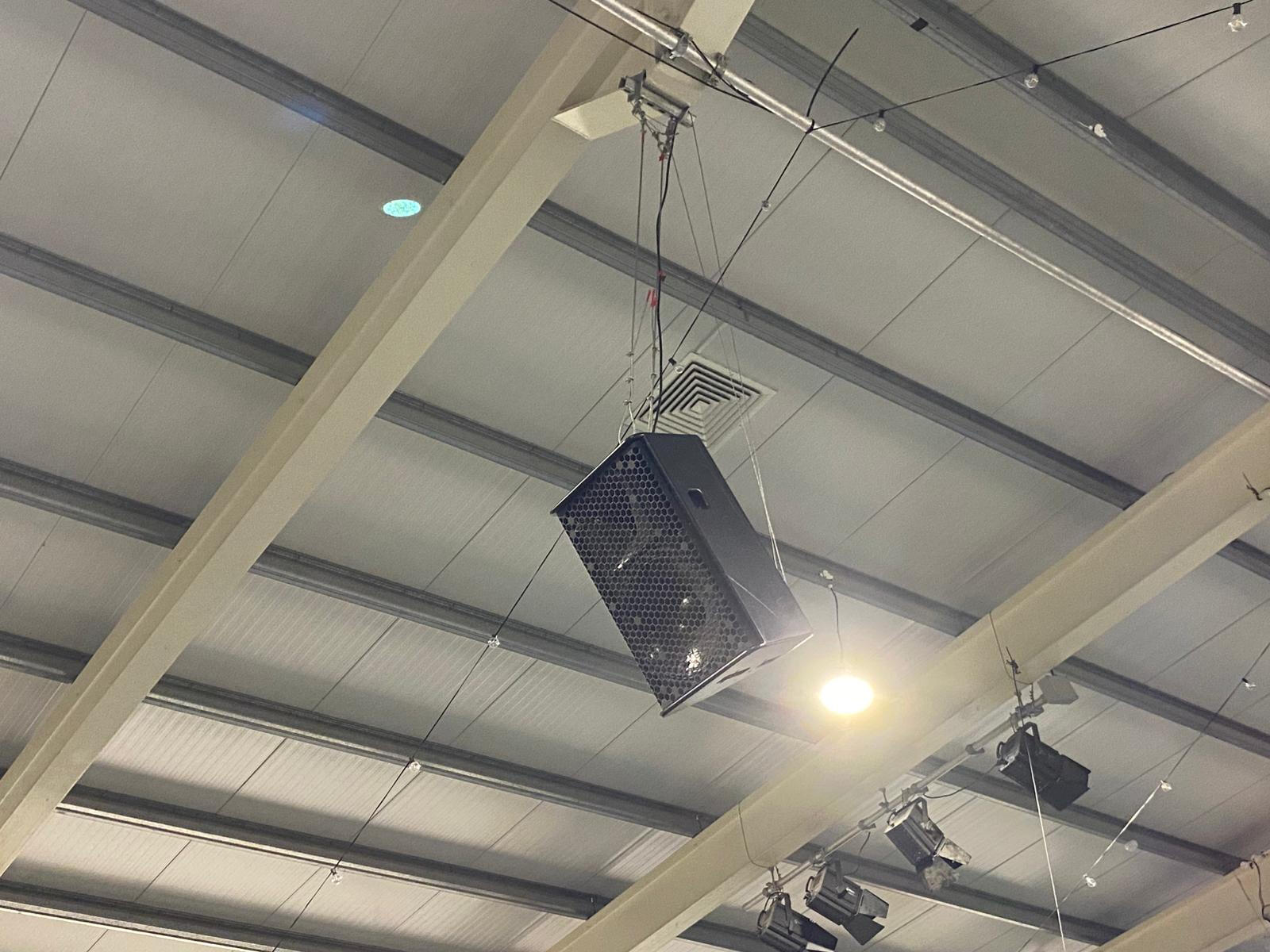
To optimise the main hall’s sound system, I proposed repositioning the existing speakers and upgrading key components. The PS8s at the rear would be rotated toward the back, the subs moved closer to the centre, the wide PS15s raised and angled slightly downward toward the congregation, and the central PS15 hung from the roof further down the hall, acting as a delay speaker to improve rear coverage. Additionally, the PS8s would be replaced with PS10s, and the LS1200 subs swapped for more powerful L18 subs, using existing amplification. These changes would cost approximately £4,000 and is visualised in the image below.Drawing on my background in audio technology, I applied knowledge of speaker placement, acoustics, and frequency distribution to ensure the adjustments would increase bass headroom, achieve balanced volume across the hall, and improve overall clarity. These changes provide a cost-effective, minimally disruptive solution that boosts rear fill, strengthens low-end response, and allows the system to support higher volume levels for both church services and hires, meeting practical requirements for coverage, clarity, and reliability.
4. Enhance Online Representation
To improve visibility and attractiveness to potential hires, I proposed restructuring the website to clearly convey all relevant information about the venue. This includes detailed specifications for each space, immersive guides, and practical visitor information such as parking, accessibility, transport links, and nearby accommodation.Professional photos and videos, covering full-capacity setups, partitioned configurations, and varied lighting, showcase the hall’s versatility, while a highlight video provides an engaging walkthrough to help users visualise the space. Listings on key third-party platforms further increase discoverability. These improvements address the current problem of low-quality, incomplete online media by demonstrating the venue’s capabilities, presenting information effectively, and encouraging bookings.
Implementation
1. Expand Parking Capacity
Plans for increasing parking by adding additional spaces on the property are scheduled for future implementation. Expansion requires careful planning and prioritisation alongside other financial commitments, so it will be addressed once resources allow.2. Main Hall Divider / Tiered Pricing
The installation of a movable curtain to create a 2/3 section of the main hall is planned for 2026. This timeline allows for preparation, compliance with safety considerations, and coordination with AV and staging requirements to ensure a smooth rollout.3. Reconfigure PA System
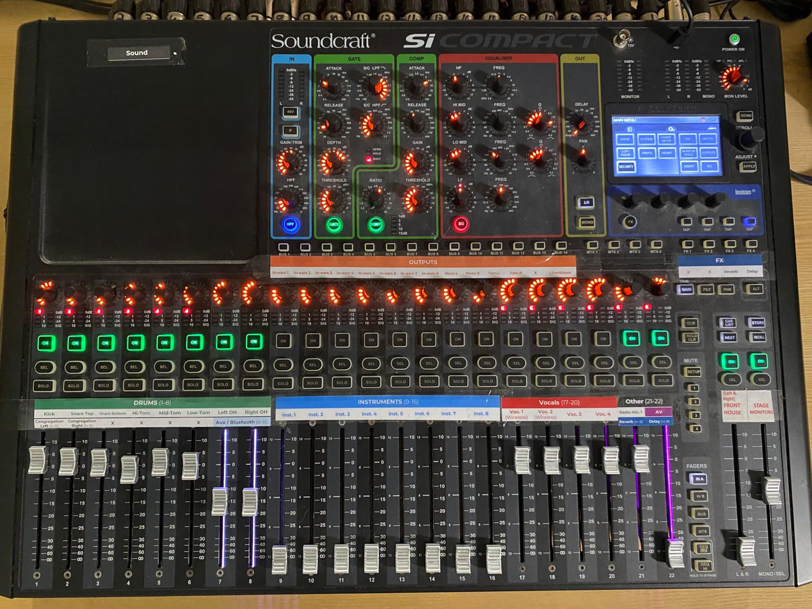
The PA system has been fully reconfigured, including repositioning existing speakers, upgrading rear fills, and swapping subs to improve bass headroom and achieve balanced coverage. Additionally, the stage and mixing desk have been redesigned for better usability, providing hires with an intuitive setup while maintaining high-quality audio performance.The implementation of the PA system upgrades has received highly positive feedback. Congregation members from the church have reported a significant improvement in sound clarity and atmosphere throughout the hall, making it easier to hear sermons and worship music from all seating areas. Overall, the changes have had a noticeable impact on both user experience and the perceived professionalism of the venue.

Repositioning of PA speakers

Improved usability and setup of sound desk

Rear delay speaker installed
4. Enhance Online Representation
A complete redesign of the venue’s website has been carried out, with professional photos and videos captured to showcase all spaces, layouts, and lighting options. Content has been structured to clearly convey specifications, visitor information, and versatility, aligning with the target market’s needs and context. The improved online presence ensures potential hires can easily understand the venue’s capabilities and make informed booking decisions.
Reflection
Project Overview
This project has been a significant growth experience for me as a UX designer. It challenged me to apply research methods in a practical, real-world context, balancing the needs of multiple stakeholders, from the church leadership to a diverse range of potential hires. Conducting interviews, observing how spaces were used, and walking through the facilities provided invaluable insight into user behaviours, needs, and constraints, deepening my understanding of context-driven design.Design Process
Working on solutions such as the room divider, PA reconfiguration, lighting upgrades, parking expansion proposals, and website redesign allowed me to translate research into tangible design interventions, strengthening my skills in ideation, prototyping, and solution validation. Being involved in the implementation phase, seeing changes like the website go live and the PA system reconfigured, reinforced the impact of UX beyond wireframes and mockups, highlighting the importance of user-centred thinking in delivering practical improvements.Challenges
This project also expanded my ability to consider multiple user groups simultaneously, designing for both the church’s mission and the practical needs of hires, which required balancing often competing requirements. It reinforced the value of thorough research, iterative design, and clear communication, as well as practical constraints such as budgets, regulations, and real-world feasibility.Future
Going forward, I’ve gained a deeper appreciation for the interplay between UX design, technical systems, and operational realities, and I feel better equipped to handle complex projects with diverse stakeholders.
Ships 'n' Sharks
January 2024

Project Summary
Sharks ’n’ Ships is a personal Unity project created for fun and experimentation. In this project, I explored elements such as local multiplayer, water effects, and player physics to test different gameplay interactions and mechanics. The concept revolves around a tag-style chase between sharks and ships, designed to bring a mix of excitement and variety to the experience.What I Learned
This project allowed me to explore and test gameplay mechanics, multiplayer interaction, and physics in a hands-on way. I deepened my understanding of game design, interaction design, and programming, while gaining confidence in experimenting with new ideas and iterating quickly to see their impact on player experience.

Creating reverse particles
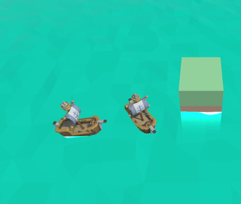
Testing multiplayer boat controls

Experimenting with shoreline graphics

Trying out a 'bath-time' theme

Fire the cannons!

Cannonball splash effects

Full speed ahead!
Headbangers
February 2024
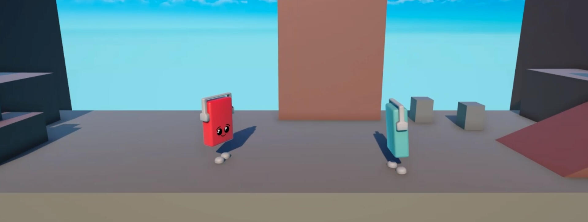
Project Summary
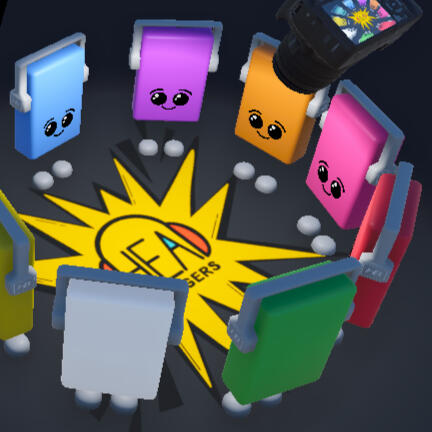
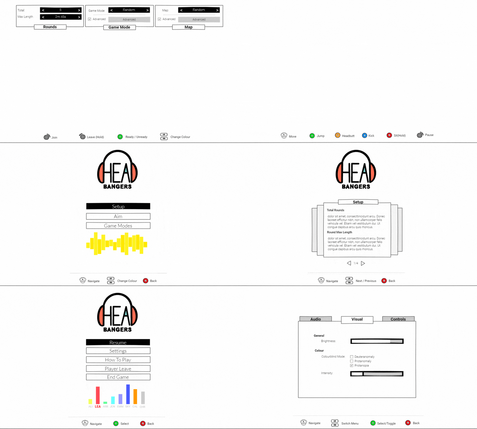
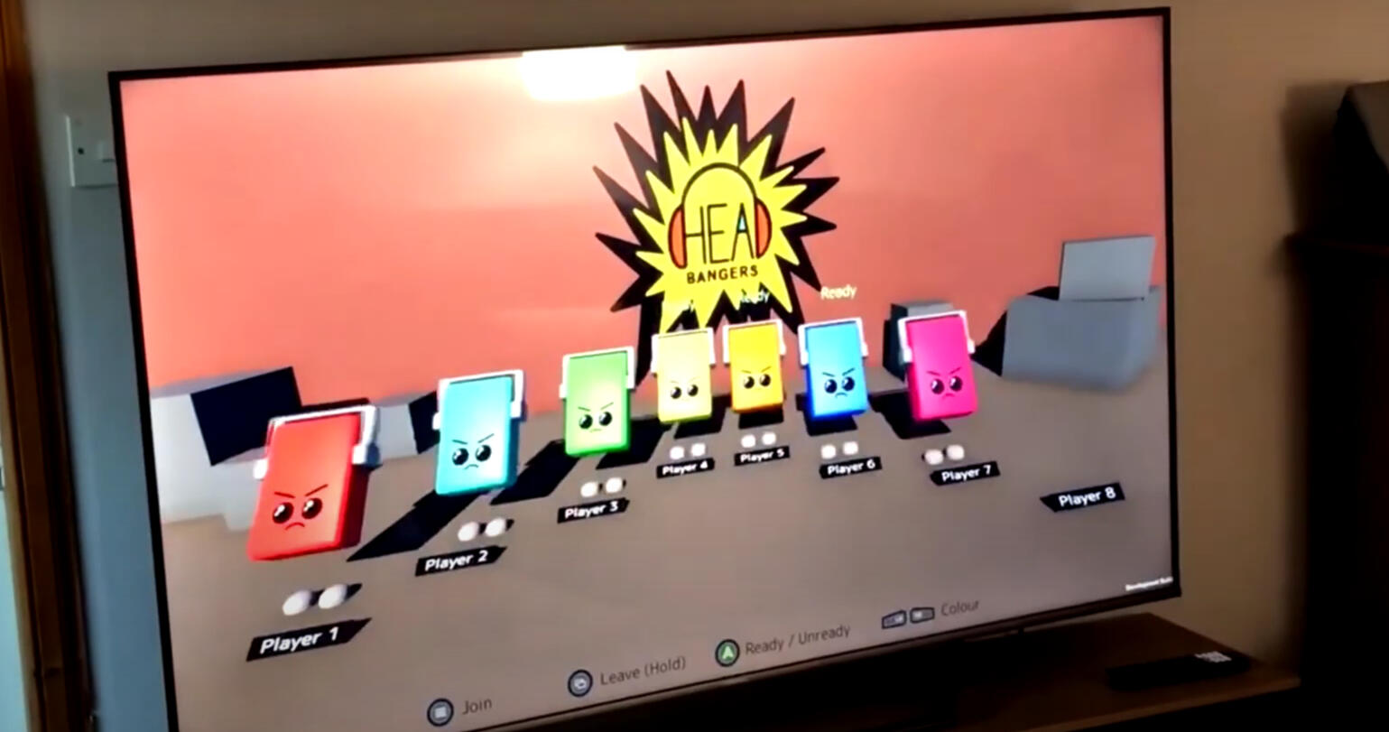
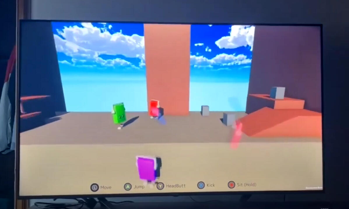
Headbangers is a multiplayer party game developed in collaboration with my brother, designed specifically for console platforms. The game features a light-hearted, brawl-style PvP concept with a musical twist. Players perform rhythmic headbanging actions that serve both as attacks and as a fun way to move in time with the beat. Alongside gameplay development, I focused on the UI and screen design to create clear, engaging, and visually cohesive player interfaces suited for console play.What I Learned
This project taught me how to design for multiplayer experiences and console platforms, balancing gameplay mechanics with clear, engaging UI. I gained experience integrating visual design into a rhythm-based, interactive system, and learned how to create interfaces that support player understanding and enjoyment in fast-paced, social gameplay.

The first UI design iteration
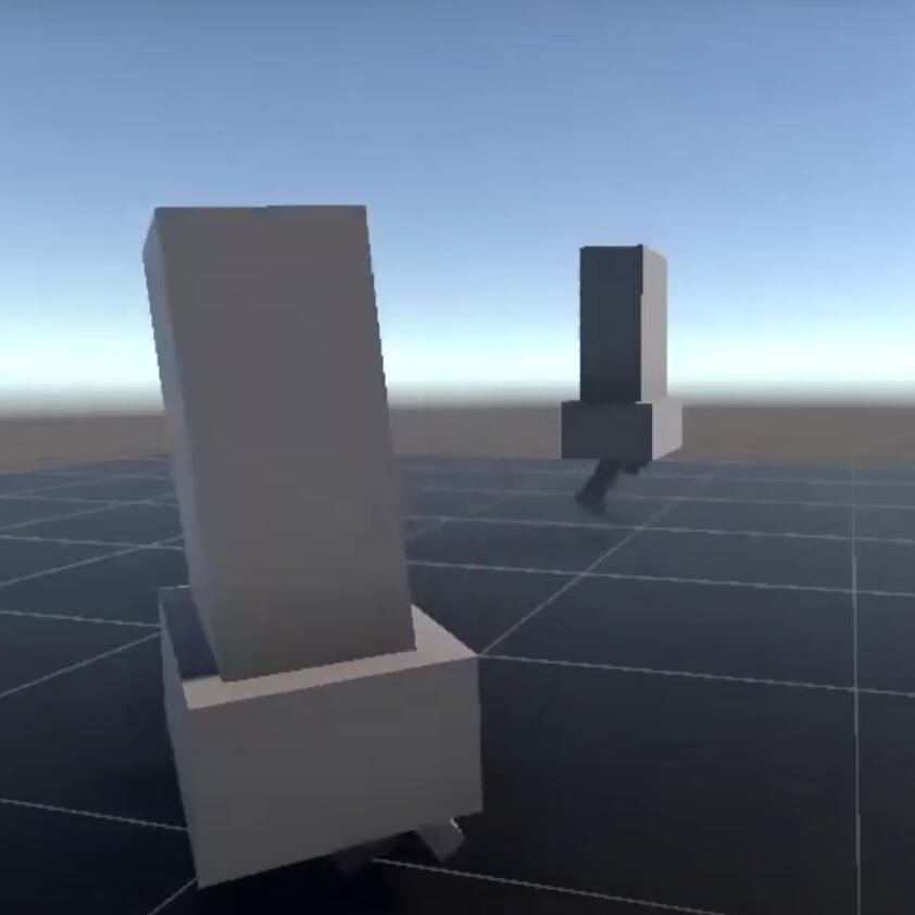
Assembling the character
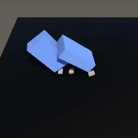
Testing collisions
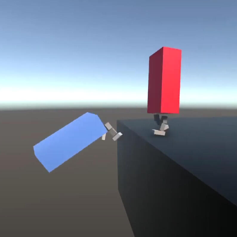
KO
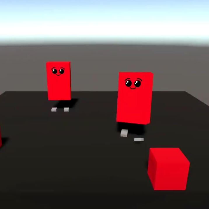
Experimenting with the face...
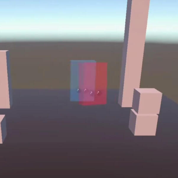
Adding the ghost mechanic upon death
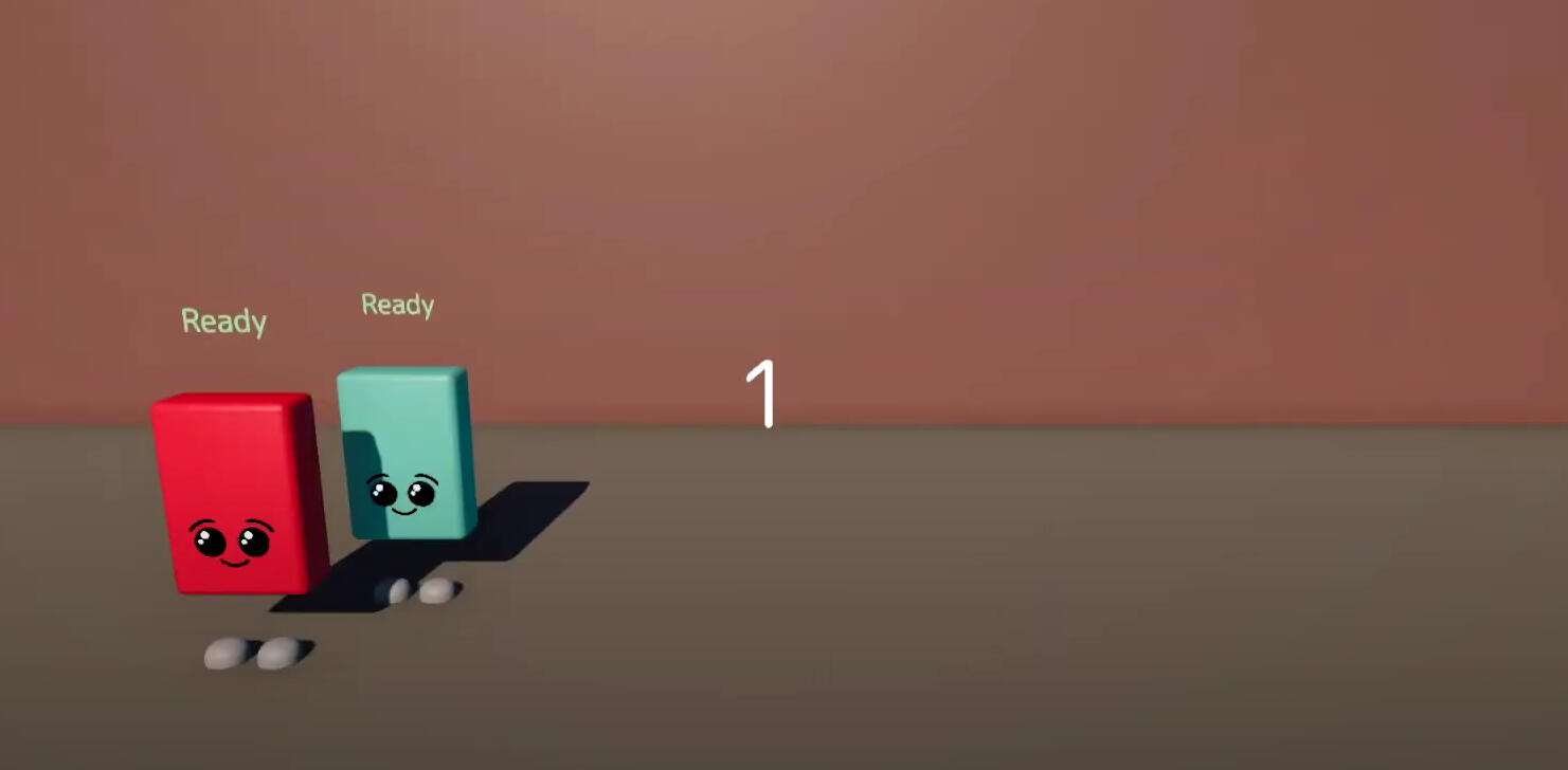
Creating the lobby

First test on Xbox!

Testing the gameplay with 6 players
Peak Flow Simulator
October 2023

Project Summary
The Peak Flow Simulator is a prototype I developed to help children practise deep breathing in a playful, interactive way. It was designed for situations such as medical procedures, where calm, controlled breathing is important.By turning the act of deep inhalation into a simple and enjoyable experience, the prototype aimed to help children build confidence and familiarity with medical breathing exercises in a supportive, game-like context.What I Learned
This project taught me how interaction design must adapt to different user groups, particularly children. I learned to prioritise accessibility, clarity, and engaging feedback, and gained insight into designing playful, supportive experiences that help users build confidence while performing important real-world tasks.

Adding controls to simulate a breathing value

Adding a trail to represent the breathing pattern

Adding a tail and eye to the fish

Bubbles to represent exhaling

Air particles to represent inhaling

Water collisions and splashes

Just keep swimming...
Flumble
Oct 2021

Project Summary
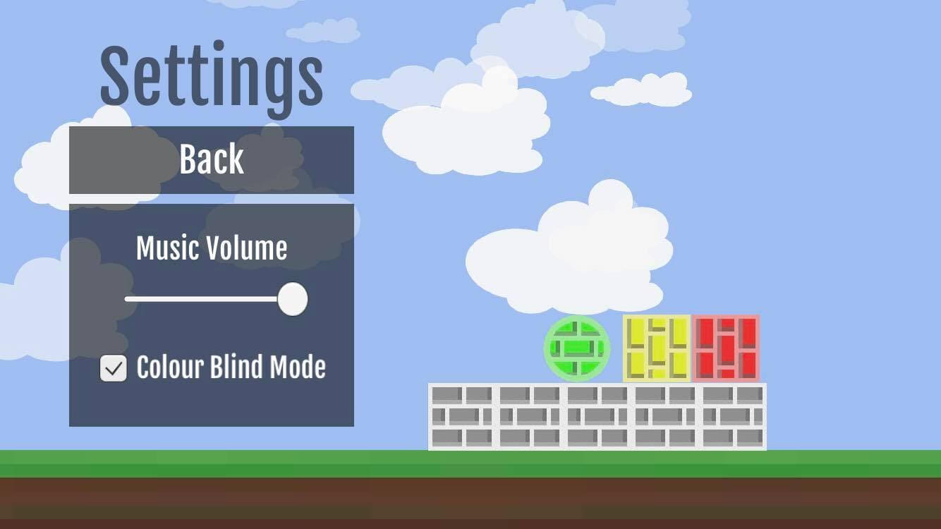
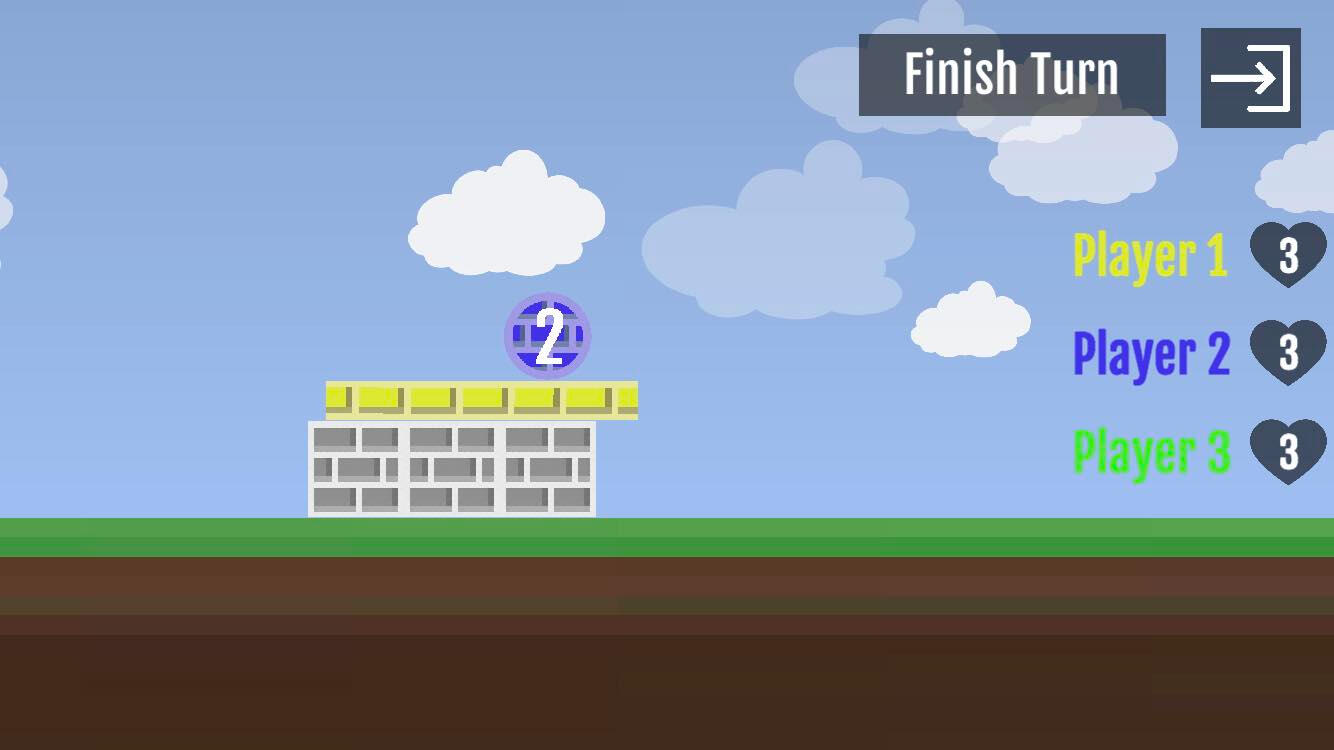
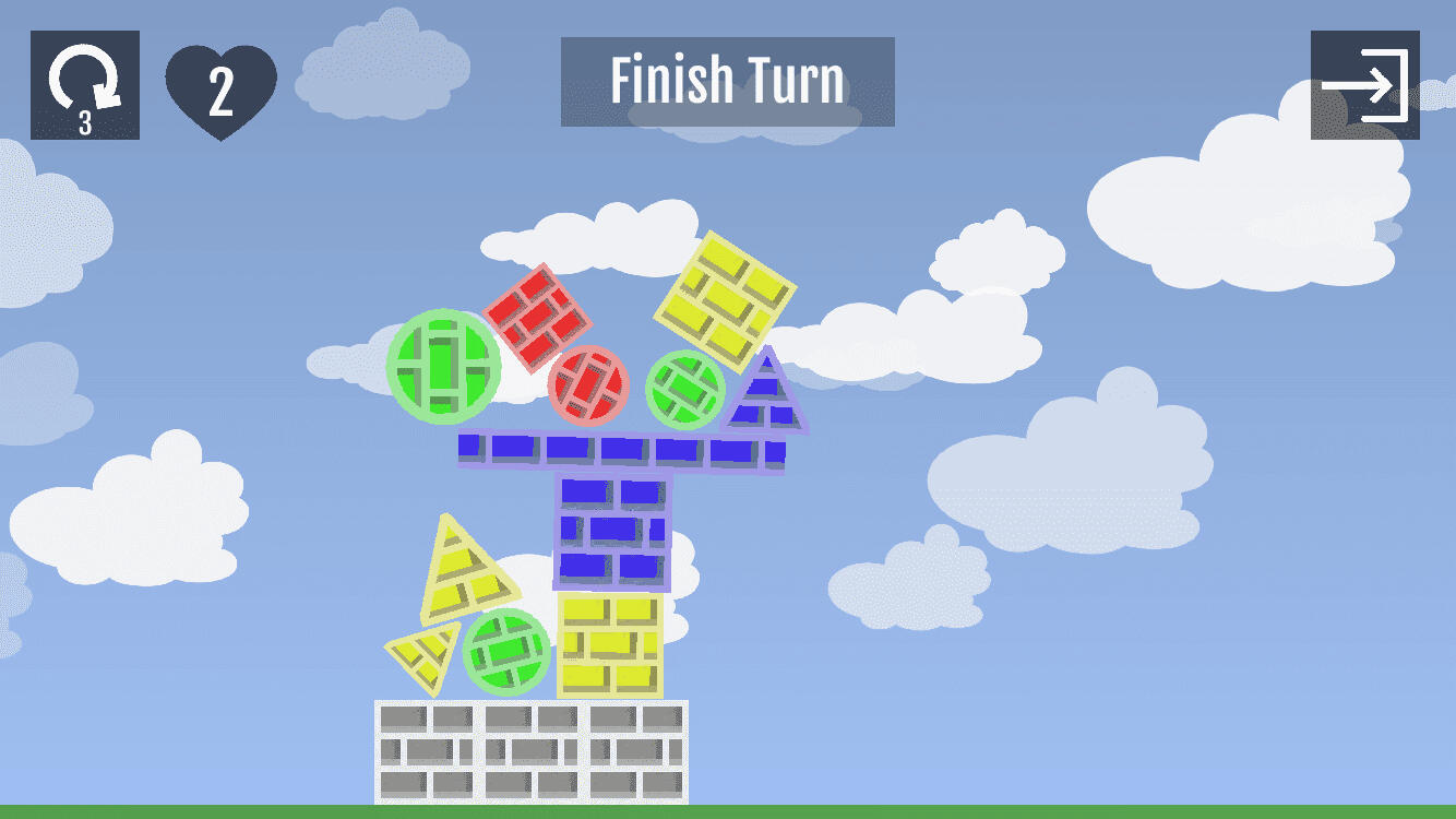
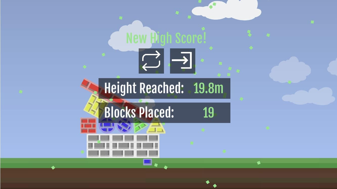
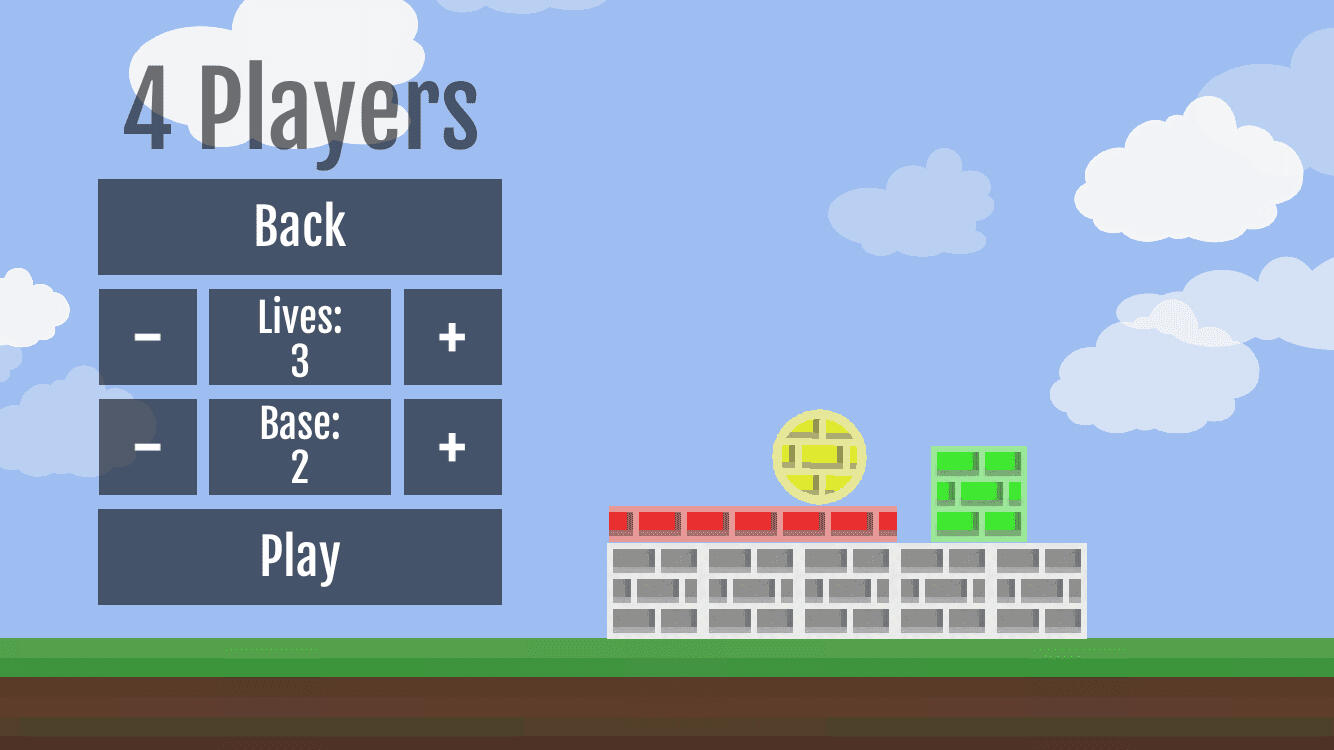
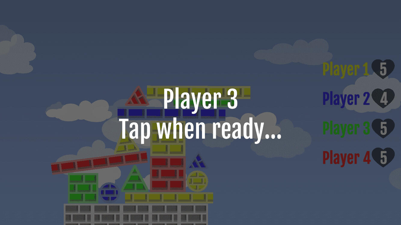
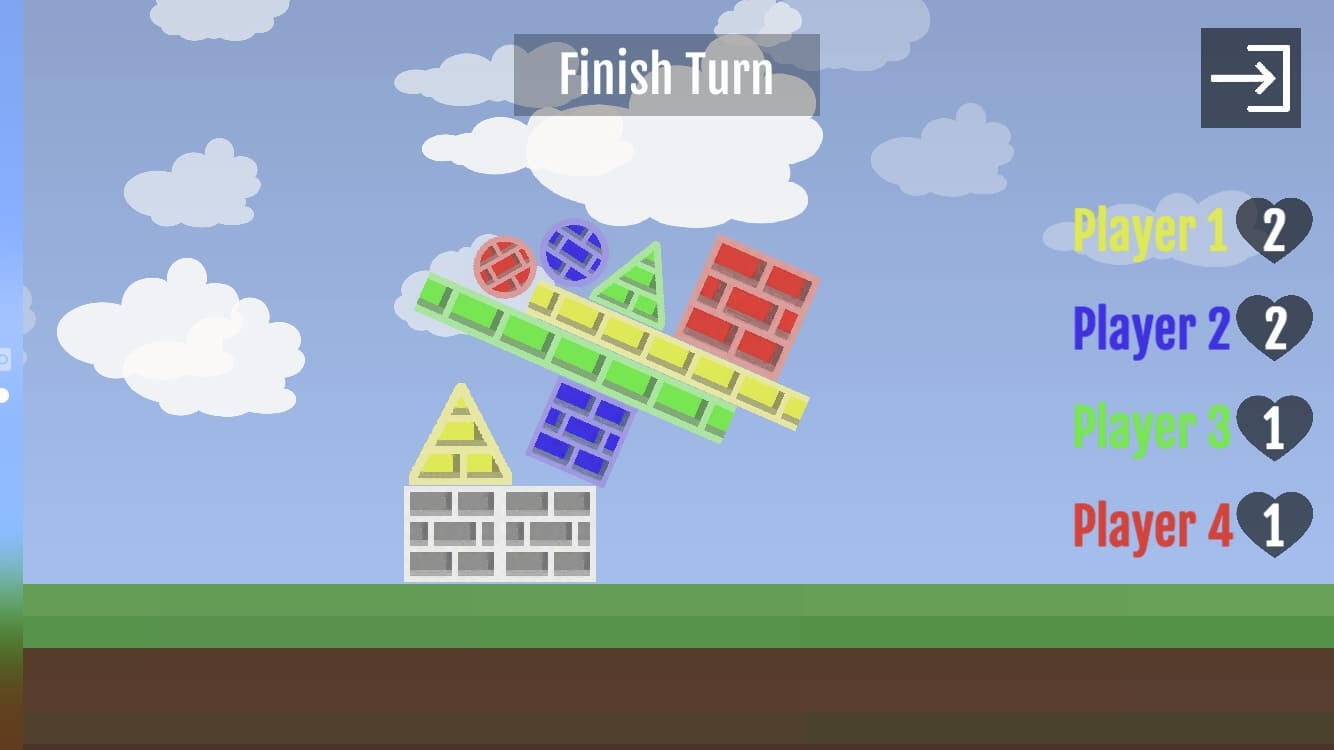
I developed and released Flumble, a mobile game available on both iOS and Android platforms. The game challenges players to take turns stacking blocks onto a progressively unstable tower, testing balance, precision, and timing. Flumble features multiple game modes, including single-player, multiplayer, and sandbox options, offering a variety of ways to play. The game also includes accessibility support for players with colour blindness, ensuring an inclusive and enjoyable experience for all users.What I Learned
This project taught me how design decisions impact user experience across multiple game modes and accessibility requirements. I deepened my understanding of creating clear, responsive interactions and feedback, and gained experience designing inclusively for players with colour blindness. Overall, it strengthened my ability to balance challenge, clarity, and engagement while ensuring accessibility in gameplay.

Game settings

Gameplay with colour blind mode on

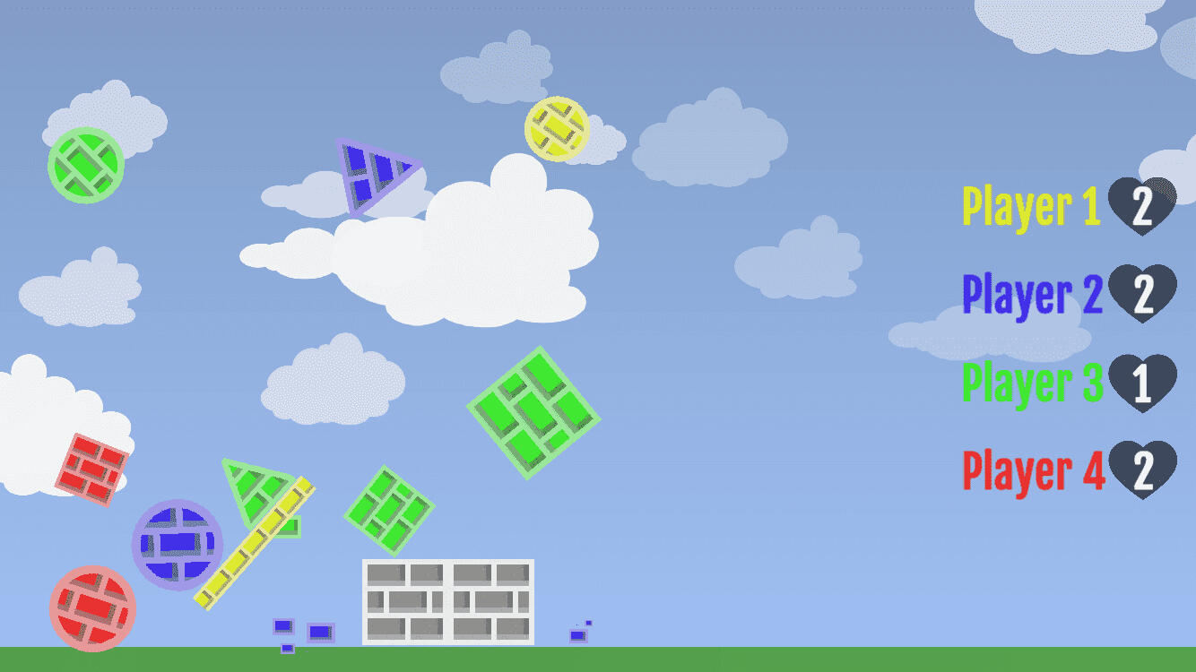
This tower is getting tall...

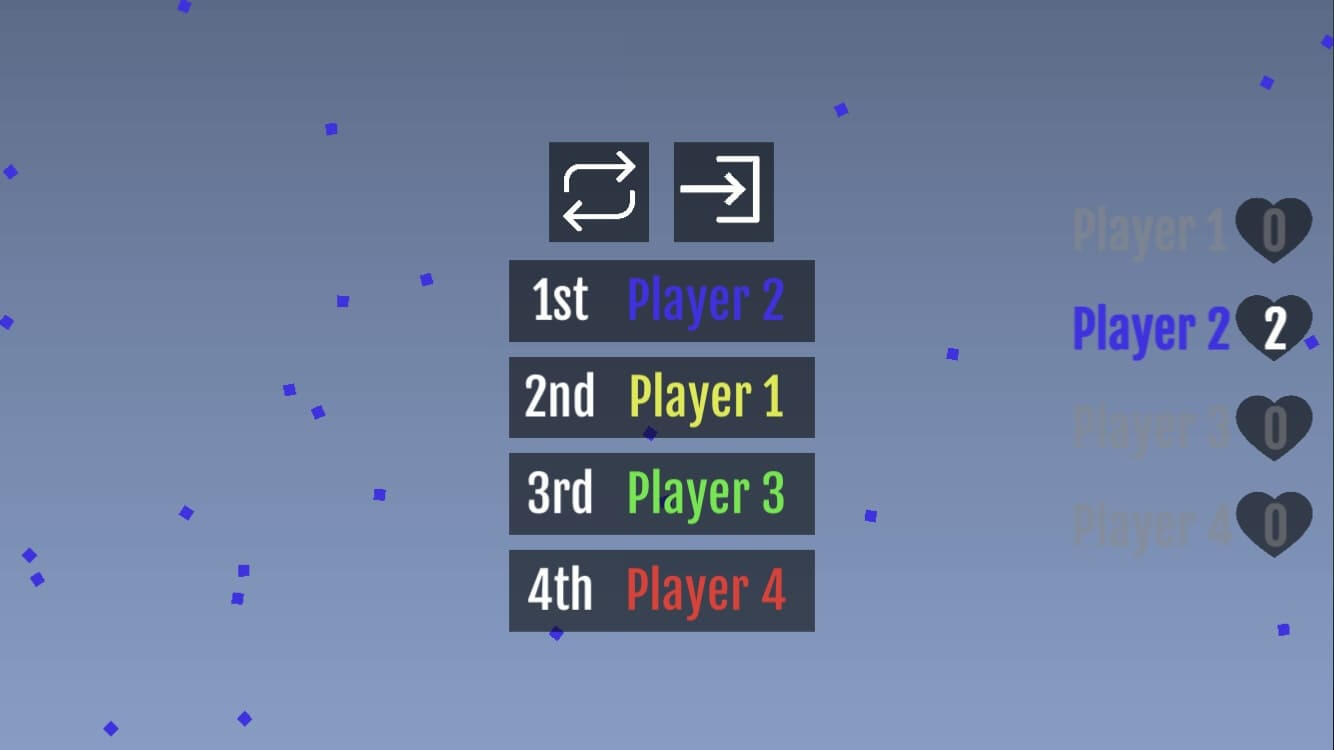
New high score!

Setting up a multiplayer game

A screen to prevent a user error

Moments before disaster...

Collapsing tower

Game over

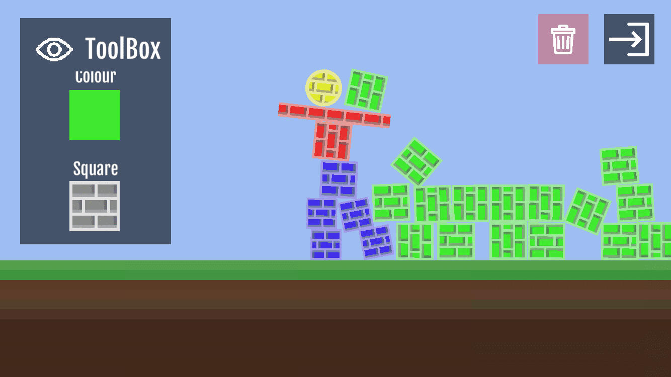
Sandbox mode
Tend & Grow
August 2023

Project Summary
Tend and Grow is a 2D top-down prototype exploring gentle gameplay, emotional wellbeing, and digital spaces designed for relaxation. Built using 2D lighting, night cycles, and dynamic sorting layers, the project aimed to create a soothing environment where users can unwind and escape daily stresses. The concept blends nurturing a virtual garden with supporting mental wellness, encouraging calm interaction through soft visuals, subtle animation, and a peaceful atmosphere.What I Learned
This project improved my ability to generate wellbeing-focused ideas, designing interactions and environments that support relaxation and comfort. I refined detail through lighting, visual layering, and smooth animations, deepening my understanding of how subtle visuals and motion shape a user’s emotional experience.

Creating the character and player movement
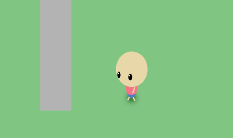
Adding limbs and walking animations

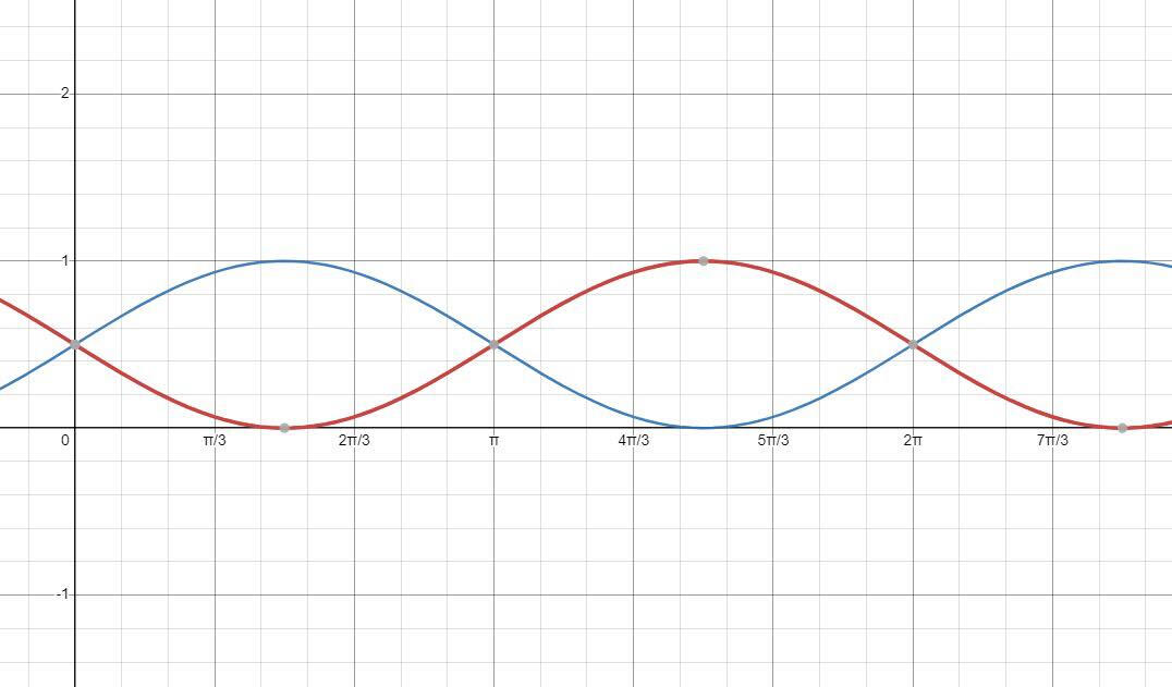
Calculating warmth and intensity for the night cycle

How it feels to stare at sine waves for hours...

Functioning night cycle and player lighting

Shadows and dynamic layering
Kerby
August 2021

Project Summary
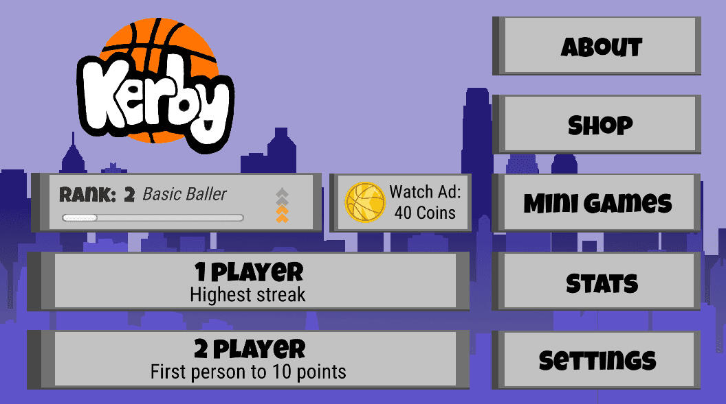
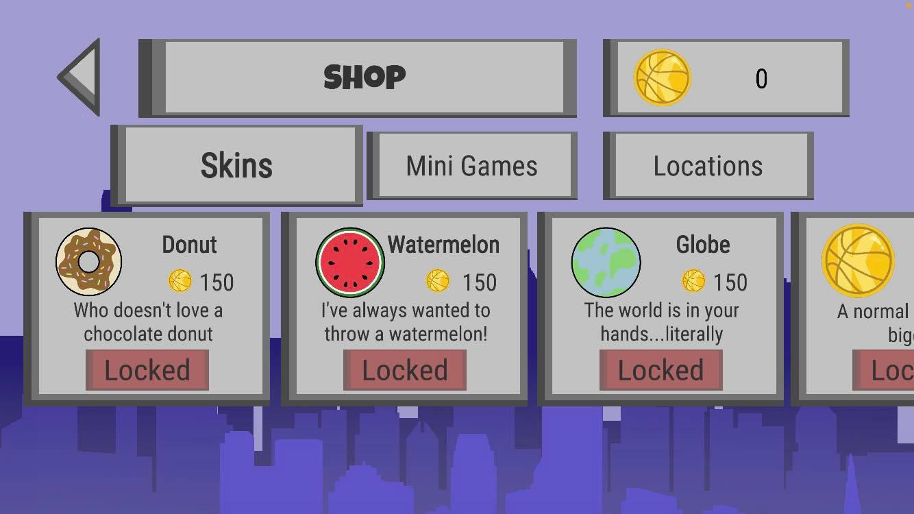
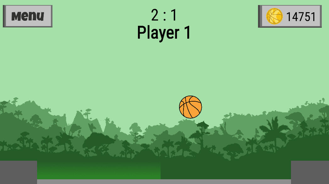
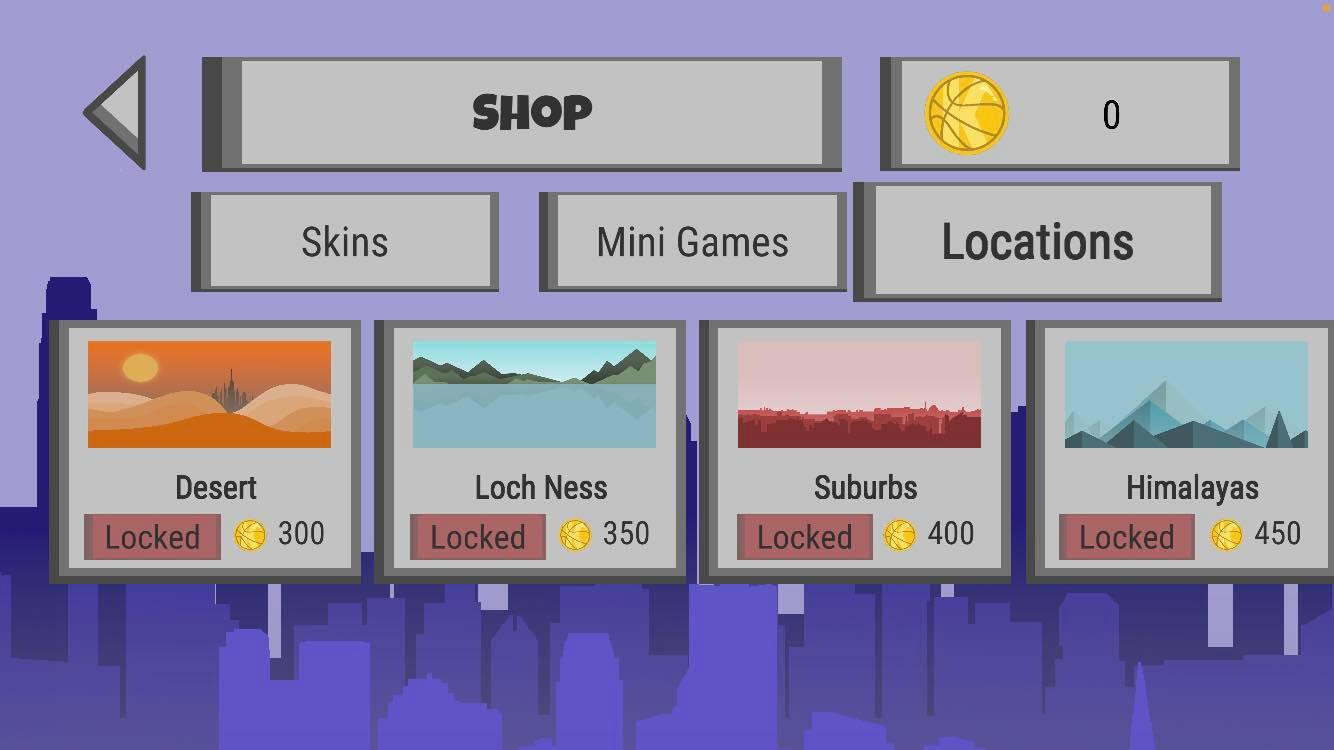
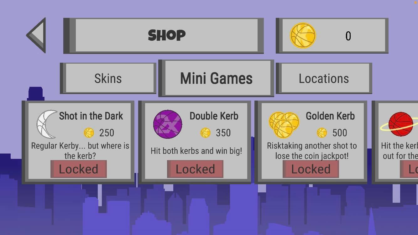
Kerby marks the beginning of my journey into game development and UI/UX design, and was released on both iOS and Android. Inspired by the classic childhood street game, it recreates the fun of throwing a ball across the road to hit the kerb. The game includes multiple modes such as single-player, multiplayer, and mini-games, along with customisable ball skins and a variety of locations available through the in-game shop.What I Learned
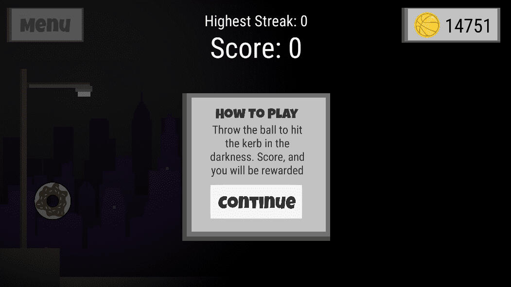
This project taught me how design decisions directly shape player experience, from balancing mechanics and challenge to creating clear feedback across different game modes. I learned how to design intuitive, accessible interfaces that support a wide range of players, and gained early insight into how UX and UI principles apply within game development. Overall, it strengthened my understanding of how gameplay, interaction, and interface design work together to create a cohesive and engaging experience.

Main menu screen

How to play screen

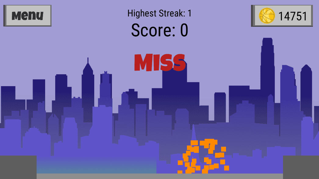
Player missing the kerb

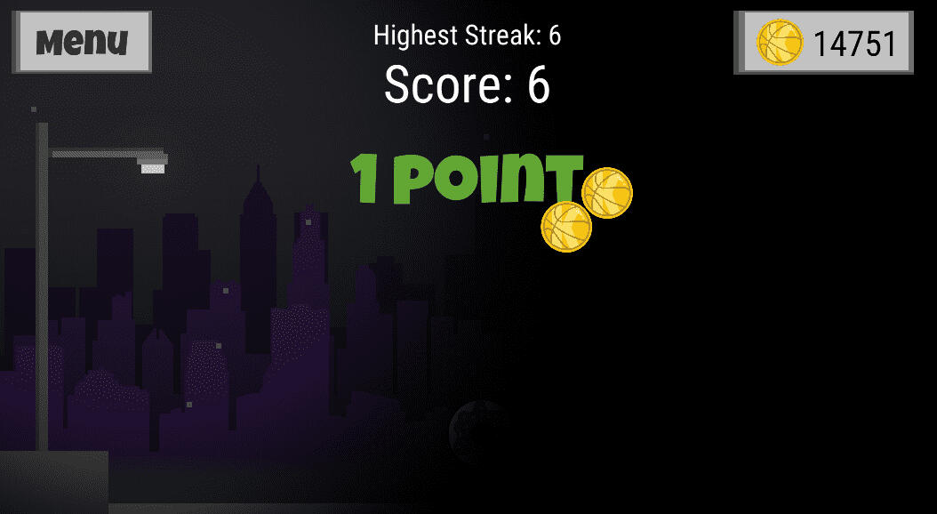
Player scoring and receiving coins

Ball skins within the shop

Multiplayer game in the rainforest

Various locations in the shop

Himalayan background

Mini games found in the shop

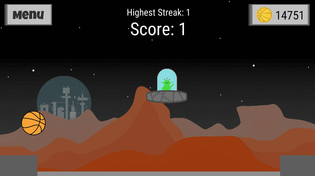
Mini game on mars!
Peace o' Scotland
January 2022

Project Summary
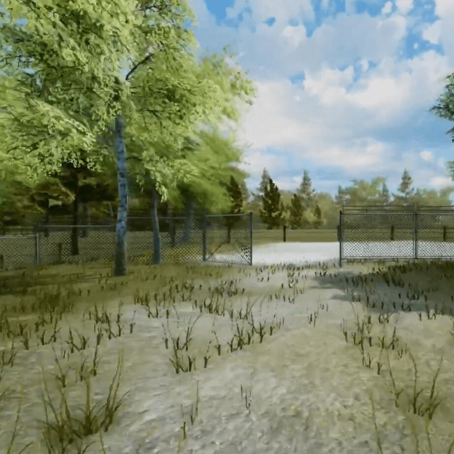
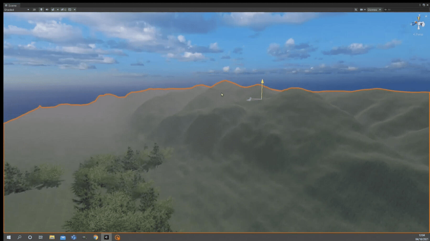
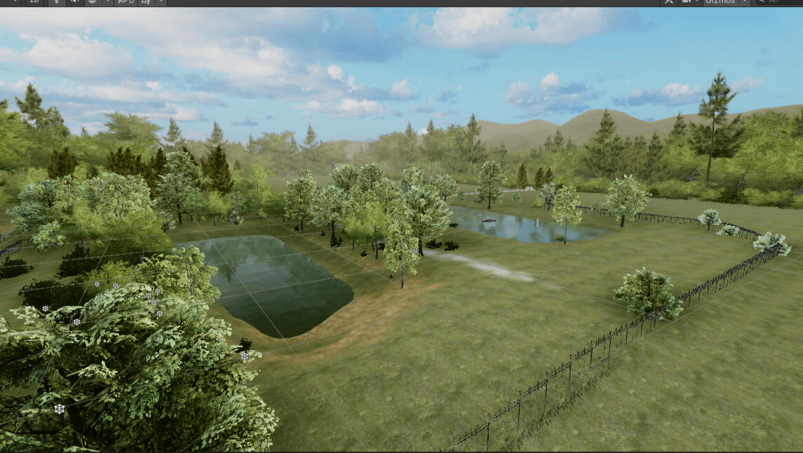
This project is a digital reconstruction of an area of land located in West Fife, Scotland, created using the Unity game engine. Starting from a land survey, I sculpted the terrain and populated it with realistic foliage and environmental details. Through the use of lighting and post-processing effects, I aimed to produce a detailed and immersive digital representation of the landscape.What I Learned
This project taught me how to work with real-world data to create accurate digital environments, strengthening my ability to translate land survey information into a believable 3D landscape. I developed a more detail-oriented workflow, learned advanced techniques in terrain sculpting, foliage placement, lighting, and post-processing, and gained a deeper understanding of how visual and environmental elements combine to create an immersive experience.

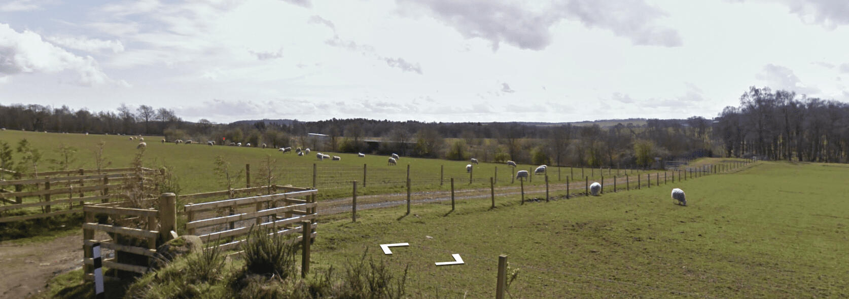
Street view of the land and surrounding fields

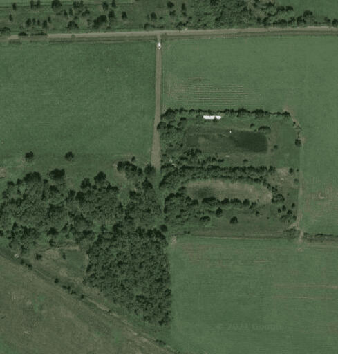
Satellite view of the land

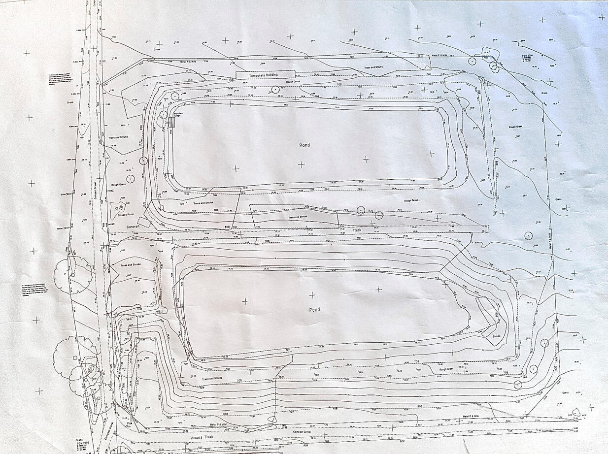
Land survey

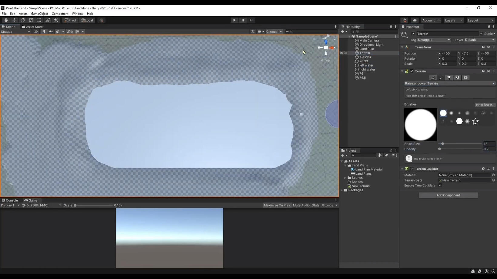
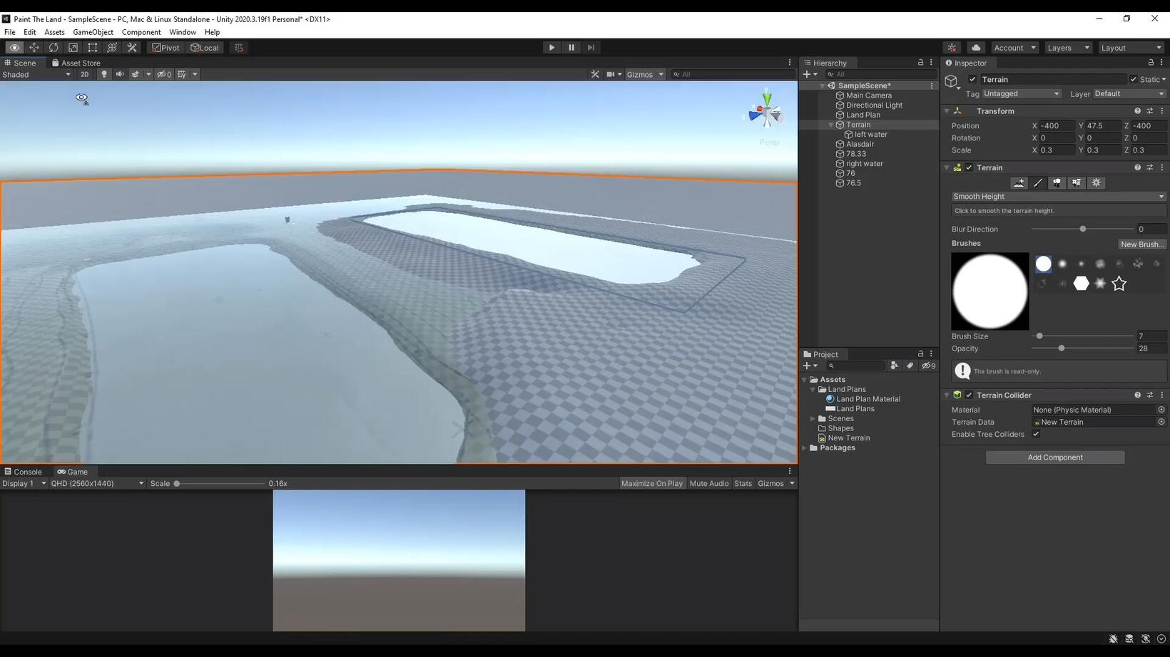
Beginning to sculpt the land

Ponds beginning to take shape

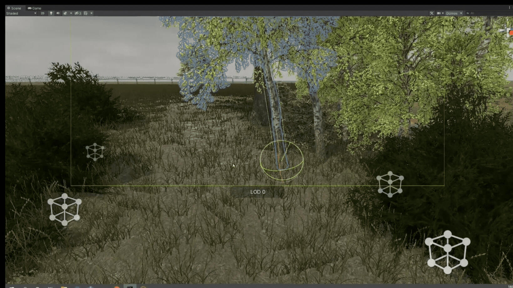
Importing foliage

Adding fencing and grass

Importing surrounding terrain from a heightmap

Trees from surrounding fields

Adding cattails to the pond
Whack-A-Hack
December 2025
Project Summary
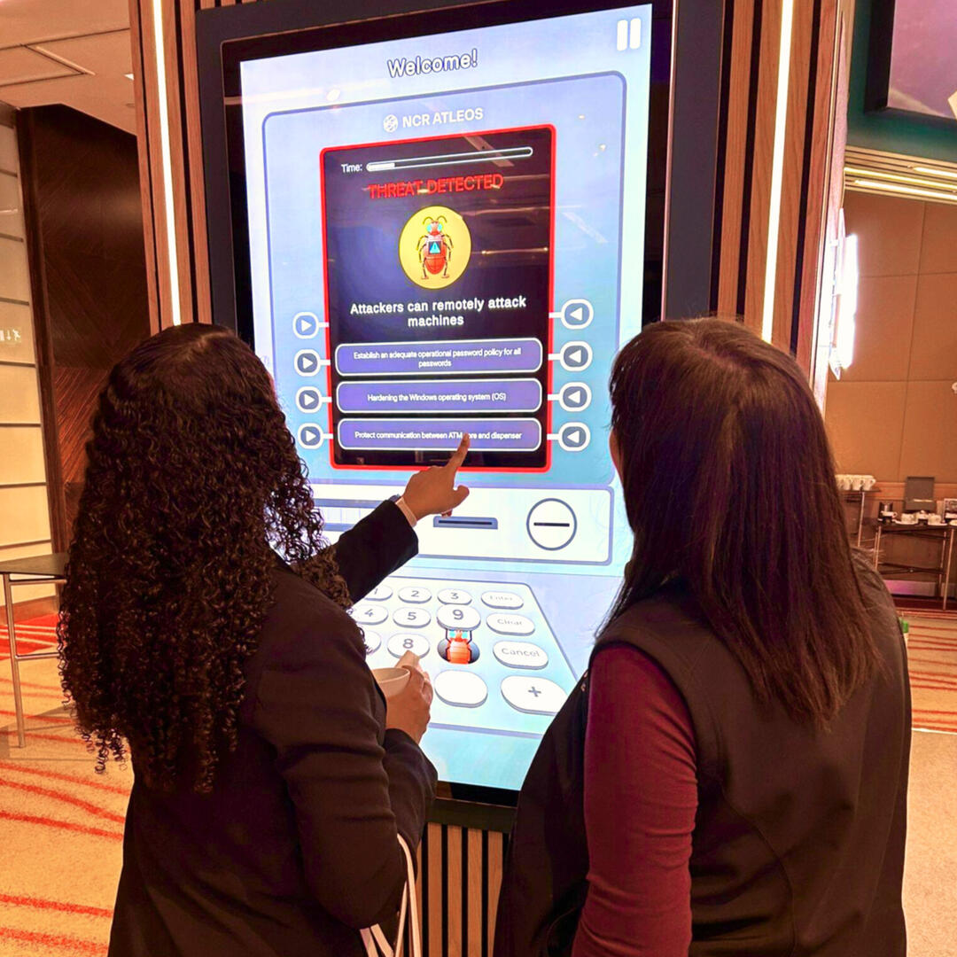
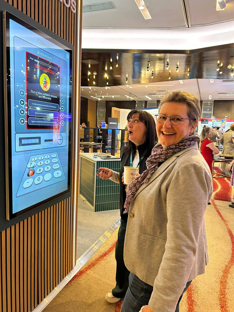
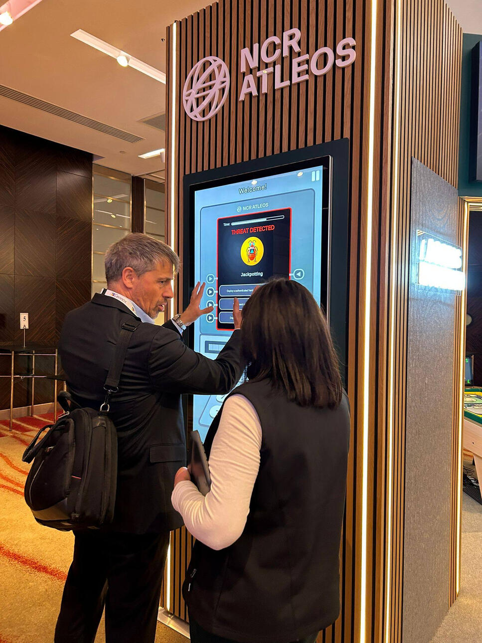
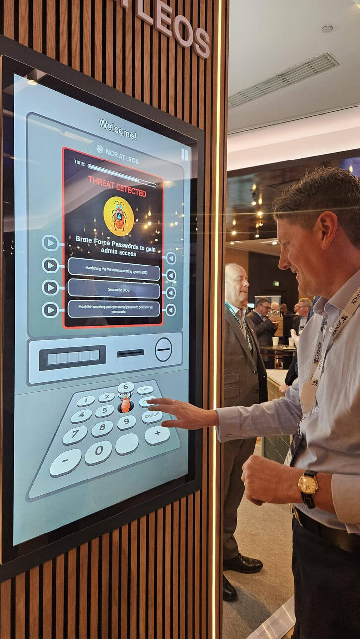
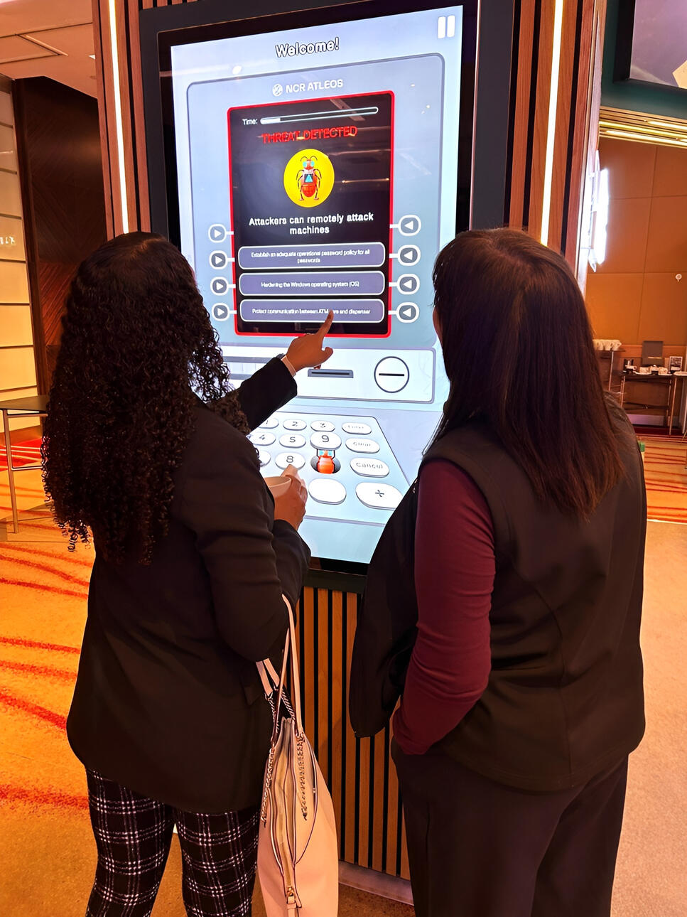
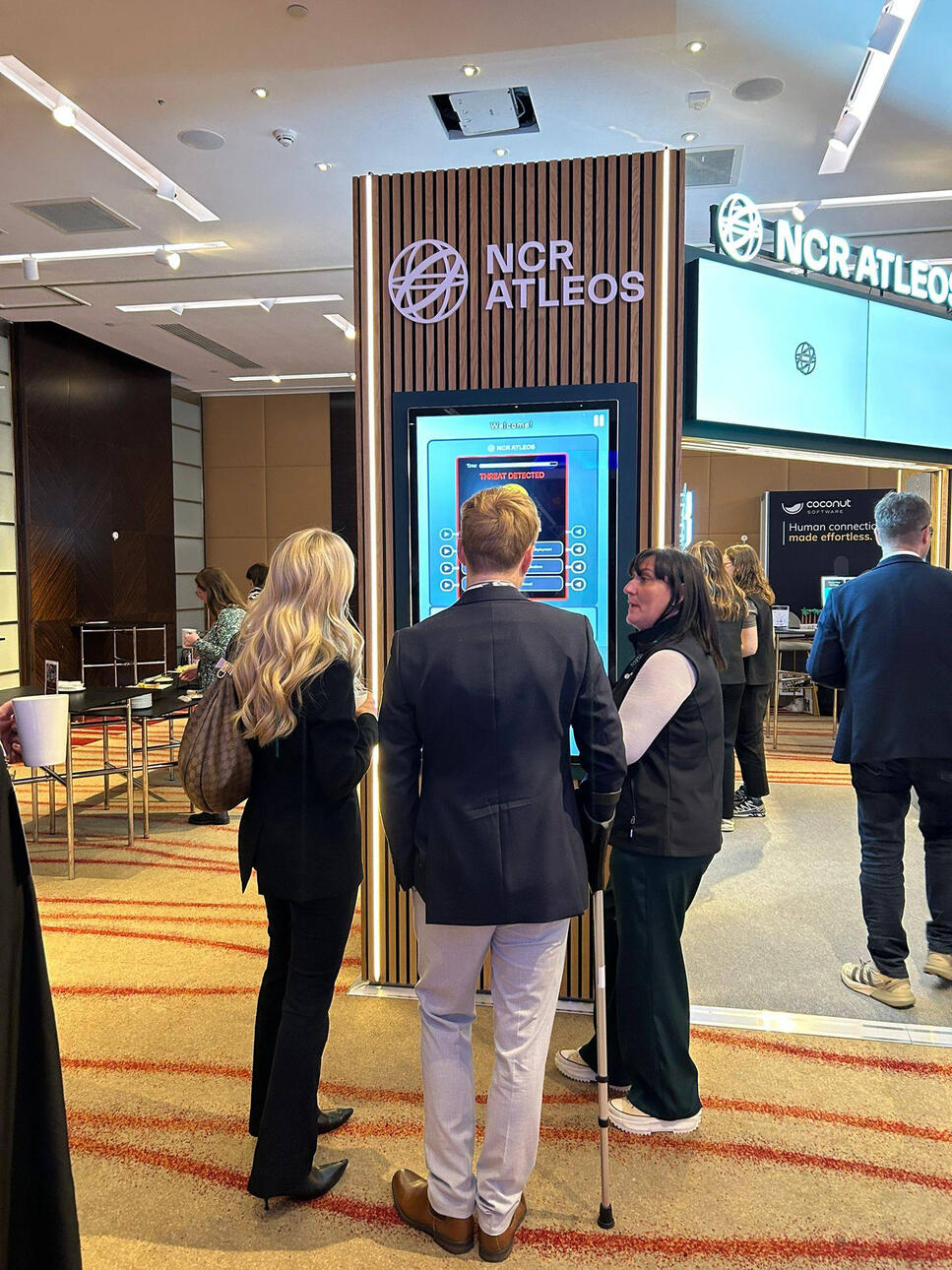
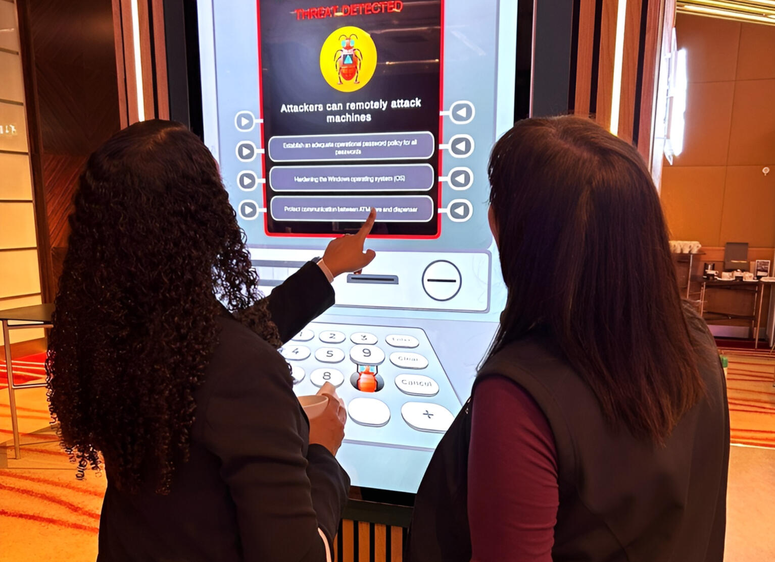
I worked as part of a multidisciplinary team to design and develop an interactive convention-focused interactive game for NCR Atleos, a multi-million-pound ATM manufacturer in Dundee, Scotland. The project was designed to attract attention at live events and promote awareness of ATM safety standards through engaging, informative gameplay. Working alongside another UX designer, a developer, and client-side engineers, I contributed to both the design and development of the game using Unity, implementing interaction designs and UI flows from Figma. The solution prioritised usability, intuitive gameplay, and customer engagement to ensure the experience was memorable and effective in a busy convention environment.What I Learned
This project strengthened my ability to collaborate effectively within a multidisciplinary team, balancing design thinking with technical implementation and client requirements. I gained valuable experience working to tight deadlines, taking responsibility on a high-profile project for a large organisation, and communicating design decisions clearly to both developers and engineers. Extensive client collaboration helped me refine solutions through feedback and iteration, reinforcing the importance of stakeholder alignment, usability testing, and clear communication in delivering a successful real-world product.

Real-world application

Real-world application

Real-world application

Real-world application

Real-world application
Ninja Nightfall
July 2023

Project Summary
Ninja Nightfall is a project I worked on while experimenting with different player input methods for movement and exploring various techniques for implementing night cycles. The concept focused on creating a suspenseful atmosphere that immerses players in the thrill of combat as ninjas operating under the cover of night.What I Learned
This project helped me deepen my understanding of user input and interaction design by experimenting with different control methods and refining movement to feel responsive and intuitive. It also strengthened my development skills by applying mathematical formulas to solve real-world problems, such as calculating movement, timing, and environmental effects to create smooth, realistic in-game behaviour.
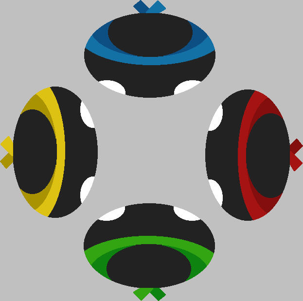
Character designs

Creating player movement and animations
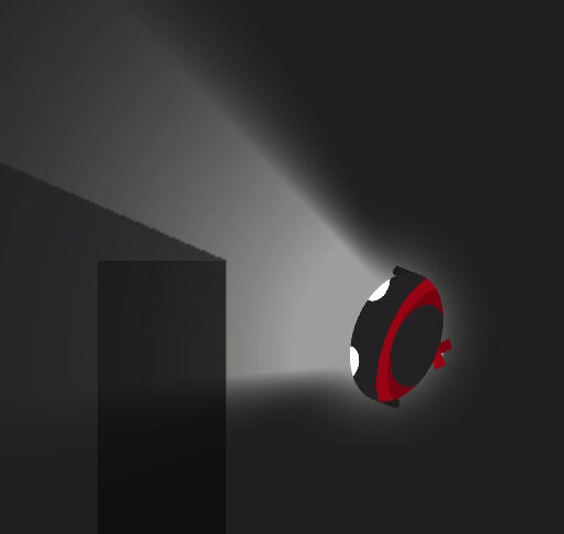
Night torch and shadows

Midnight...
Bike King Borders
Dec 2020

Project Summary
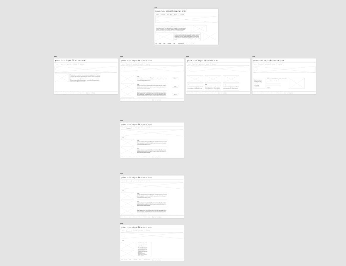
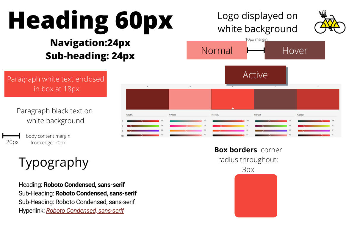
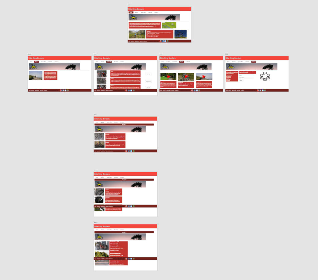
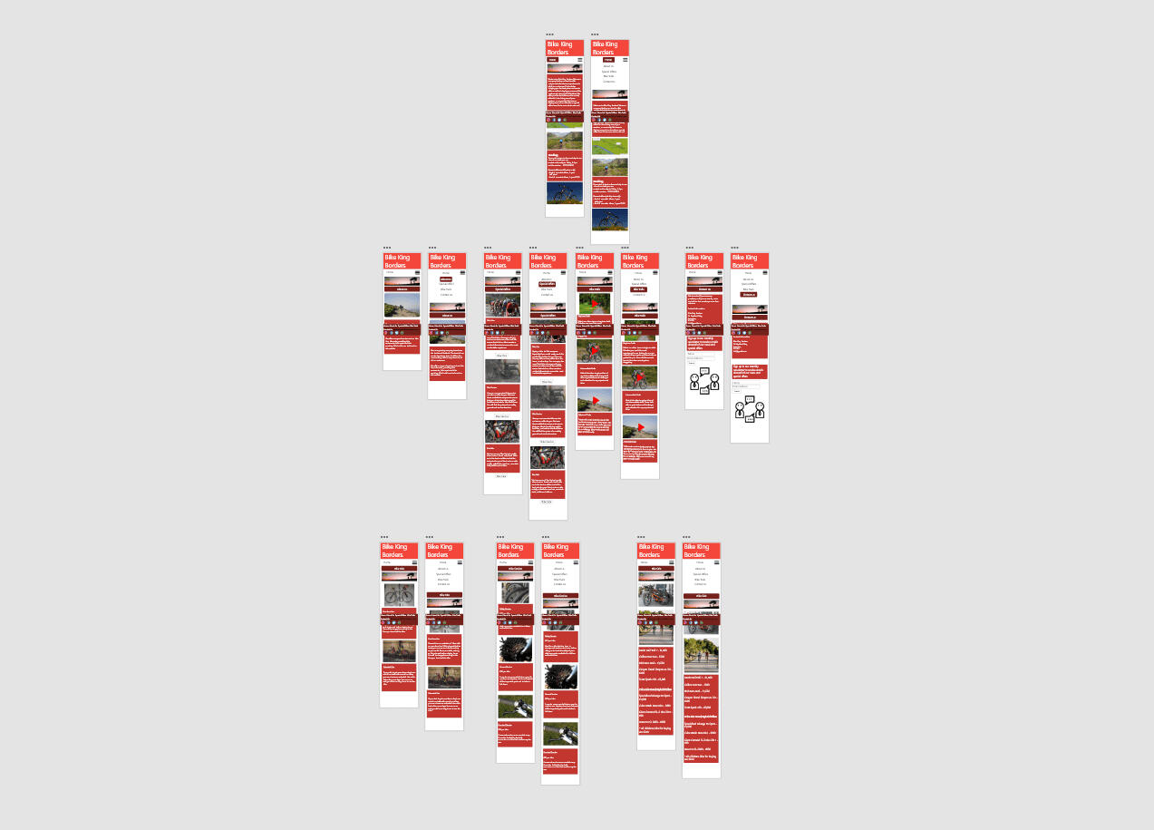
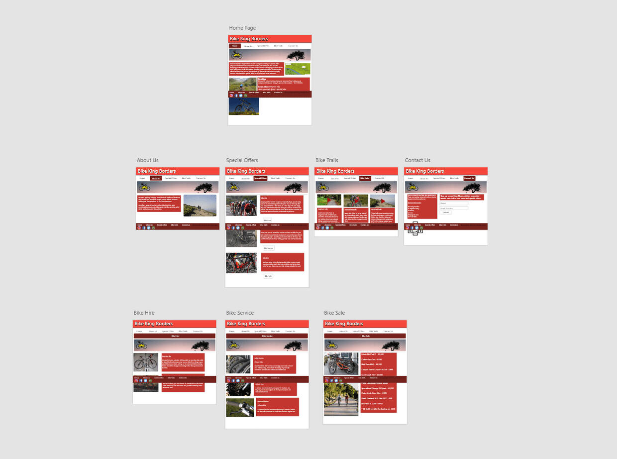
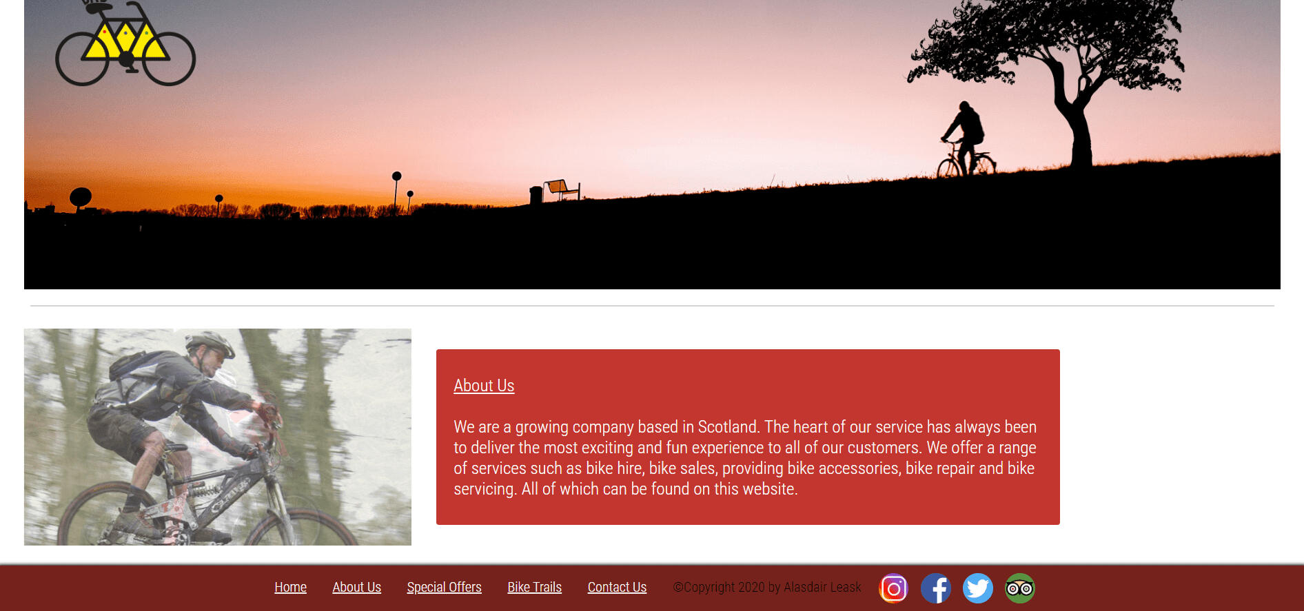
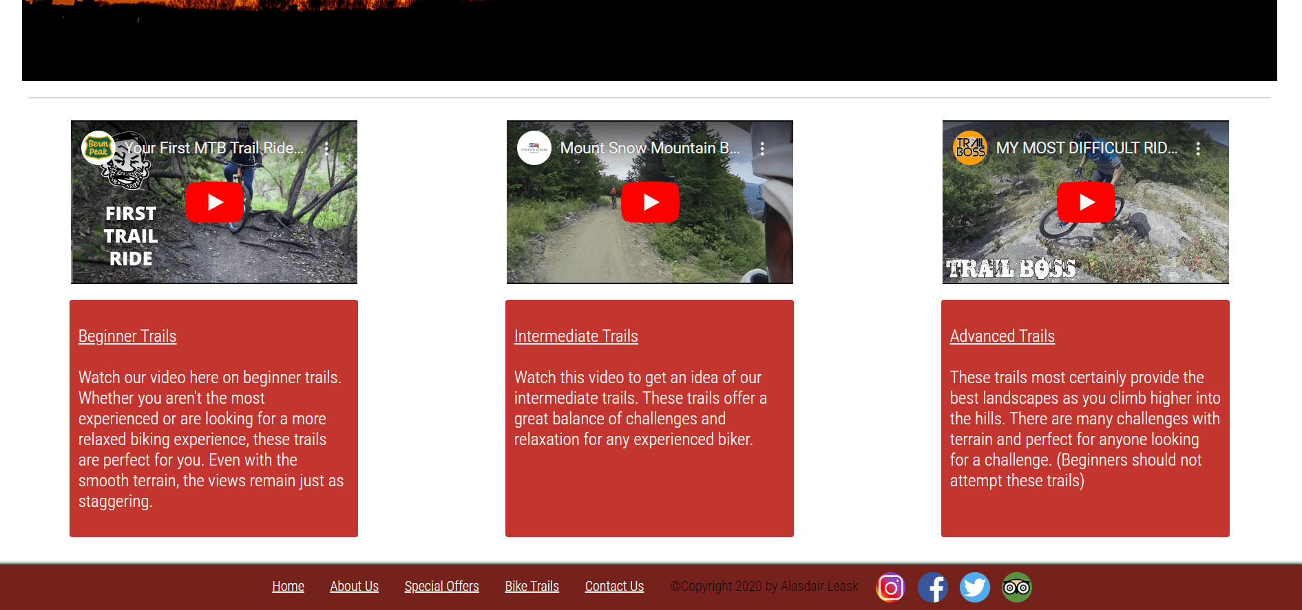
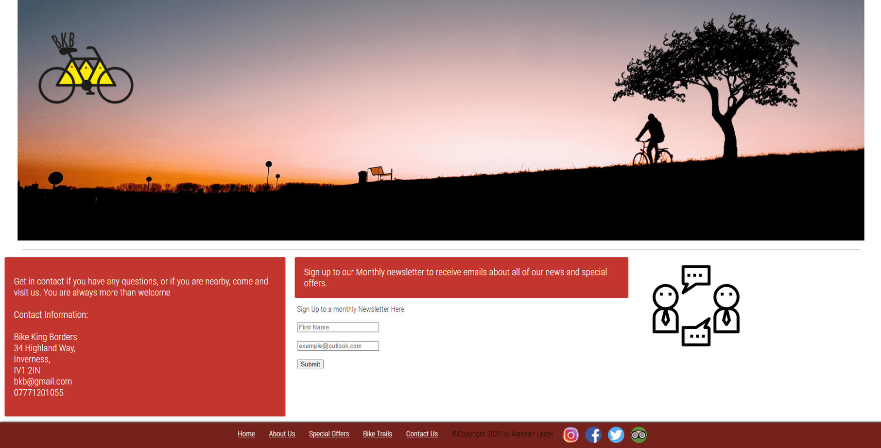
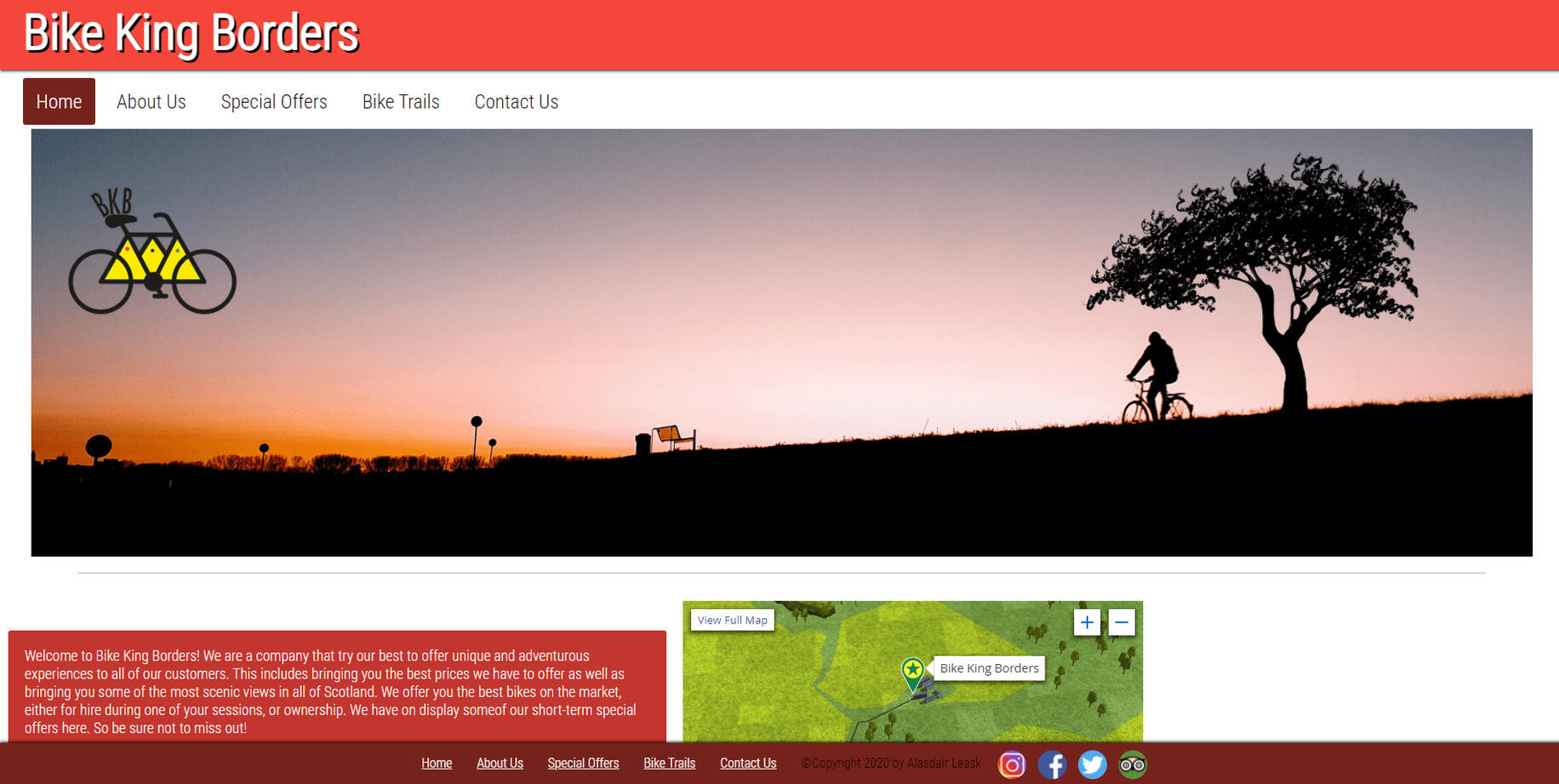
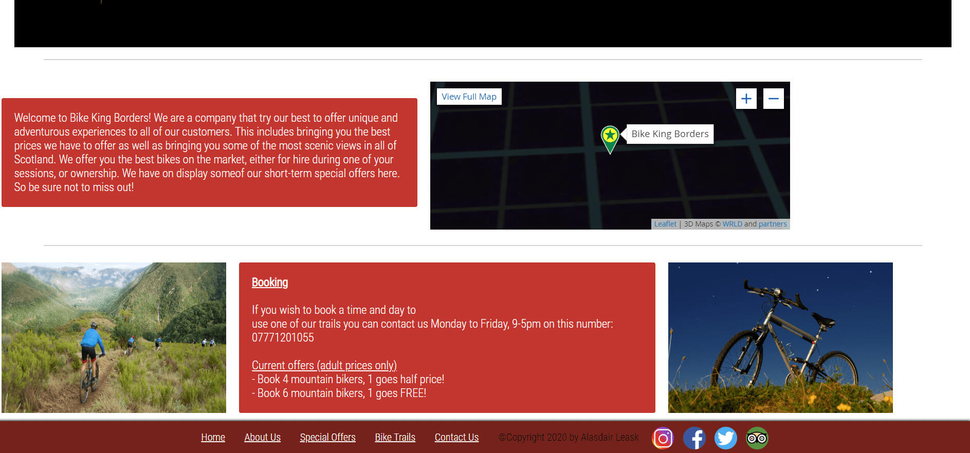
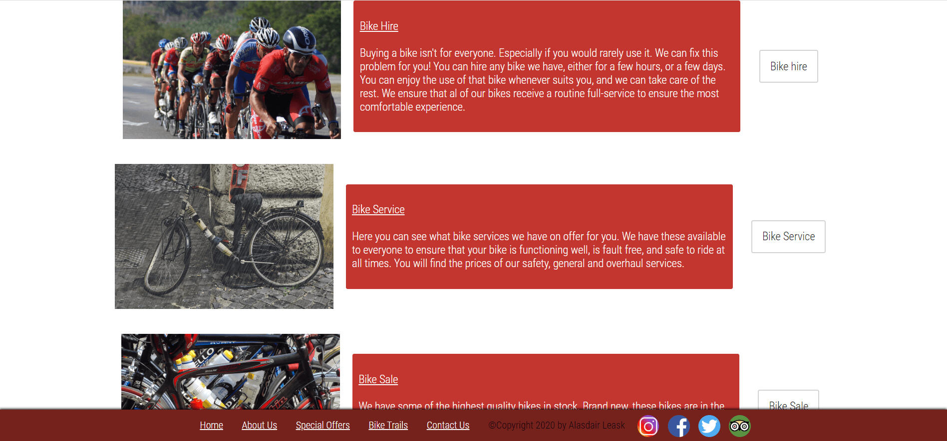
Bike King Borders is a website I developed during my HND qualification in Digital Design and Development (Games). It was the first website I developed solely using HTML and CSS, supplemented with additional JavaScript. Following a specific brief, I utilised Adobe XD to design wireframes and prototypes before proceeding to the full development of the site. The site is fully responsive, designed to seamlessly adapt to desktop, mobile, and tablet devices.What I Learned
This project strengthened my ability to follow a clear design brief and gave me a solid understanding of the full development process, from initial design and wireframing to prototyping and front-end build. It improved my confidence in creating responsive layouts, writing clean HTML/CSS, and using JavaScript for interaction, while helping me better connect design decisions with practical implementation.

Wireframe - dektop
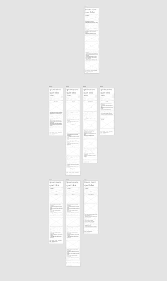
Wireframe - mobile
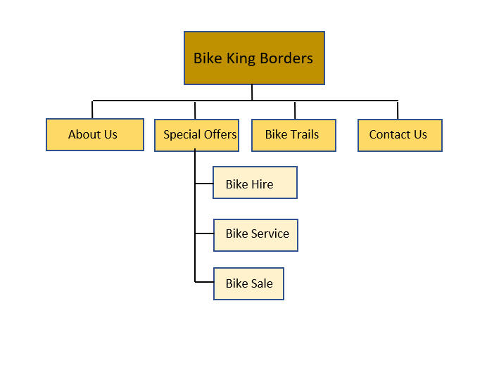
Site navigation map

Style guide

Prototype - desktop

Prototype - mobile

Prototype - tablet

Final product - about us

Final product - bike trails

Final product - contact

Final product - home1

Final product - home2

Final product - services
Fresh Assist
June 2025
Project Summary
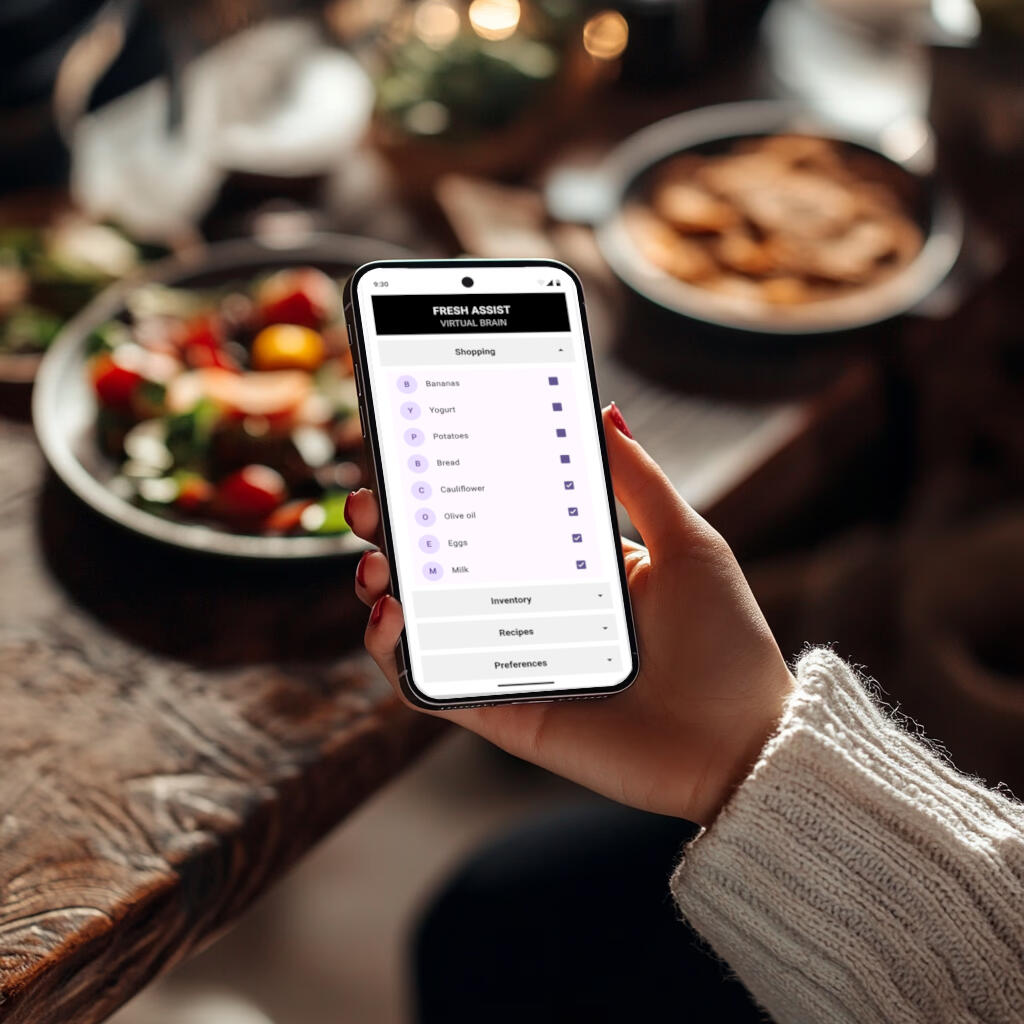
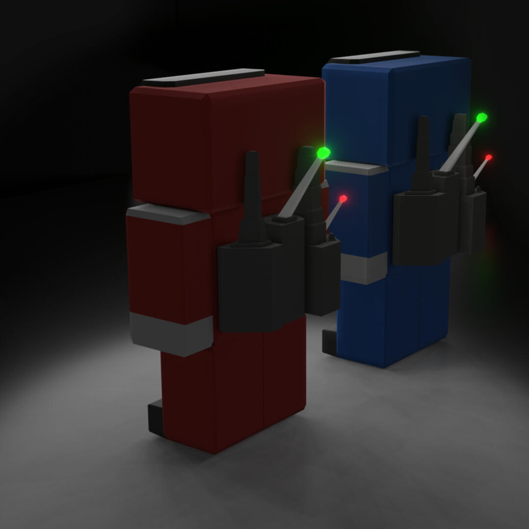
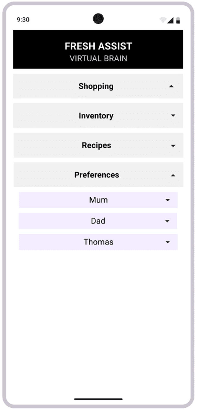
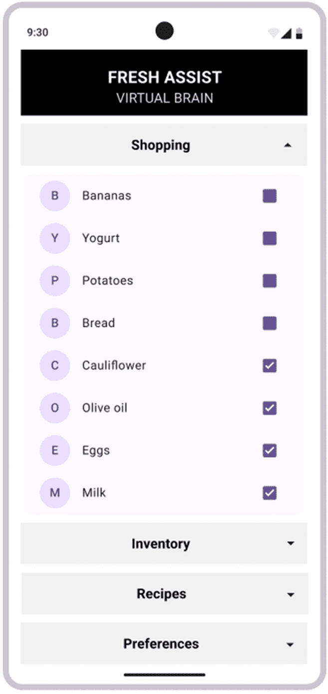
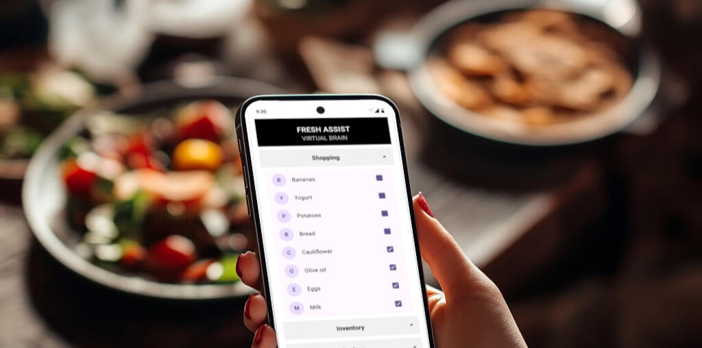
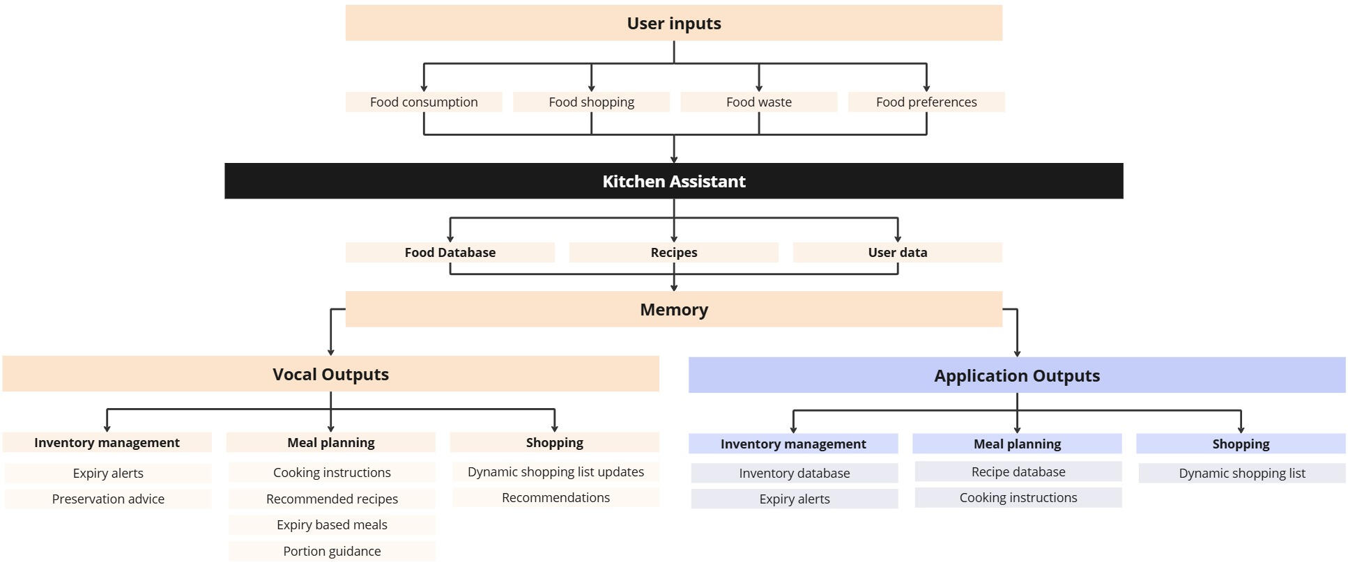
This project, completed as part of my BSc (Honours) in Computing & IT and Design, focuses on tackling household food waste and the unhealthy reliance on preservatives. The result is Fresh Assist, an AI-powered food management assistant that combines a voice-controlled device with a mobile app to track inventory, suggest meals, reduce waste, and support healthier habits. Designed within strict academic and budget constraints, the concept demonstrates a practical, user-centred approach to improving everyday food management through intuitive interaction and intelligent support.What I Learned
This project significantly strengthened my development as a UX designer. It pushed me to analyse broad societal issues, conduct user research to uncover real needs, and translate these insights into a coherent design vision. Working with a systems-level problem improved my ability to simplify complexity, design for long-term behaviour change, and consider how technology fits seamlessly into daily routines. Overall, it expanded my confidence in problem-framing, user-centred thinking, and creating solutions that balance innovation with practical, real-world use.

Screen prototype

Screen prototype
Induction Hob
January 2024
Project Summary
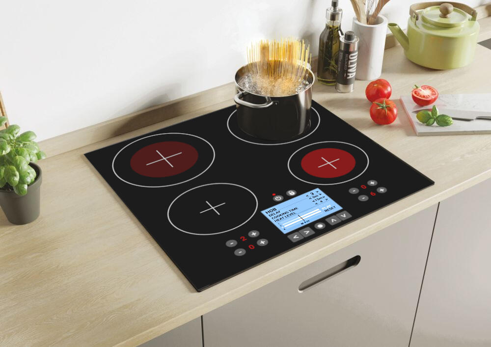
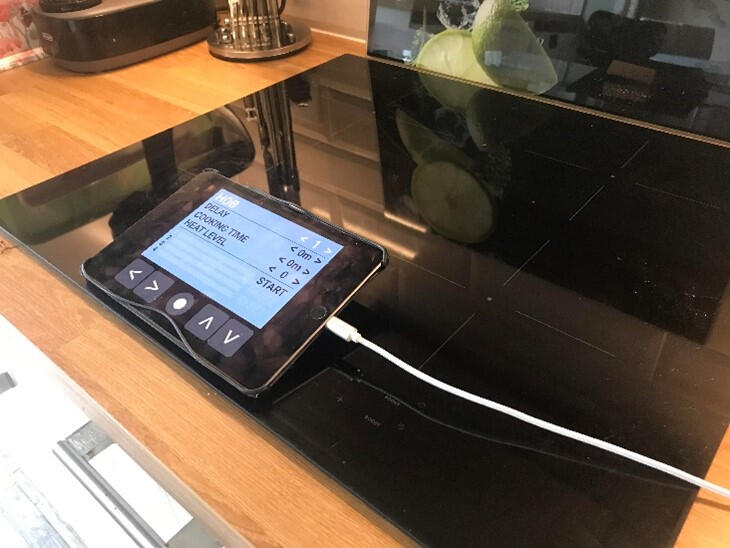
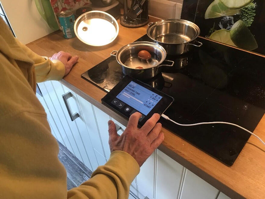
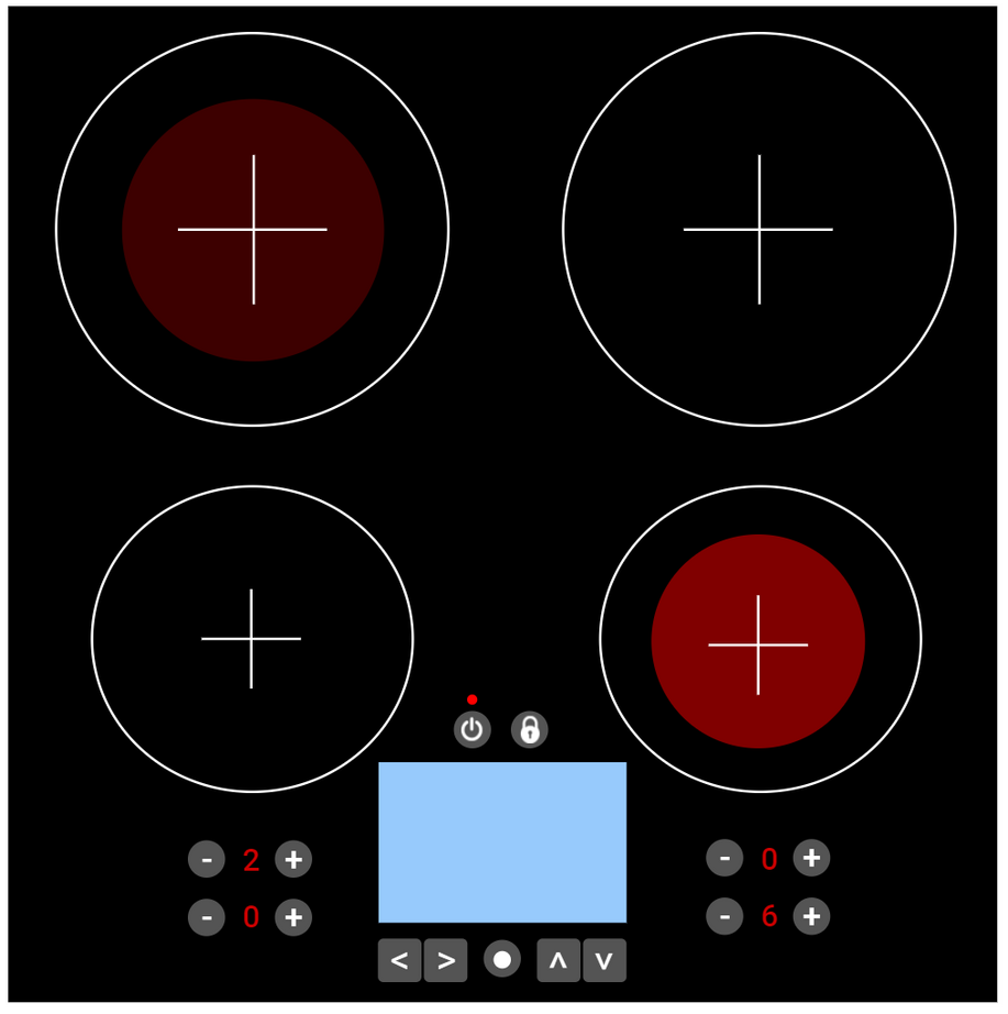
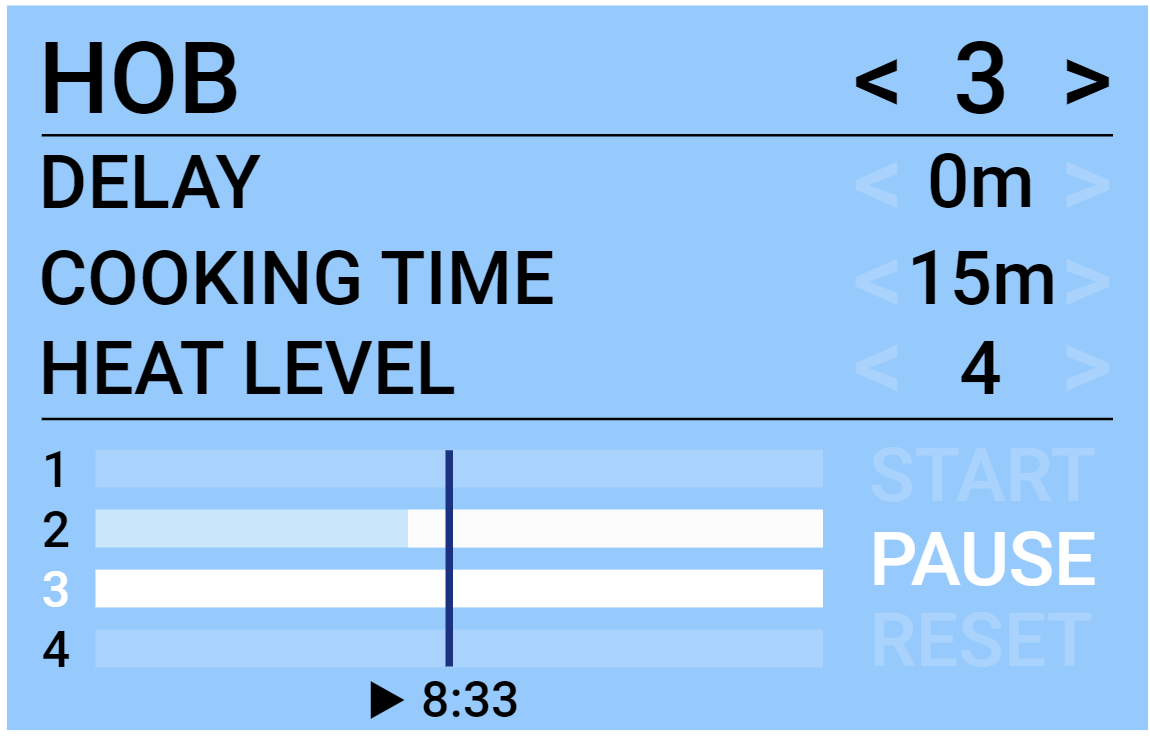
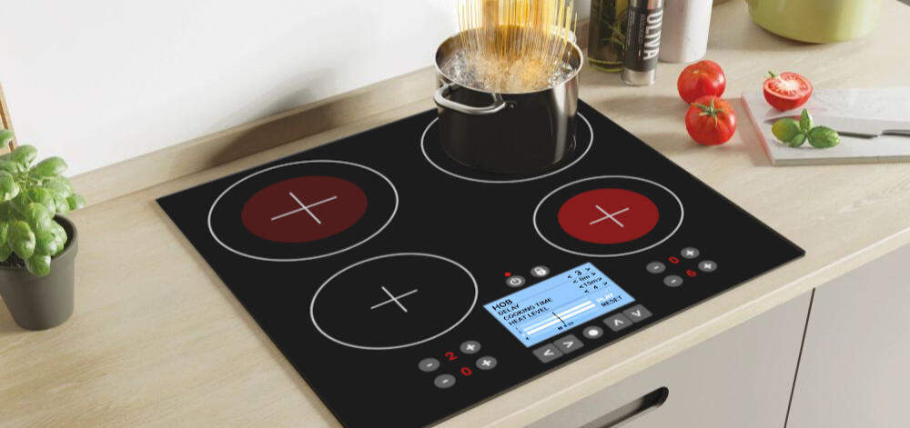
This project was completed as part of my BSc (Honours) in Computing & IT and Design, within the Interaction Design and User Experience module (TM356). The project focused on identifying and addressing a specific design problem by understanding its context and developing a practical, user-centred solution. The challenge centres on improving the usability of an induction hob for users with sight, mobility, and dexterity impairments. Working within the constraints of the course requirements, timeframe, and zero budget, the goal was to design a solution that enhances accessibility and interaction without compromising the hob’s original functionality or purpose.What I Learned
This project reinforced my ability to apply design thinking and user experience principles to create inclusive and functional design solutions, considering diverse user needs, accessibility, and interaction design to ensure practical, user-centred outcomes.

Prototype

Usability testing
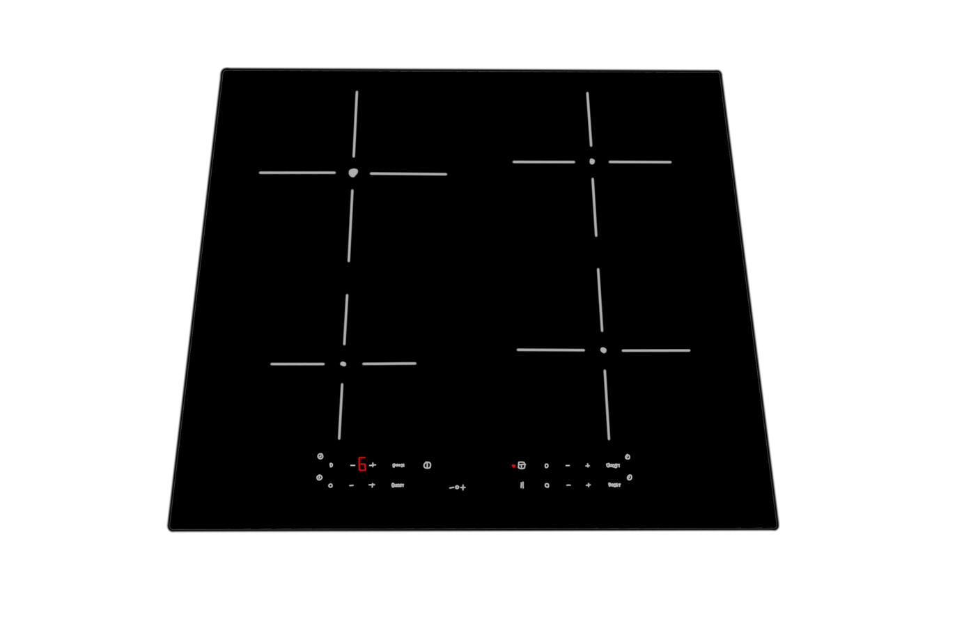
Hob sketch

Hob design

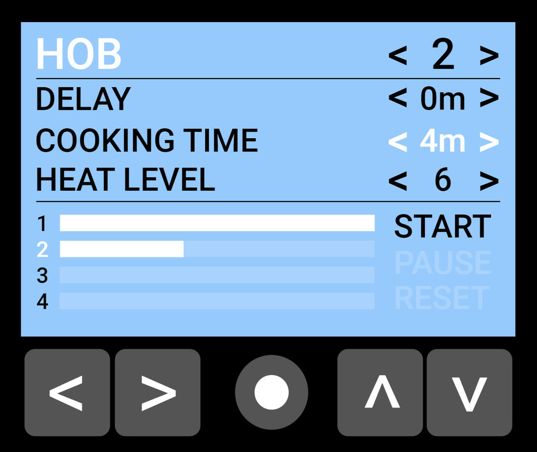
Hob screen design

Hob display integration
Campaign Manager
June 2024
Project Summary
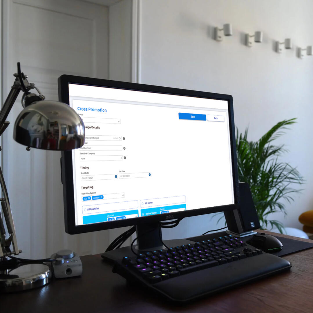
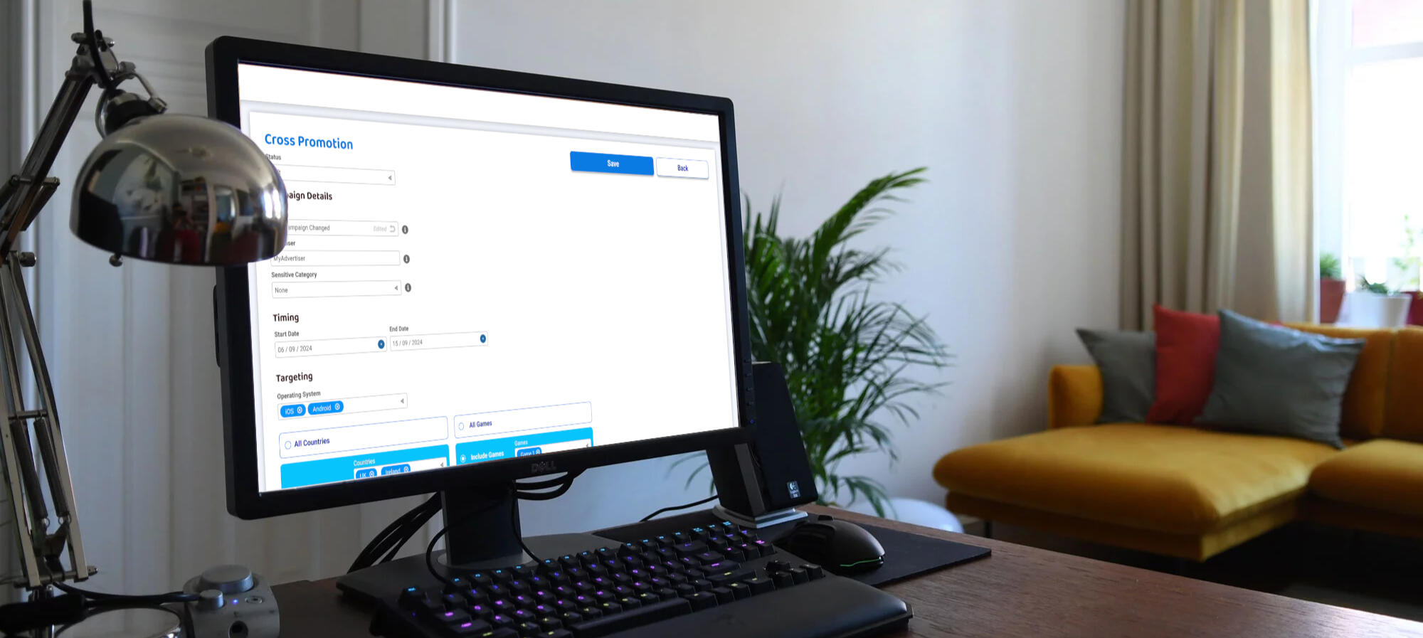
This project was for a prominent in-game brand advertising platform. The goal was to transform the campaign edit and view page by organising the information and data more effectively, making the design easier to use and understand, and ensuring it was visually appealing and consistent with the brand and existing webpages. The interactive prototype was created using Figma.What I Learned
This project deepened my understanding of how to improve user experience through thoughtful design and prototyping. It taught me how to make clearer decisions about information organisation, visual hierarchy, and creating interfaces that feel both intuitive and consistent. It also expanded my confidence in using Figma to explore ideas, iterate quickly, and translate user needs into designs that communicate more effectively.
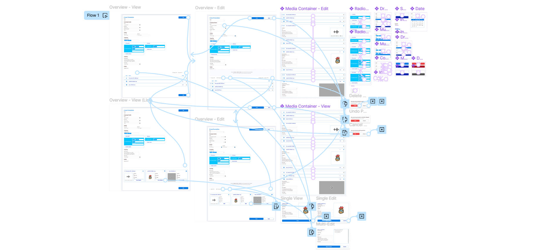
Original Design

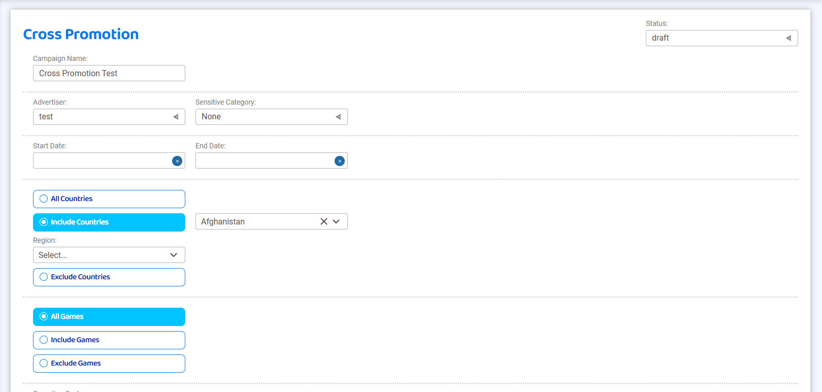
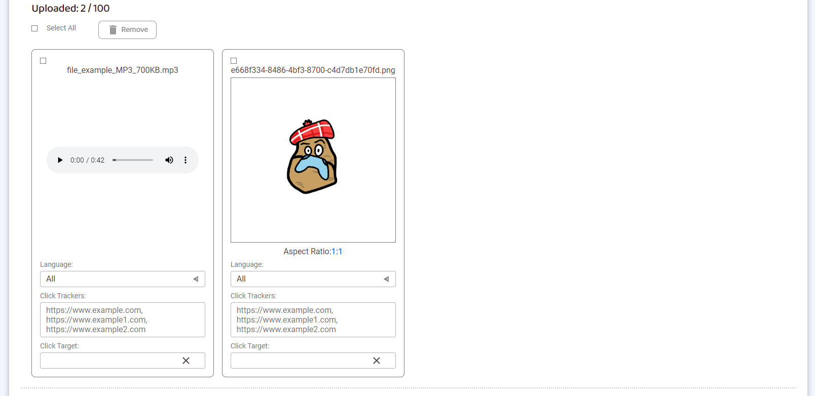
Original Design #1

Original Design #2

Original Design #3
New Design

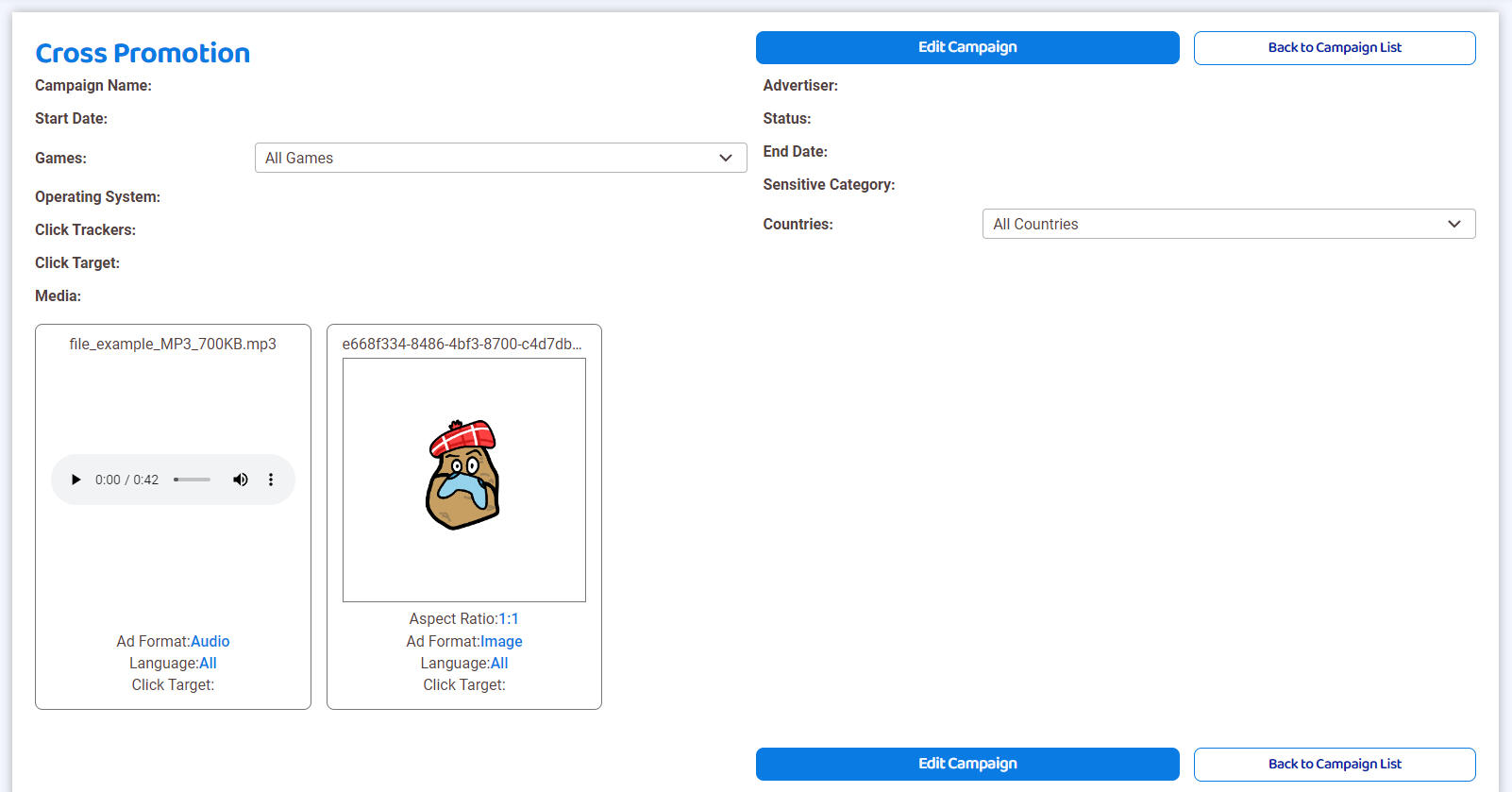
New Design #1

New Design #2

New Design #3
Achology
July 2024
Project Summary
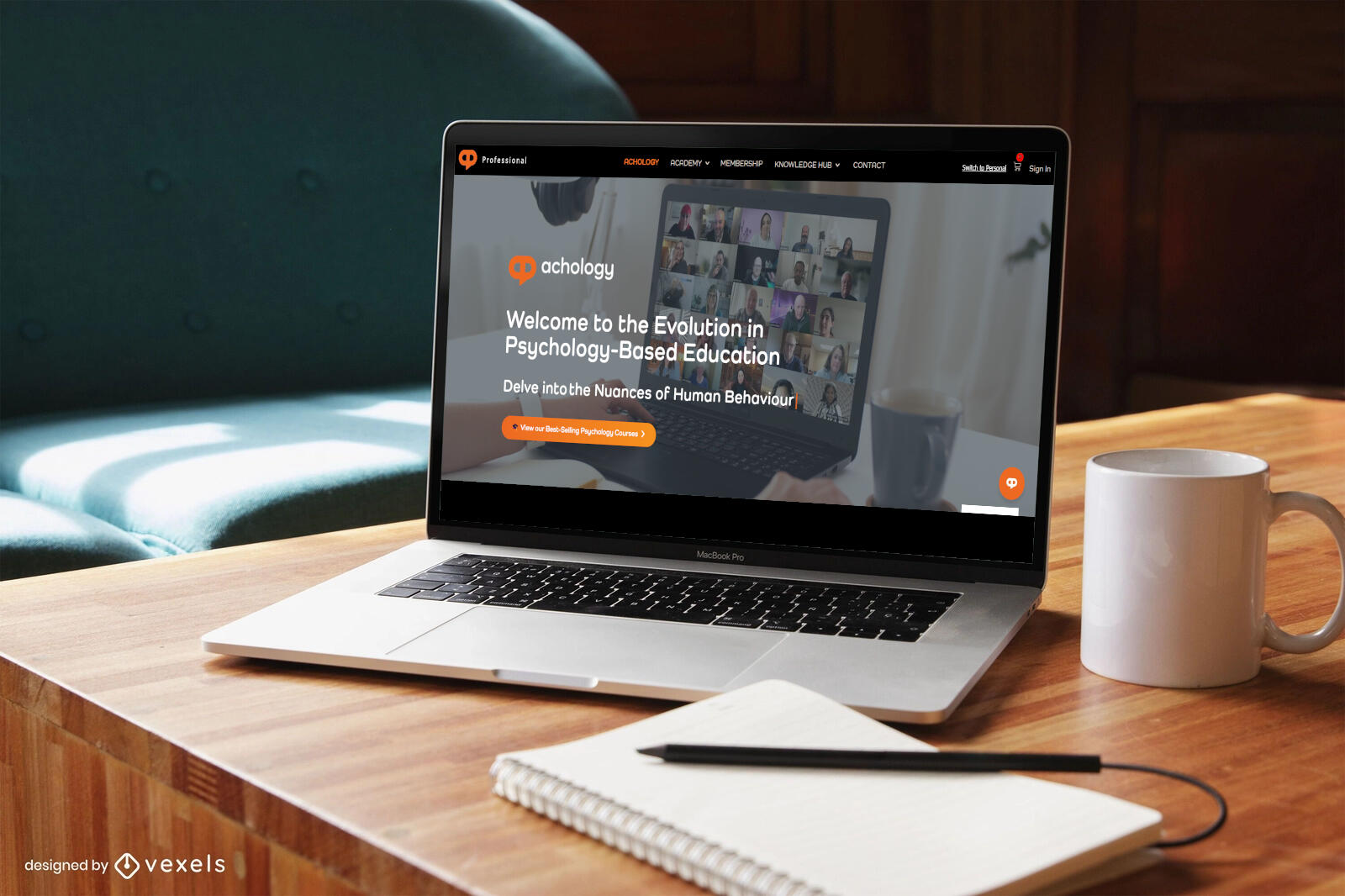
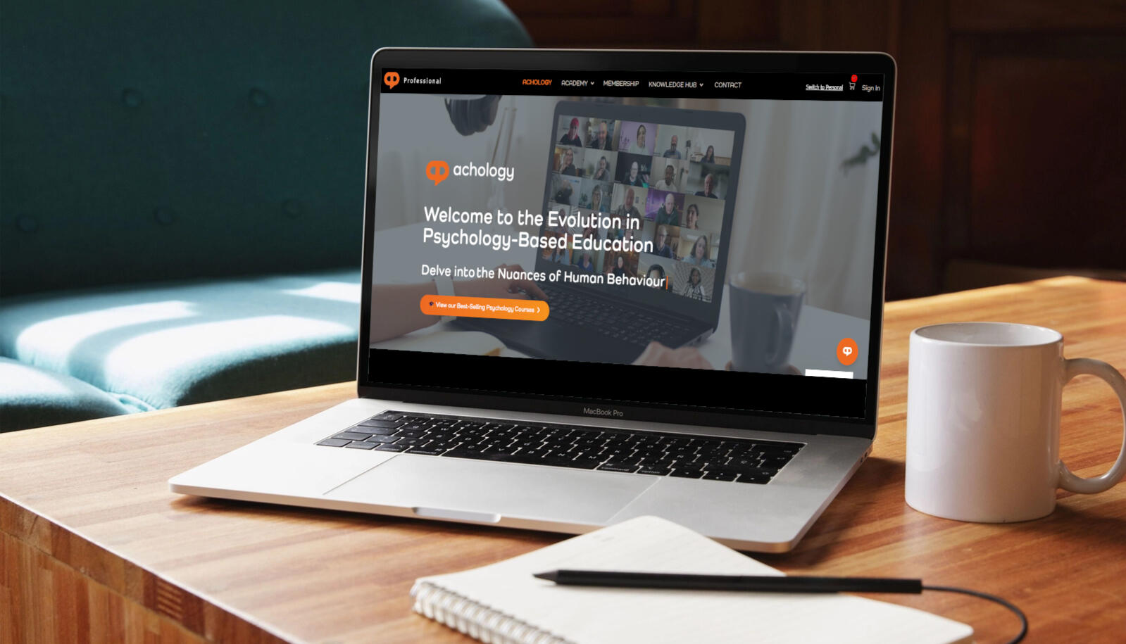
In this project, I volunteered as a UX Designer and researcher at Simplicity Marketing, collaborating with another designer to address the business challenges faced by the client, Achology. Our task was to understand the company’s key issues and propose research-backed design solutions. We conducted extensive user research, including surveys, usability tests, and card sorting sessions, to gather insights into user goals, contexts, and behaviors. Using this evidence, we developed a detailed design proposal aimed at improving the overall user experience and increasing conversion rates. I presented our findings and recommendations to key stakeholders, demonstrating how our design solutions directly addressed the identified challenges.What I Learned
This project taught me how to collaborate more effectively and work confidently with user-centred research methods. It also helped me grow my confidence in presenting and proposing ideas to stakeholders, enabling me to communicate design decisions more clearly and ensure the reasoning behind each choice is understood and supported.
Chambers
February 2022

Project Summary
This project involved designing and developing a complete game in accordance with a provided project brief, completed as part of my HND in Digital Design and Development (Games). The game challenges players to explore mysterious chambers in search of lost artifacts, returning them one at a time to load into a truck before the entrance seals shut. Players must navigate carefully within a strict four-minute time limit, balancing exploration and strategy while staying alert for unexpected surprises.What I Learned
This project helped me deepen my understanding of UX design principles by exploring player interaction, intuitive controls, meaningful feedback, and accessibility. It taught me how to design engaging, user-centred experiences that balance challenge with clarity and usability, while also growing my confidence in evaluating design decisions and understanding how small interaction choices shape the overall player experience.
Multi-Space
July 2022
Project Summary
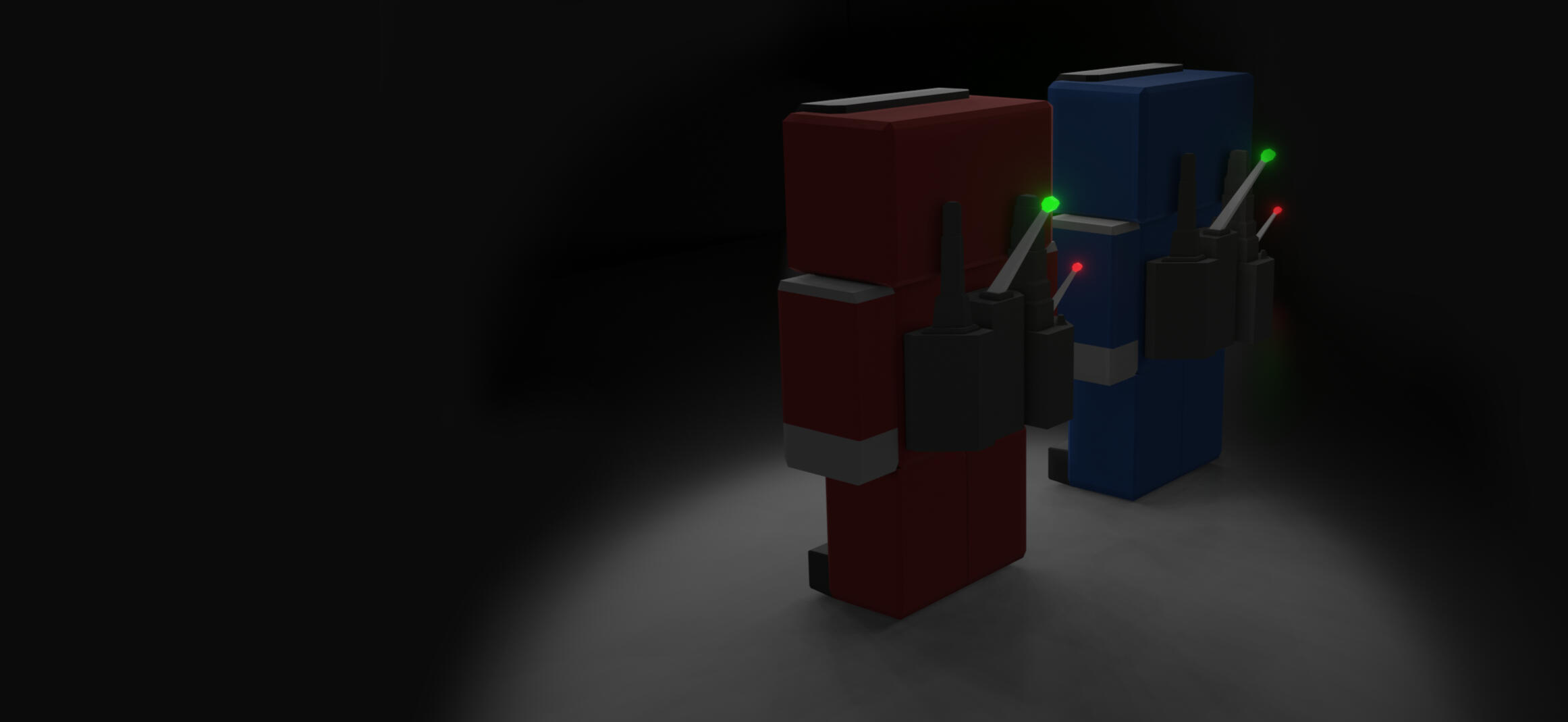
This project involved the full design and development of an original game in response to a detailed project brief, completed as part of my HND in Digital Design and Development (Games). The game challenges players to defend the solar system from an alien invasion, battling relentless waves of enemies across the outer planets. It incorporates 3D gameplay mechanics to give players a tactical advantage through spatial movement and depth.What I Learned
This project allowed me to apply and deepen my understanding of UX and UI principles, focusing on intuitive controls, clear screen designs, meaningful feedback, and engaging, user-centred interactions.
Bloomin' Boots
July 2021
Project Summary
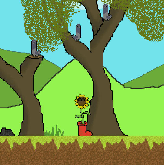
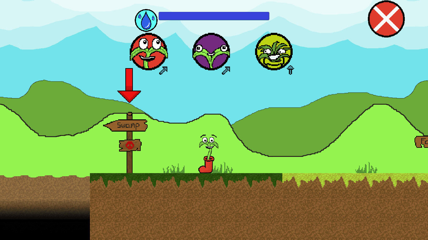
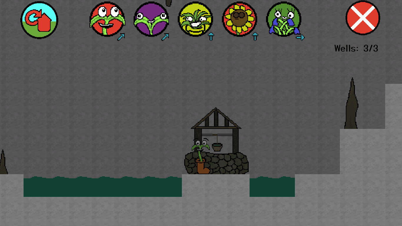
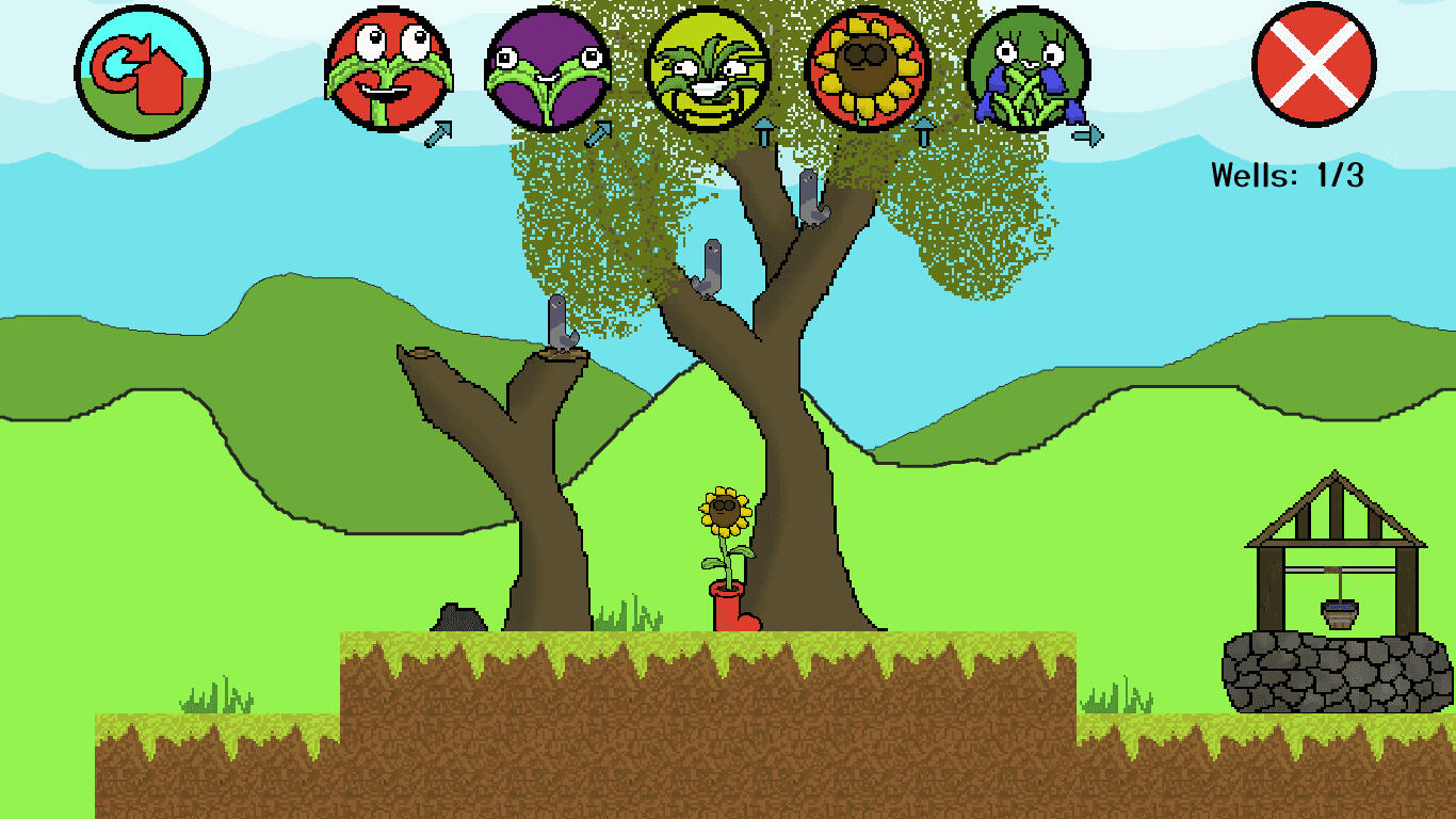
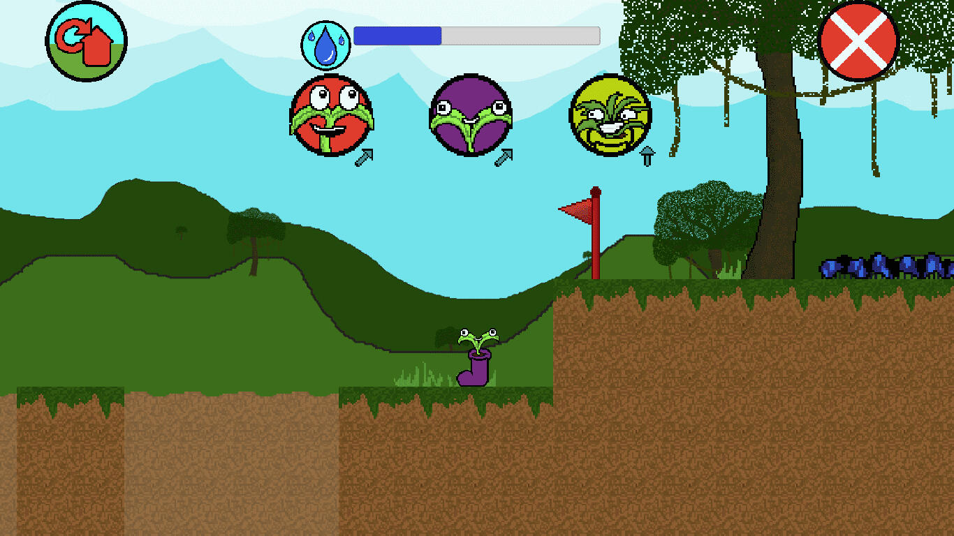
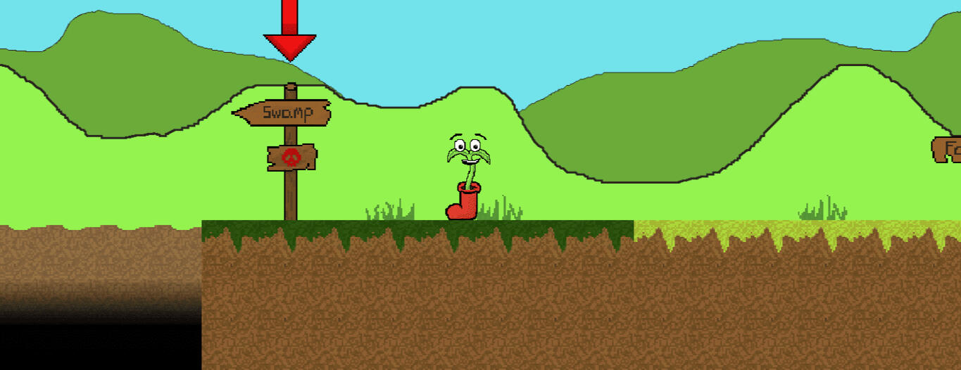
Blooming Boots marked my first project during my HND in Digital Design and Development (Games) and served as my introduction to the Unity game engine. This simple platformer, designed for mobile, features multiple characters, each with unique abilities essential for navigating a variety of levels. The objective is to reach the well at the end of each level before the plant perishes from dehydration, with every move consuming a limited water supply and adding strategic depth to the gameplay.What I Learned
This project strengthened my ability to work professionally by following a structured design brief from start to finish. I learned how to interpret requirements, stay aligned with project constraints, and make design decisions that directly support the brief’s goals rather than personal assumptions. It also taught me how to communicate progress clearly, justify design choices with evidence, and stay adaptable as new insights emerged. Overall, it improved my confidence in approaching design work with a more disciplined, accountable, and industry-focused mindset.

Level selection screen

Some refreshing water...

Sunflower resting under a tree

The end of the swamp level


